Week 2: Linear Models & Causal Inference
The second week covers Chapter 4 (Geocentric Models).
2.2 Exercises
2.2.1 Chapter 4
4E1. In the model definition below, which line is the likelihood? \[\begin{align} y_i &\sim \text{Normal}(\mu,\sigma) \\ \mu &\sim \text{Normal}(0,10) \\ \sigma &\sim \text{Exponential}(1) \end{align}\]
The likelihood is given by the first line, \(y_i \sim \text{Normal}(\mu,\sigma)\). The other lines represent the prior distributions for \(\mu\) and \(\sigma\).
4E2. In the model definition just above, how many parameters are in the posterior distribution?
There are two parameters, \(\mu\) and \(\sigma\).
4E3. Using the model definition above, write down the appropriate form of Bayes’ theorem that includes the proper likelihood and priors.
\[ \text{Pr}(\mu,\sigma|y) = \frac{\text{Normal}(y|\mu,\sigma)\text{Normal}(\mu|0,10)\text{Exponential}(\sigma|1)}{\int\int\text{Normal}(y|\mu,\sigma)\text{Normal}(\mu|0,10)\text{Exponential}(\sigma|1)d \mu d \sigma} \]
4E4. In the model definition below, which line is the linear model? \[\begin{align} y_i &\sim \text{Normal}(\mu,\sigma) \\ \mu_i &= \alpha + \beta x_i \\ \alpha &\sim \text{Normal}(0,10) \\ \beta &\sim \text{Normal}(0,1) \\ \sigma &\sim \text{Exponential}(2) \end{align}\]
The linear model is the second line, \(\mu_i = \alpha + \beta x_i\).
4E5. In the model definition just above, how many parameters are in the posterior distribution?
There are now three model parameters: \(\alpha\), \(\beta\), and \(\sigma\). The mean, \(\mu\) is no longer a parameter, as it is defined deterministically, as a function of other parameters in the model.
4M1. For the model definition below, simulate observed y values from the prior (not the posterior). \[\begin{align} y_i &\sim \text{Normal}(\mu,\sigma) \\ \mu &\sim \text{Normal}(0,10) \\ \sigma &\sim \text{Exponential}(1) \end{align}\]
library(tidyverse)

sim <- tibble(mu = rnorm(n = 10000, mean = 0, sd = 10),
              sigma = rexp(n = 10000, rate = 1)) %>%
  mutate(y = rnorm(n = 10000, mean = mu, sd = sigma))

ggplot(sim, aes(x = y)) +
  geom_density() +
  labs(x = "y", y = "Density")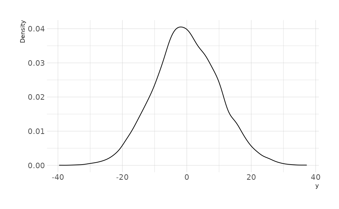
4M2. Trasnlate the model just above into a
quapformula.
4M3. Translate the
quapmodel formula below into a mathematical model definition.
y ~ dnorm( mu , sigma ),
mu <- a + b*x,
a ~ dnorm( 0 , 10 ),
b ~ dunif( 0 , 1 ),
sigma ~ dexp( 1 )
\[\begin{align} y_i &\sim \text{Normal}(\mu_i,\sigma) \\ \mu_i &= \alpha + \beta x_i \\ \alpha &\sim \text{Normal}(0, 10) \\ \beta &\sim \text{Uniform}(0, 1) \\ \sigma &\sim \text{Exponential}(1) \end{align}\]
4M4. A sample of students is measured for height each year for 3 years. After the third year, you want to fit a linear regression predicting height using year as a predictor. Write down the mathematical model definition for this regression, using any variable names and priors you choose. Be prepared to defend your choice of priors.
\[\begin{align} h_{ij} &\sim \text{Normal}(\mu_{ij}, \sigma) \\ \mu_{ij} &= \alpha + \beta(y_j - \bar{y}) \\ \alpha &\sim \text{Normal}(100, 10) \\ \beta &\sim \text{Normal}(0, 10) \\ \sigma &\sim \text{Exponential}(1) \end{align}\]
Because height is centered, \(\alpha\) represents the average height in the average year (i.e., year 2). The prior of \(\text{Normal}(100, 10)\) was chosen assuming that height is measured in centimeters and that that sample is of children who are still growing.
The slope is extremely vague. The a prior centered on zero, and the standard deviation of the prior of 10 represents a wide range of possible growth (or shrinkage). During growth spurts, height growth averages 6–13 cm/year. The standard deviation of 10 encompasses the range we might expect to see if growth were occurring at a high rate.
Finally, the exponential prior on \(\sigma\) assumes an average deviation of 1.
Prior predictive simulations also appear to give reasonably plausible regression lines, given our current assumptions.
n <- 50
tibble(group = seq_len(n),
       alpha = rnorm(n, 100, 10),
       beta = rnorm(n, 0, 10),
       sigma = rexp(n, 1)) %>%
  expand(nesting(group, alpha, beta, sigma), year = c(1, 2, 3)) %>%
  mutate(height = rnorm(n(), alpha + beta * (year - mean(year)), sigma)) %>%
  ggplot(aes(x = year, y = height, group = group)) +
  geom_line() +
  labs(x = "Year", y = "Height")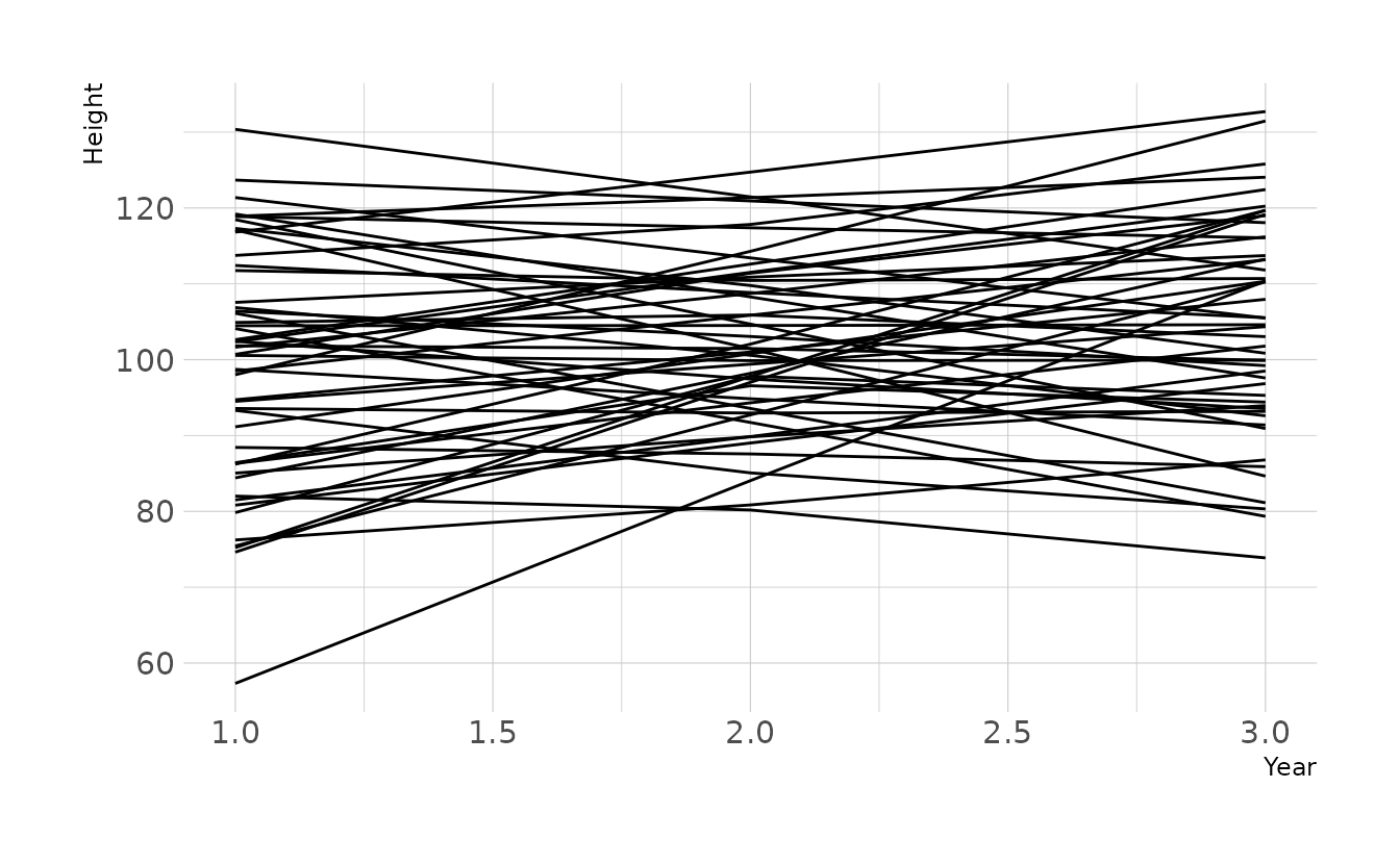
4M5. Now suppose I remind you that every student got taller each year. Does this information lead you to change your choice of priors? How?
Yes. Because we know that an increase in year will always lead to increased height, we know that \(\beta\) will be positive. Therefore, our prior should reflect this by using, for example, a log-normal distribution.
\[ \beta \sim \text{Log-Normal}(1,0.5) \]
This prior gives an expectation of about 3cm per year, with the 89% highest density interval between 0.87cm and 5.18cm per year.
library(tidybayes)

set.seed(123)
samples <- rlnorm(1e8, 1, 0.5)
bounds <- mean_hdi(samples, .width = 0.89)

ggplot() +
  stat_function(data = tibble(x = c(0, 10)), mapping = aes(x = x),
                geom = "line", fun = dlnorm,
                args = list(meanlog = 1, sdlog = 0.5)) +
  geom_ribbon(data = tibble(x = seq(bounds$ymin, bounds$ymax, 0.01)),
              aes(x = x, ymin = 0, ymax = dlnorm(x, 1, 0.5)),
              alpha = 0.8) +
  scale_x_continuous(breaks = seq(0, 10, 2)) +
  labs(x = expression(beta), y = "Density")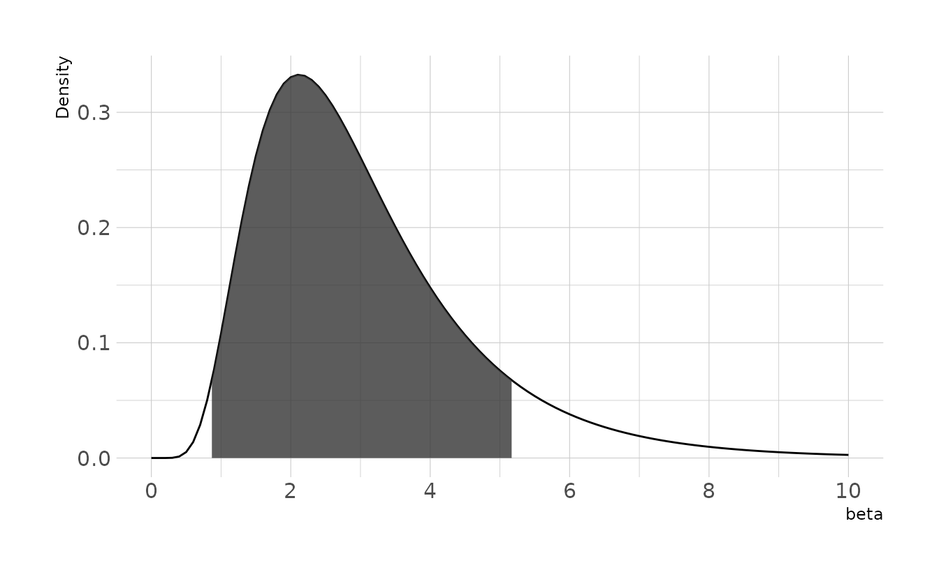
Prior predictive simulations of plausible lines using this new log-normal prior indicate that these priors still represent plausible values. Most the lines are positive, due to the prior constraint. However, because of variation around the mean, some lines do show a decrease in height. If it is truly impossible for students to shrink, then data like this might arise from measurement error.
n <- 50
tibble(group = seq_len(n),
       alpha = rnorm(n, 100, 10),
       beta = rlnorm(n, 1, 0.5),
       sigma = rexp(n, 1)) %>%
  expand(nesting(group, alpha, beta, sigma), year = c(1, 2, 3)) %>%
  mutate(height = rnorm(n(), alpha + beta * (year - mean(year)), sigma)) %>%
  ggplot(aes(x = year, y = height, group = group)) +
  geom_line() +
  labs(x = "Year", y = "Height")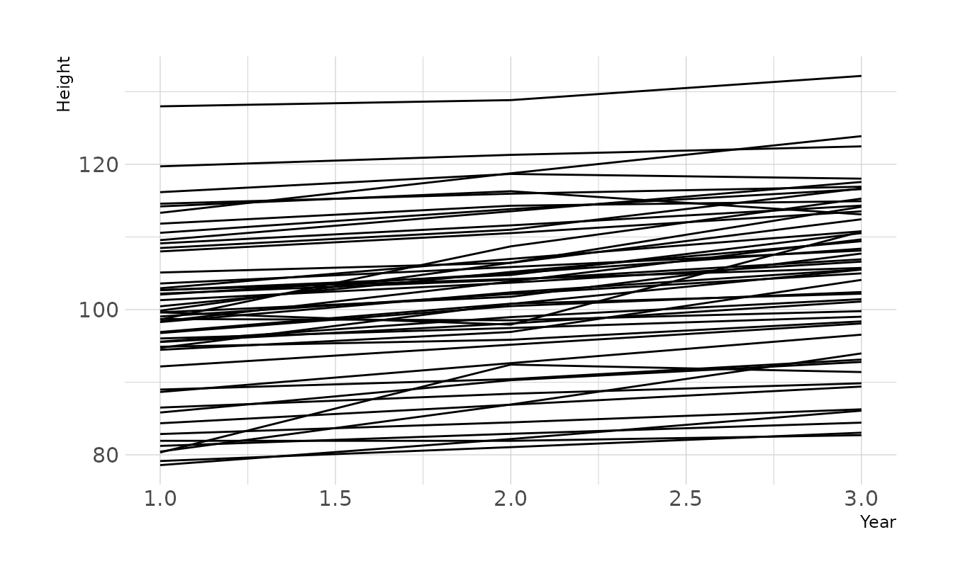
4M6. Now suppose I tell you that the variance among heights for students of the same age is never more than 64cm. How does this lead you to revise your priors?
A variance of 64cm corresponds to a standard deviation of 8cm. Our current prior of \(\sigma \sim \text{Exponential}(1)\) gives very little probability mass to values greater than 8. However, it is still theoretically possible. If we want to truly constrain the variance in this way, we could use a \(\text{Uniform}(0,8)\) prior. This would eliminate all values that would result in a variance greater than 64cm.
4M7. Refit model
m4.3from the chapter, but omit the mean weightxbarthis time. Compare the new model’s posterior to that of the original model. In particular, look at the covariance among the parameters. What is different? Then compare the posterior predictions of both models.
First, we’ll reproduce m4.3 using quap(), and then again using brm(). The covariance matrix from both is the same, as we would expect.
library(rethinking)
library(brms)

data(Howell1)
how_dat <- Howell1 %>%
  filter(age >= 18) %>%
  mutate(weight_c = weight - mean(weight))

# first, duplicate model with `quap`
m4.3 <- quap(alist(height ~ dnorm(mu, sigma),
                   mu <- a + b * (weight_c),
                   a ~ dnorm(178, 20),
                   b ~ dlnorm(0, 1),
                   sigma ~ dunif(0, 50)),
             data = how_dat)

round(vcov(m4.3), 3)
#>           a     b sigma
#> a     0.073 0.000 0.000
#> b     0.000 0.002 0.000
#> sigma 0.000 0.000 0.037

# and then with brms
b4.3 <- brm(height ~ 1 + weight_c, data = how_dat, family = gaussian,
            prior = c(prior(normal(178, 20), class = Intercept),
                      prior(lognormal(0, 1), class = b, lb = 0),
                      prior(uniform(0, 50), class = sigma)),
            iter = 28000, warmup = 27000, chains = 4, cores = 4, seed = 1234,
            file = here("fits", "chp4", "b4.3-0"))
#> Warning: It appears as if you have specified an upper bounded prior on a parameter that has no natural upper bound.
#> If this is really what you want, please specify argument 'ub' of 'set_prior' appropriately.
#> Warning occurred for prior
#> sigma ~ uniform(0, 50)

as_draws_df(b4.3) %>%
  as_tibble() %>%
  select(b_Intercept, b_weight_c, sigma) %>%
  cov() %>%
  round(digits = 3)
#>             b_Intercept b_weight_c sigma
#> b_Intercept       0.074      0.000 0.000
#> b_weight_c        0.000      0.002 0.000
#> sigma             0.000      0.000 0.038
Now, let’s using the non-centered parameterization. This time, we’ll only use brm().
b4.3_nc <- brm(height ~ 1 + weight, data = how_dat, family = gaussian,
               prior = c(prior(normal(178, 20), class = Intercept),
                         prior(lognormal(0, 1), class = b, lb = 0),
                         prior(uniform(0, 50), class = sigma)),
               iter = 28000, warmup = 27000, chains = 4, cores = 4, seed = 1234,
               file = here("fits", "chp4", "b4.3_nc"))
#> Warning: It appears as if you have specified an upper bounded prior on a parameter that has no natural upper bound.
#> If this is really what you want, please specify argument 'ub' of 'set_prior' appropriately.
#> Warning occurred for prior
#> sigma ~ uniform(0, 50)

as_draws_df(b4.3_nc) %>%
  as_tibble() %>%
  select(b_Intercept, b_weight, sigma) %>%
  cov() %>%
  round(digits = 3)
#>             b_Intercept b_weight sigma
#> b_Intercept       3.653   -0.079 0.010
#> b_weight         -0.079    0.002 0.000
#> sigma             0.010    0.000 0.035
We now see non-zero covariances between the parameters. Lets compare the posterior predictions. We’ll generate hypothetical outcome plots which are animated to show the uncertainty in estimates (see Hullman et al., 2015; Kale et al., 2019). Here we’ll just animate the estimated regression line using {gganimate} (Pedersen & Robinson, 2020). We can see that the predictions from the two models are nearly identical.
library(gganimate)

weight_seq <- tibble(weight = seq(25, 70, length.out = 100)) %>%
  mutate(weight_c = weight - mean(how_dat$weight))

predictions <- bind_rows(
  predict(b4.3, newdata = weight_seq) %>%
    as_tibble() %>%
    bind_cols(weight_seq) %>%
    mutate(type = "Centered"),
  predict(b4.3_nc, newdata = weight_seq) %>%
    as_tibble() %>%
    bind_cols(weight_seq) %>%
    mutate(type = "Non-centered")
)

fits <- bind_rows(
  weight_seq %>%
    add_epred_draws(b4.3) %>%
    mutate(type = "Centered"),
  weight_seq %>%
    add_epred_draws(b4.3_nc) %>%
    mutate(type = "Non-centered")
) %>%
  ungroup()

bands <- fits %>%
  group_by(type, weight) %>%
  median_qi(.epred, .width = c(.67, .89, .97))

lines <- fits %>%
  filter(.draw %in% sample(unique(.data$.draw), size = 50))

ggplot(lines, aes(x = weight)) +
  facet_wrap(~type, nrow = 1) +
  geom_ribbon(data = predictions, aes(ymin = Q2.5, ymax = Q97.5), alpha = 0.3) +
  geom_lineribbon(data = bands, aes(y = .epred, ymin = .lower, ymax = .upper),
                  color = NA) +
  scale_fill_brewer(palette = "Blues", breaks = c(.67, .89, .97)) +
  geom_line(aes(y = .epred, group = .draw)) +
  geom_point(data = how_dat, aes(y = height), shape = 1, alpha = 0.7) +
  labs(x = "Weight", y = "Height", fill = "Interval") +
  transition_states(.draw, 0, 1)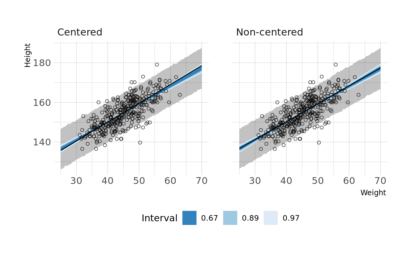
4M8. In the chapter, we used 15 knots with the cherry blossom spline. Increase the number of knots and observe what happens to the resulting spline. Then adjust also the width of the prior on the weights—change the standard deviation of the prior and watch what happens. What do you think the combination of know number and the prior on the weights controls?
First lets duplicate the 15-knot spline model from the chapter. Then we’ll double the number of knots and play with the prior.
library(splines)

data(cherry_blossoms)
cb_dat <- cherry_blossoms %>%
  drop_na(doy)

# original m4.7 model
knots_15 <- quantile(cb_dat$year, probs = seq(0, 1, length.out = 15))
B_15 <- bs(cb_dat$year, knots = knots_15[-c(1, 15)],
           degree = 3, intercept = TRUE)

cb_dat_15 <- cb_dat %>%
  mutate(B = B_15)

b4.7 <- brm(doy ~ 1 + B, data = cb_dat_15, family = gaussian,
            prior = c(prior(normal(100, 10), class = Intercept),
                      prior(normal(0, 10), class = b),
                      prior(exponential(1), class = sigma)),
            iter = 2000, warmup = 1000, chains = 4, cores = 4, seed = 1234,
            file = here("fits", "chp4", "b4.7"))
Visualizing the model, we see that it looks very similar to the fitted model from the chapter.
original_draws <- cb_dat_15 %>%
  add_epred_draws(b4.7) %>%
  summarize(mean_hdi(.epred, .width = 0.89),
            .groups = "drop")

ggplot(original_draws, aes(x = year, y = doy)) +
  geom_vline(xintercept = knots_15, alpha = 0.5) +
  geom_hline(yintercept = fixef(b4.7)[1, 1], linetype = "dashed") +
  geom_point(alpha = 0.5) +
  geom_ribbon(aes(ymin = ymin, ymax = ymax), fill = "#009FB7", alpha = 0.8) +
  labs(x = "Year", y = "Day in Year")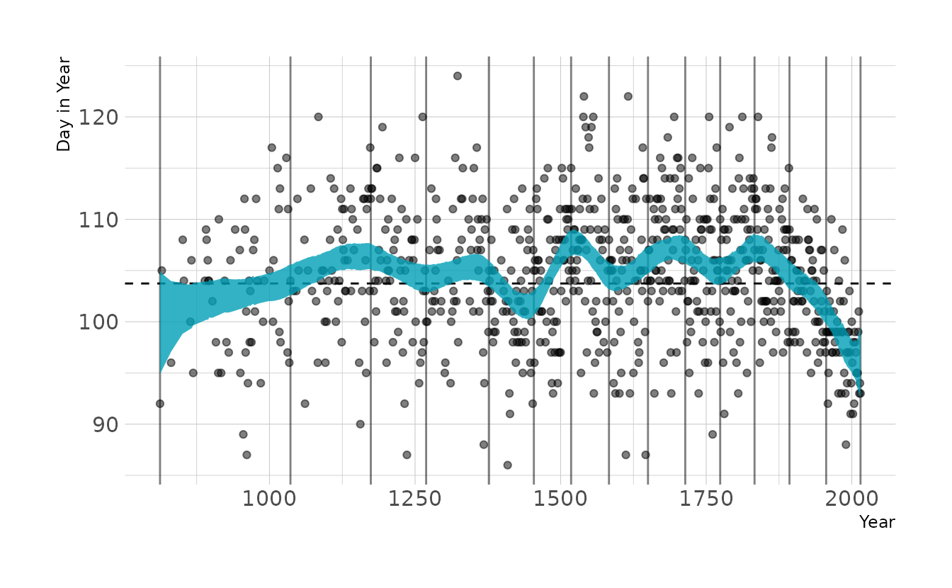
Now we’ll fit two additional models. The first uses 30 knots, and the second uses a tighter prior.
# double the number of knots
knots_30 <- quantile(cb_dat$year, probs = seq(0, 1, length.out = 30))
B_30 <- bs(cb_dat$year, knots = knots_30[-c(1, 30)],
           degree = 3, intercept = TRUE)

cb_dat_30 <- cb_dat %>%
  mutate(B = B_30)

b4.7_30 <- brm(doy ~ 1 + B, data = cb_dat_30, family = gaussian,
               prior = c(prior(normal(100, 10), class = Intercept),
                         prior(normal(0, 10), class = b),
                         prior(exponential(1), class = sigma)),
               iter = 2000, warmup = 1000, chains = 4, cores = 4, seed = 1234,
               file = here("fits", "chp4", "b4.7_30"))

# and modify the prior
b4.7_30p <- brm(doy ~ 1 + B, data = cb_dat_30, family = gaussian,
                prior = c(prior(normal(100, 10), class = Intercept),
                          prior(normal(0, 2), class = b),
                          prior(exponential(1), class = sigma)),
                iter = 2000, warmup = 1000, chains = 4, cores = 4, seed = 1234,
                file = here("fits", "chp4", "b4.7_30p"))
As expected, when we visualize these models we see that increasing the number of knots increases the “wiggly-ness” of the spline. We can also see that tightening the prior on the weights takes away some of the “wiggly-ness”.
# create plot data
spline_15 <- original_draws %>%
  select(-B) %>%
  mutate(knots = "15 knots (original model)")

spline_30 <- cb_dat_30 %>%
  add_epred_draws(b4.7_30) %>%
  summarize(mean_hdi(.epred, .width = 0.89),
            .groups = "drop") %>%
  select(-B) %>%
  mutate(knots = "30 knots")

spline_30p <- cb_dat_30 %>%
  add_epred_draws(b4.7_30p) %>%
  summarize(mean_hdi(.epred, .width = 0.89),
            .groups = "drop") %>%
  select(-B) %>%
  mutate(knots = "30 knots; Tight prior")

all_splines <- bind_rows(spline_15, spline_30, spline_30p)

# make plot
ggplot(all_splines, aes(x = year, y = doy)) +
  geom_point(alpha = 0.5) +
  geom_ribbon(aes(ymin = ymin, ymax = ymax), fill = "#009FB7", alpha = 0.8) +
  facet_wrap(~knots, ncol = 1) +
  labs(x = "Year", y = "Day in Year")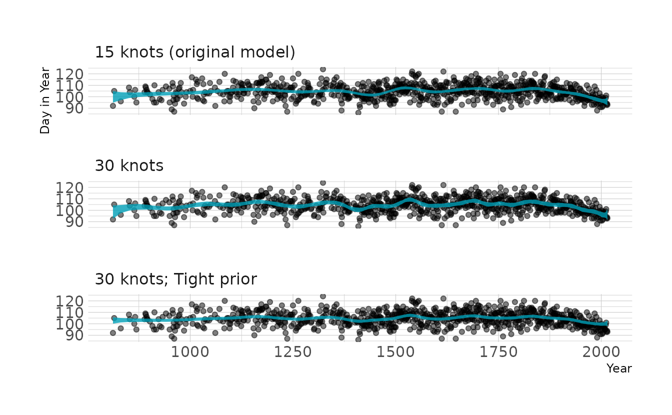
4H1. The weights listed below were recored in the !Kung census, but heights were not recorded for these individuals. Provide predicted heights and 89% intervals for each of these individuals. That is, fill in the table, below, using model-based predictions.
| Individual | weight | expected height | 89% interval |
|---|---|---|---|
| 1 | 47.0 | ||
| 2 | 43.7 | ||
| 3 | 64.8 | ||
| 4 | 32.6 | ||
| 5 | 54.6 |
The key function here is tidybayes::add_predicted_draws(), which samples from the posterior predictive distribution. We use model b4.3 to make the predictions, which we estimated back in question 4M7.
tibble(individual = 1:5,
       weight = c(46.95, 43.72, 64.78, 32.59, 54.63)) %>%
  mutate(weight_c = weight - mean(how_dat$weight)) %>%
  add_predicted_draws(b4.3) %>%
  group_by(individual, weight) %>%
  mean_qi(.prediction, .width = 0.89) %>%
  mutate(range = glue("[{sprintf('%0.1f', .lower)}--",
                      "{sprintf('%0.1f', .upper)}]"),
         .prediction = sprintf("%0.1f", .prediction)) %>%
  select(individual, weight, exp = .prediction, range) %>%
  kbl(align = "c", booktabs = TRUE,
col.names = c("Individual", "weight", "expected height", "89% interval"))| Individual | weight | expected height | 89% interval |
|---|---|---|---|
| 1 | 47.0 | 156.4 | [148.2–164.5] |
| 2 | 43.7 | 153.3 | [145.0–161.4] |
| 3 | 64.8 | 172.4 | [164.1–180.5] |
| 4 | 32.6 | 143.5 | [135.2–151.7] |
| 5 | 54.6 | 163.3 | [154.8–171.6] |
4H2. Select out all the rows in the
Howell1data with ages below 18 years of age. If you do it right, you should end up with a new data frame with 192 rows in it.
young_how <- Howell1 %>%
  filter(age < 18) %>%
  mutate(weight_c = weight - mean(weight))
nrow(young_how)
#> [1] 192
- Fit a linear regression to these data, using
quap. Present and interpret the estimates. For every 10 units of increase in weight, how much taller does the model predict a child gets?
We’ll use brms::brm() for fitting the model. We’ll use the same priors as for the model of adults, except for the weight for \(\beta\). Because children are shorter than adults, we’ll use a prior of \(\text{Normal}(138,20)\), based on the data reported in Fryar et al. (2016). Based on these estimates, an increase 10 units of weights corresponds to an average increase in height of 27.2 centimeters.
b4h2 <- brm(height ~ 1 + weight_c, data = young_how, family = gaussian,
            prior = c(prior(normal(138, 20), class = Intercept),
                      prior(lognormal(0, 1), class = b, lb = 0),
                      prior(exponential(1), class = sigma)),
            iter = 4000, warmup = 2000, chains = 4, cores = 4, seed = 1234,
            file = here("fits", "chp4", "b4h2.rds"))

summary(b4h2)
#>  Family: gaussian
#>   Links: mu = identity; sigma = identity
#> Formula: height ~ 1 + weight_c
#>    Data: young_how (Number of observations: 192)
#>   Draws: 4 chains, each with iter = 2000; warmup = 0; thin = 1;
#>          total post-warmup draws = 8000
#>
#> Population-Level Effects:
#>           Estimate Est.Error l-95% CI u-95% CI Rhat Bulk_ESS Tail_ESS
#> Intercept   108.36      0.60   107.17   109.55 1.00     6976     5427
#> weight_c      2.72      0.07     2.58     2.85 1.00     7770     5680
#>
#> Family Specific Parameters:
#>       Estimate Est.Error l-95% CI u-95% CI Rhat Bulk_ESS Tail_ESS
#> sigma     8.36      0.42     7.59     9.22 1.00     7618     5811
#>
#> Draws were sampled using sample(hmc). For each parameter, Bulk_ESS
#> and Tail_ESS are effective sample size measures, and Rhat is the potential
#> scale reduction factor on split chains (at convergence, Rhat = 1).
- Plot the raw data, with height on the vertical axis and weight on the horizontal axis. Superimpose the MAP regression line and 89% interval for the mean. Also superimpose the 89% interval for predicted heights.
mod_fits <- tibble(weight = seq_range(young_how$weight, 100)) %>%
  mutate(weight_c = weight - mean(young_how$weight)) %>%
  add_epred_draws(b4h2) %>%
  group_by(weight) %>%
  mean_qi(.epred, .width = 0.89)

mod_preds <- tibble(weight = seq_range(young_how$weight, 100)) %>%
  mutate(weight_c = weight - mean(young_how$weight)) %>%
  add_predicted_draws(b4h2) %>%
  group_by(weight) %>%
  mean_qi(.prediction, .width = 0.89)

ggplot(young_how, aes(x = weight)) +
  geom_point(aes(y = height), alpha = 0.4) +
  geom_ribbon(data = mod_preds, aes(ymin = .lower, ymax = .upper),
              alpha = 0.2) +
  geom_lineribbon(data = mod_fits,
                  aes(y = .epred, ymin = .lower, ymax = .upper),
                  fill = "grey60", size = 1) +
  labs(x = "Weight", y = "Height")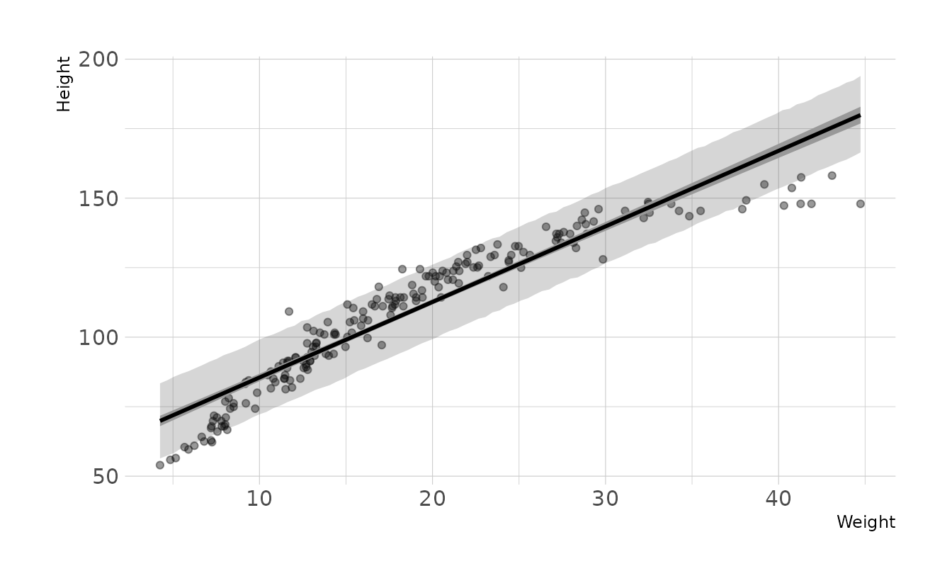
- What aspects of the model fit concern you? Describe the kinds of assumptions you would change, if any, to improve the model. You don’t have to write any new code. Just explain what the model appears to be doing a bad job of, and what you hypothesize would be a better model.
The model consistently over-estimates the height for individuals with weight less than ~13 and great than ~35. The model is also consistently underestimating the height of individuals with weight between ~13-35. Thus, our data appears to have a curve that our assumption of a straight line is violating. If we wanted to improve the model, we should relax the assumption of a straight line.
4H3. Suppose a colleauge of yours, who works on allometry, glances at the practice problems just above. Your colleague exclaims, “That’s silly. Everyone knows that it’s only the logarithm of body weight that scales with height!” Let’s take your colleague’s advice and see what happens.
- Model the relationship between height (cm) and the natural logarithm of weight (log-kg). Use the entire
Howell1data frame, all 544 rows, adults and non-adults. Can you interpret the resulting estimates?
full_how <- Howell1 %>%
  mutate(log_weight = log(weight),
         log_weight_c = log_weight - mean(log_weight))

b4h3 <- brm(height ~ 1 + log_weight_c, data = full_how, family = gaussian,
            prior = c(prior(normal(158, 20), class = Intercept),
                      prior(lognormal(0, 1), class = b, lb = 0),
                      prior(exponential(1), class = sigma)),
            iter = 4000, warmup = 2000, chains = 4, cores = 4, seed = 1234,
            file = here("fits", "chp4", "b4h3"))
summary(b4h3)
#>  Family: gaussian
#>   Links: mu = identity; sigma = identity
#> Formula: height ~ 1 + log_weight_c
#>    Data: full_how (Number of observations: 544)
#>   Draws: 4 chains, each with iter = 2000; warmup = 0; thin = 1;
#>          total post-warmup draws = 8000
#>
#> Population-Level Effects:
#>              Estimate Est.Error l-95% CI u-95% CI Rhat Bulk_ESS Tail_ESS
#> Intercept      138.27      0.22   137.83   138.70 1.00     8706     6181
#> log_weight_c    47.08      0.38    46.33    47.81 1.00     8601     6066
#>
#> Family Specific Parameters:
#>       Estimate Est.Error l-95% CI u-95% CI Rhat Bulk_ESS Tail_ESS
#> sigma     5.13      0.15     4.85     5.44 1.00     8332     5723
#>
#> Draws were sampled using sample(hmc). For each parameter, Bulk_ESS
#> and Tail_ESS are effective sample size measures, and Rhat is the potential
#> scale reduction factor on split chains (at convergence, Rhat = 1).
Conditional on the data and the model, the intercept estimate of sprintf("%0.1f", summary(b4h3)[["fixed"]]["Intercept", "Estimate"]) represents the predicted average height for an individual with an average log-weight (log-kg). The \(\beta\) estimate of sprintf("%0.1f", summary(b4h3)[["fixed"]]["log_weight_c", "Estimate"]) represents the average expected increase in height associated with an one-unit increase in weight (log-kg).
- Begin with this plot:
plot( height ~ weight , data = Howell1 ). Then use samples from the quadratic approximate posterior of the model in (a) to superimpose on the plot: (1) the predicted mean height as a function of weight, (2) the 97% interval for the mean, and (3) the 97% interval for predicted heights.
how_fits <- tibble(weight = seq_range(full_how$weight, 100)) %>%
  mutate(log_weight = log(weight),
         log_weight_c = log_weight - mean(full_how$log_weight)) %>%
  add_epred_draws(b4h3) %>%
  group_by(weight) %>%
  mean_qi(.epred, .width = 0.97)

how_preds <- tibble(weight = seq_range(full_how$weight, 100)) %>%
  mutate(log_weight = log(weight),
         log_weight_c = log_weight - mean(full_how$log_weight)) %>%
  add_predicted_draws(b4h3) %>%
  group_by(weight) %>%
  mean_qi(.prediction, .width = 0.97)

ggplot(full_how, aes(x = weight)) +
  geom_point(aes(y = height), alpha = 0.4) +
  geom_ribbon(data = how_preds, aes(ymin = .lower, ymax = .upper),
              alpha = 0.2) +
  geom_lineribbon(data = how_fits,
                  aes(y = .epred, ymin = .lower, ymax = .upper),
                  fill = "grey60", size = 1) +
  labs(x = "Weight", y = "Height")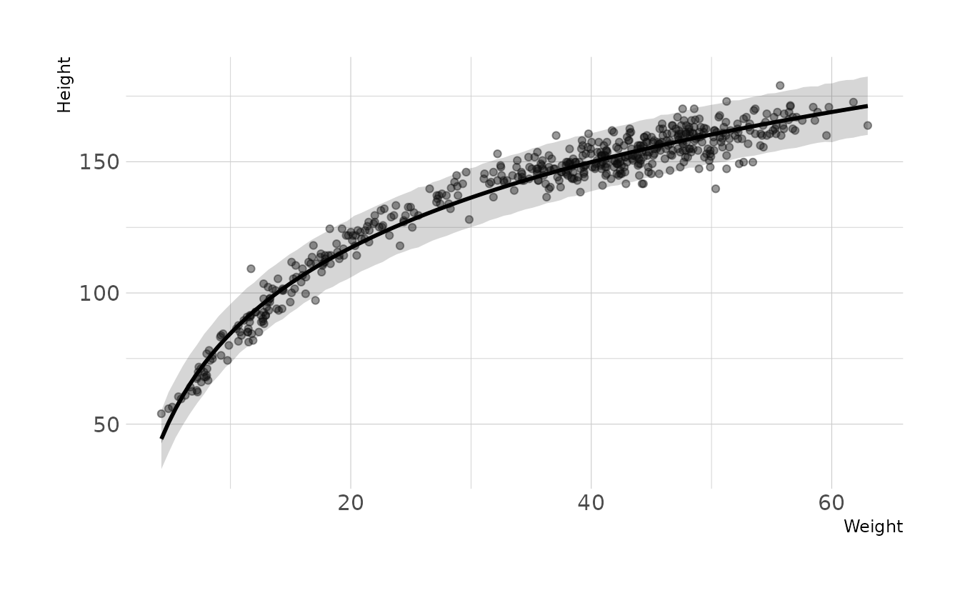
4H4. Plot the prior predictive distribution for the parabolic polynomial regression model in the chapter. You can modify the code that plots the linear regression prior predictive distribution. Can you modify the prior distributions of \(\alpha\), \(\beta_1\), and \(\beta_2\) so that the prior predictions stay within the biologically reasonable outcome space? That is to say: Do not try to fit the data by hand. But do try to keep the curves consistent with what you know about height and weight, before seeing these exact data.
The polynomial model from the chapter is defined as:
\[\begin{align} h_i &\sim \text{Normal}(\mu_i,\sigma) \\ \mu_i &= \alpha + \beta_1x_i + \beta_2x_i^2 \\ \alpha &\sim \text{Normal}(178,20) \\ \beta_1 &\sim \text{Log-Normal}(0,1) \\ \beta_2 &\sim \text{Normal}(0,1) \\ \sigma &\sim \text{Uniform}(0,50) \end{align}\]
First, let’s generate some prior predictive checks from the original priors.
n <- 1000
tibble(group = seq_len(n),
       alpha = rnorm(n, 178, 20),
       beta1 = rlnorm(n, 0, 1),
       beta2 = rnorm(n, 0, 1)) %>%
  expand(nesting(group, alpha, beta1, beta2),
         weight = seq(25, 70, length.out = 100)) %>%
  mutate(height = alpha + (beta1 * weight) + (beta2 * (weight ^ 2))) %>%
  ggplot(aes(x = weight, y = height, group = group)) +
  geom_line(alpha = 1 / 10) +
  geom_hline(yintercept = c(0, 272), linetype = 2:1, color = "red") +
  annotate(geom = "text", x = 25, y = 0, hjust = 0, vjust = 1,
           label = "Embryo") +
  annotate(geom = "text", x = 25, y = 272, hjust = 0, vjust = 0,
           label = "World's tallest person (272cm)") +
  coord_cartesian(ylim = c(-25, 300)) +
  labs(x = "Weight", y = "Height")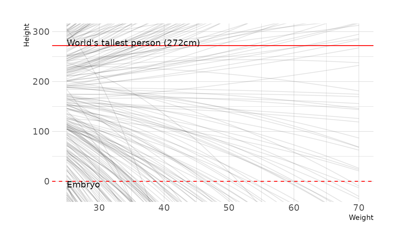
Clearly there is room for improvement here. However, because it’s not intuitive how exactly each parameter effects the parabolic curve, finding a good prior distribution is really hard! After much trial and error and playing with parabola calculators online, here is what I ended up with:
\[\begin{align} h_i &\sim \text{Normal}(\mu_i,\sigma) \\ \mu_i &= \alpha + \beta_1x_i + \beta_2x_i^2 \\ \alpha &\sim \text{Normal}(-190,5) \\ \beta_1 &\sim \text{Normal}(13,0.2) \\ \beta_2 &\sim \text{Uniform}(-0.13,-0.10) \\ \sigma &\sim \text{Uniform}(0,50) \end{align}\]
Which has the following prior predictive distribution.
n <- 1000
tibble(group = seq_len(n),
       alpha = rnorm(n, -190, 5),
       beta1 = rnorm(n, 13, 0.2),
       beta2 = runif(n, -0.13, -0.1)) %>%
  expand(nesting(group, alpha, beta1, beta2),
         weight = seq(25, 70, length.out = 100)) %>%
  mutate(height = alpha + (beta1 * weight) + (beta2 * (weight ^ 2))) %>%
  ggplot(aes(x = weight, y = height, group = group)) +
  geom_line(alpha = 1 / 10) +
  geom_hline(yintercept = c(0, 272), linetype = 2:1, color = "red") +
  annotate(geom = "text", x = 25, y = -3, hjust = 0, vjust = 1,
           label = "Embryo") +
  annotate(geom = "text", x = 25, y = 275, hjust = 0, vjust = 0,
           label = "World's tallest person (272cm)") +
  coord_cartesian(ylim = c(-25, 300)) +
  labs(x = "Weight", y = "Height")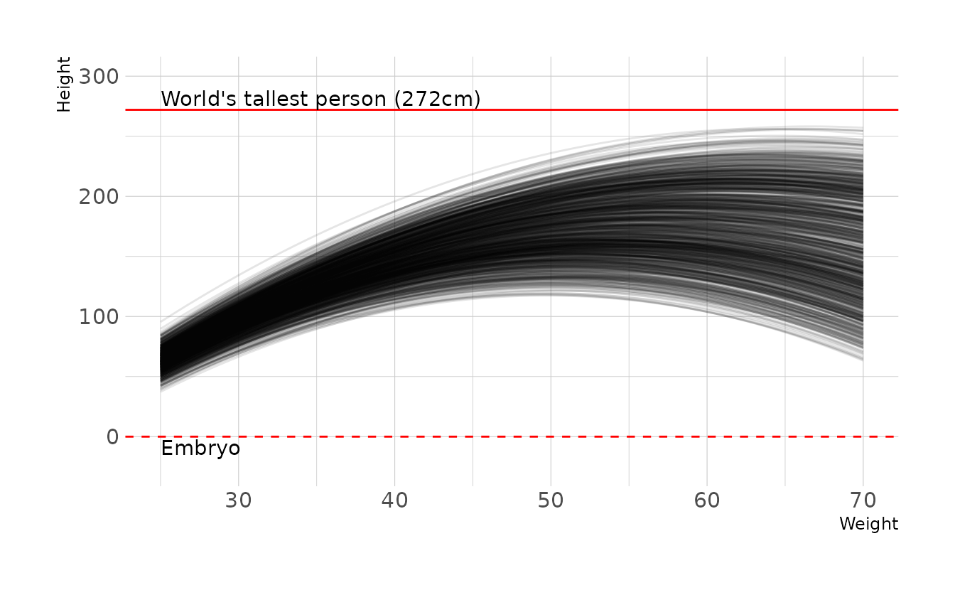
4H5. Return to
data(cherry_blossoms)and model the association between blossom date (doy) and March temperature (temp). Note that there are many missing values in both variables. You may consider a linear model, a polynomial, or a spline on temperature. How well does temperature trend predict the blossom trend?
We’ll try each type of model: linear, polynomial, and spline. For each, we’ll fit the model, and then visualize the predictions with the observed data.
data(cherry_blossoms)

cb_temp <- cherry_blossoms %>%
  drop_na(doy, temp) %>%
  mutate(temp_c = temp - mean(temp),
         temp_s = temp_c / sd(temp),
         temp_s2 = temp_s ^ 2,
         temp_s3 = temp_s ^ 3)

# linear model
lin_mod <- brm(doy ~ 1 + temp_c, data = cb_temp, family = gaussian,
               prior = c(prior(normal(100, 10), class = Intercept),
                         prior(normal(0, 10), class = b),
                         prior(exponential(1), class = sigma)),
               iter = 4000, warmup = 2000, chains = 4, cores = 4, seed = 1234,
               file = here("fits", "chp4", "b4h5-linear"))

# quadratic model
qad_mod <- brm(doy ~ 1 + temp_s + temp_s2, data = cb_temp, family = gaussian,
               prior = c(prior(normal(100, 10), class = Intercept),
                         prior(normal(0, 10), class = b, coef = "temp_s"),
                         prior(normal(0, 1), class = b, coef = "temp_s2"),
                         prior(exponential(1), class = sigma)),
               iter = 4000, warmup = 2000, chains = 4, cores = 4, seed = 1234,
               file = here("fits", "chp4", "b4h5-quadratic"))

# cubic model
cub_mod <- brm(doy ~ 1 + temp_s + temp_s2 + temp_s3, data = cb_temp,
               family = gaussian,
               prior = c(prior(normal(100, 10), class = Intercept),
                         prior(normal(0, 10), class = b, coef = "temp_s"),
                         prior(normal(0, 1), class = b, coef = "temp_s2"),
                         prior(normal(0, 1), class = b, coef = "temp_s3"),
                         prior(exponential(1), class = sigma)),
               iter = 4000, warmup = 2000, chains = 4, cores = 4, seed = 1234,
               file = here("fits", "chp4", "b4h5-cubic"))

# spline model
knots_30 <- quantile(cb_temp$temp, probs = seq(0, 1, length.out = 30))
B_30 <- bs(cb_temp$temp, knots = knots_30[-c(1, 30)],
           degree = 3, intercept = TRUE)

cb_temp_30 <- cb_temp %>%
  mutate(B = B_30)

spl_mod <- brm(doy ~ 1 + B, data = cb_temp_30, family = gaussian,
               prior = c(prior(normal(100, 10), class = Intercept),
                         prior(normal(0, 10), class = b),
                         prior(exponential(1), class = sigma)),
               iter = 2000, warmup = 1000, chains = 4, cores = 4, seed = 1234,
               file = here("fits", "chp4", "b4h5-spline"))
Now let’s visualize the predictions from each model. Overall the predictions from each model are remarkably similar. Therefore, I would go with a linear model, as that is the simplest of the models.
grid <- tibble(temp = seq_range(cb_temp_30$temp, 100)) %>%
  mutate(temp_c = temp - mean(cb_temp$temp),
         temp_s = temp_c / sd(cb_temp$temp),
         temp_s2 = temp_s ^ 2,
         temp_s3 = temp_s ^ 3)

knots_30 <- quantile(grid$temp, probs = seq(0, 1, length.out = 30))
B_30 <- bs(grid$temp, knots = knots_30[-c(1, 30)],
           degree = 3, intercept = TRUE)

grid <- grid %>%
  mutate(B = B_30)


fits <- bind_rows(
  add_epred_draws(grid, lin_mod) %>%
    summarize(mean_qi(.epred, .width = c(0.67, 0.89, 0.97)),
              .groups = "drop") %>%
    select(-B) %>%
    rename(.epred = y, .lower = ymin, .upper = ymax) %>%
    mutate(model = "Linear"),
  add_epred_draws(grid, qad_mod) %>%
    summarize(mean_qi(.epred, .width = c(0.67, 0.89, 0.97)),
              .groups = "drop") %>%
    select(-B) %>%
    rename(.epred = y, .lower = ymin, .upper = ymax) %>%
    mutate(model = "Quadratic"),
  add_epred_draws(grid, cub_mod) %>%
    summarize(mean_qi(.epred, .width = c(0.67, 0.89, 0.97)),
              .groups = "drop") %>%
    select(-B) %>%
    rename(.epred = y, .lower = ymin, .upper = ymax) %>%
    mutate(model = "Cubic"),
  add_epred_draws(grid, spl_mod) %>%
    summarize(mean_qi(.epred, .width = c(0.67, 0.89, 0.97)),
              .groups = "drop") %>%
    select(-B) %>%
    rename(.epred = y, .lower = ymin, .upper = ymax) %>%
    mutate(model = "Spline")
) %>%
  ungroup() %>%
  mutate(model = factor(model, levels = c("Linear", "Quadratic", "Cubic",
                                          "Spline")))

preds <- bind_rows(
  add_predicted_draws(grid, lin_mod) %>%
    summarize(mean_qi(.prediction, .width = 0.89), .groups = "drop") %>%
    select(-B) %>%
    rename(.prediction = y, .lower = ymin, .upper = ymax) %>%
    mutate(model = "Linear"),
  add_predicted_draws(grid, qad_mod) %>%
    summarize(mean_qi(.prediction, .width = 0.89), .groups = "drop") %>%
    select(-B) %>%
    rename(.prediction = y, .lower = ymin, .upper = ymax) %>%
    mutate(model = "Quadratic"),
  add_predicted_draws(grid, cub_mod) %>%
    summarize(mean_qi(.prediction, .width = 0.89), .groups = "drop") %>%
    select(-B) %>%
    rename(.prediction = y, .lower = ymin, .upper = ymax) %>%
    mutate(model = "Cubic"),
  add_predicted_draws(grid, spl_mod) %>%
    summarize(mean_qi(.prediction, .width = 0.89), .groups = "drop") %>%
    select(-B) %>%
    rename(.prediction = y, .lower = ymin, .upper = ymax) %>%
    mutate(model = "Spline")
) %>%
  ungroup() %>%
  mutate(model = factor(model, levels = c("Linear", "Quadratic", "Cubic",
                                          "Spline")))

ggplot(cb_temp, aes(x = temp)) +
  facet_wrap(~model, nrow = 2) +
  geom_point(aes(y = doy), alpha = 0.2) +
  geom_ribbon(data = preds, aes(ymin = .lower, ymax = .upper),
              alpha = 0.2) +
  geom_lineribbon(data = fits, aes(y = .epred, ymin = .lower, ymax = .upper),
                  size = .6) +
  scale_fill_brewer(palette = "Blues", breaks = c(0.67, 0.89, 0.97)) +
  labs(x = "March Temperature", y = "Day in Year")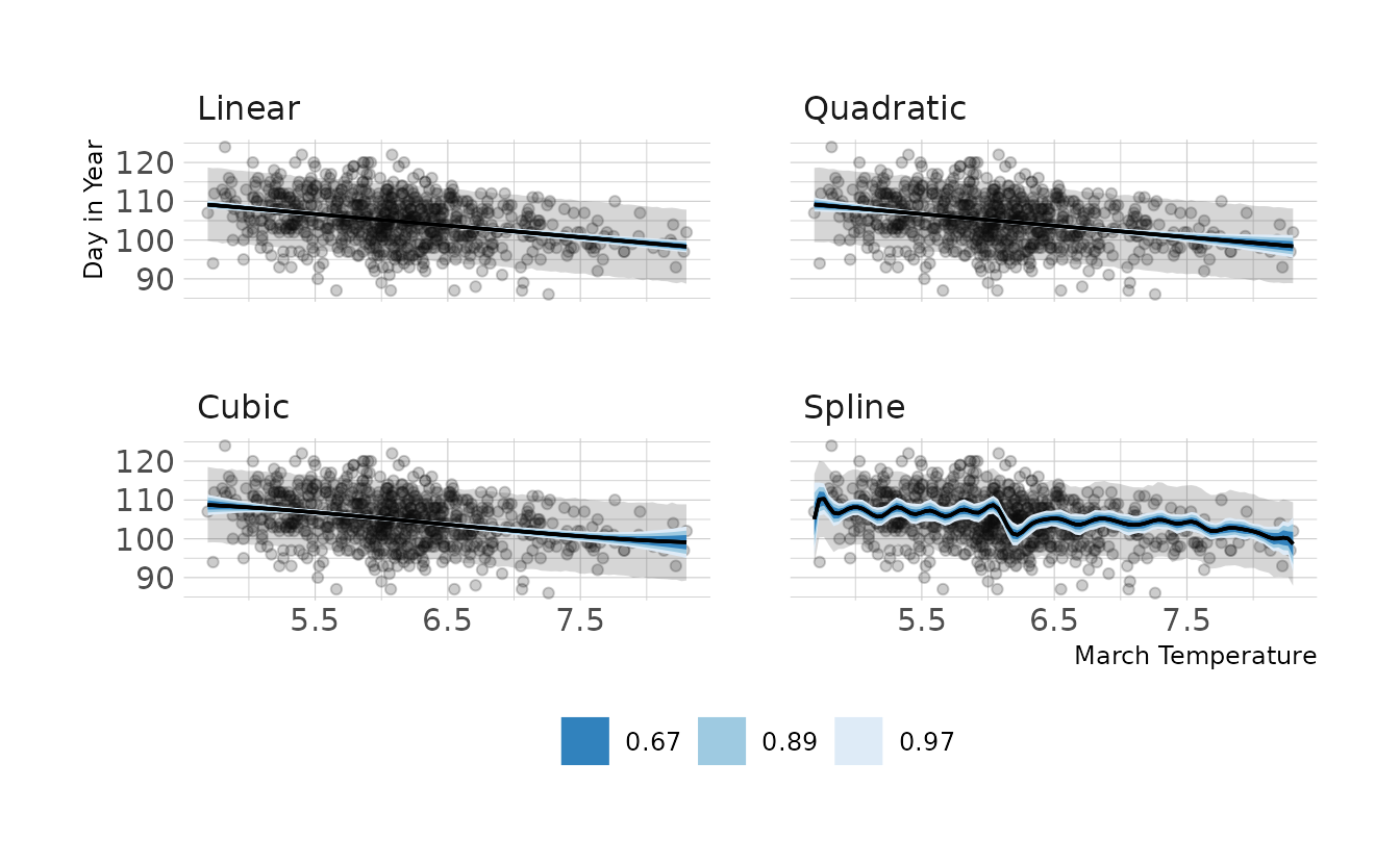
4H6. Simulate the prior predictive distribution for the cherry blossom spline in the chapter. Adjust the prior on the weights and observe what happens. What do you think the prior on the weights is doing?
As a reminder, here is the cherry blossom spline model from the chapter:
\[\begin{align} D_i &\sim \text{Normal}(\mu_i,\sigma) \\ \mu_i &= \alpha + \sum_{k=1}^Kw_kB_{k,i} \\ \alpha &\sim \text{Normal}(100, 10) \\ w_k &\sim \text{Normal}(0,10) \\ \sigma &\sim \text{Exponential}(1) \end{align}\]
We’ll also need to recreate the basis functions that that model uses:
cb_dat <- cherry_blossoms %>%
  drop_na(doy)

knot_list <- quantile(cb_dat$year, probs = seq(0, 1, length.out = 15))

B <- bs(cb_dat$year,
        knots = knot_list[-c(1, 15)],
        degree = 3, intercept = TRUE)
Finally, we can generate data from the priors, and combine those parameters with the basis functions to get the prior predictive distributions.
n <- 50
tibble(.draw = seq_len(n),
       alpha = rnorm(n, 100, 10),
       w = purrr::map(seq_len(n),
                      function(x, knots) {
                        w <- rnorm(n = knots + 2, 0, 10)
                        return(w)
                      },
                      knots = 15)) %>%
  mutate(mu = map2(alpha, w,
                   function(alpha, w, b) {
                     res <- b %*% w
                     res <- res + alpha
                     res <- res %>%
                       as_tibble(.name_repair = ~".value") %>%
                       mutate(year = cb_dat$year, .before = 1)
                     return(res)
                   },
                   b = B)) %>%
  unnest(cols = mu) %>%
  ggplot(aes(x = year, y = .value)) +
  geom_vline(xintercept = knot_list, alpha = 0.5) +
  geom_line(aes(group = .draw)) +
  expand_limits(y = c(60, 140)) +
  labs(x = "Year", y = "Day in Year")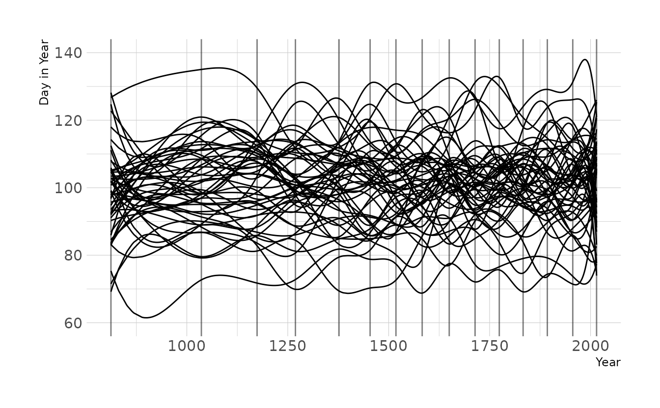
Now let’s tighten the prior on w to \(\text{Normal}(0,2)\), as we used for exercise 4M8. Now the lines are much less wiggly, which is consistent with what we found in the previous exercise, which used the observed data.
n <- 50
tibble(.draw = seq_len(n),
       alpha = rnorm(n, 100, 10),
       w = purrr::map(seq_len(n),
                      function(x, knots) {
                        w <- rnorm(n = knots + 2, 0, 1)
                        return(w)
                      },
                      knots = 15)) %>%
  mutate(mu = map2(alpha, w,
                   function(alpha, w, b) {
                     res <- b %*% w
                     res <- res + alpha
                     res <- res %>%
                       as_tibble(.name_repair = ~".value") %>%
                       mutate(year = cb_dat$year, .before = 1)
                     return(res)
                   },
                   b = B)) %>%
  unnest(cols = mu) %>%
  ggplot(aes(x = year, y = .value)) +
  geom_vline(xintercept = knot_list, alpha = 0.5) +
  geom_line(aes(group = .draw)) +
  expand_limits(y = c(60, 140)) +
  labs(x = "Year", y = "Day in Year")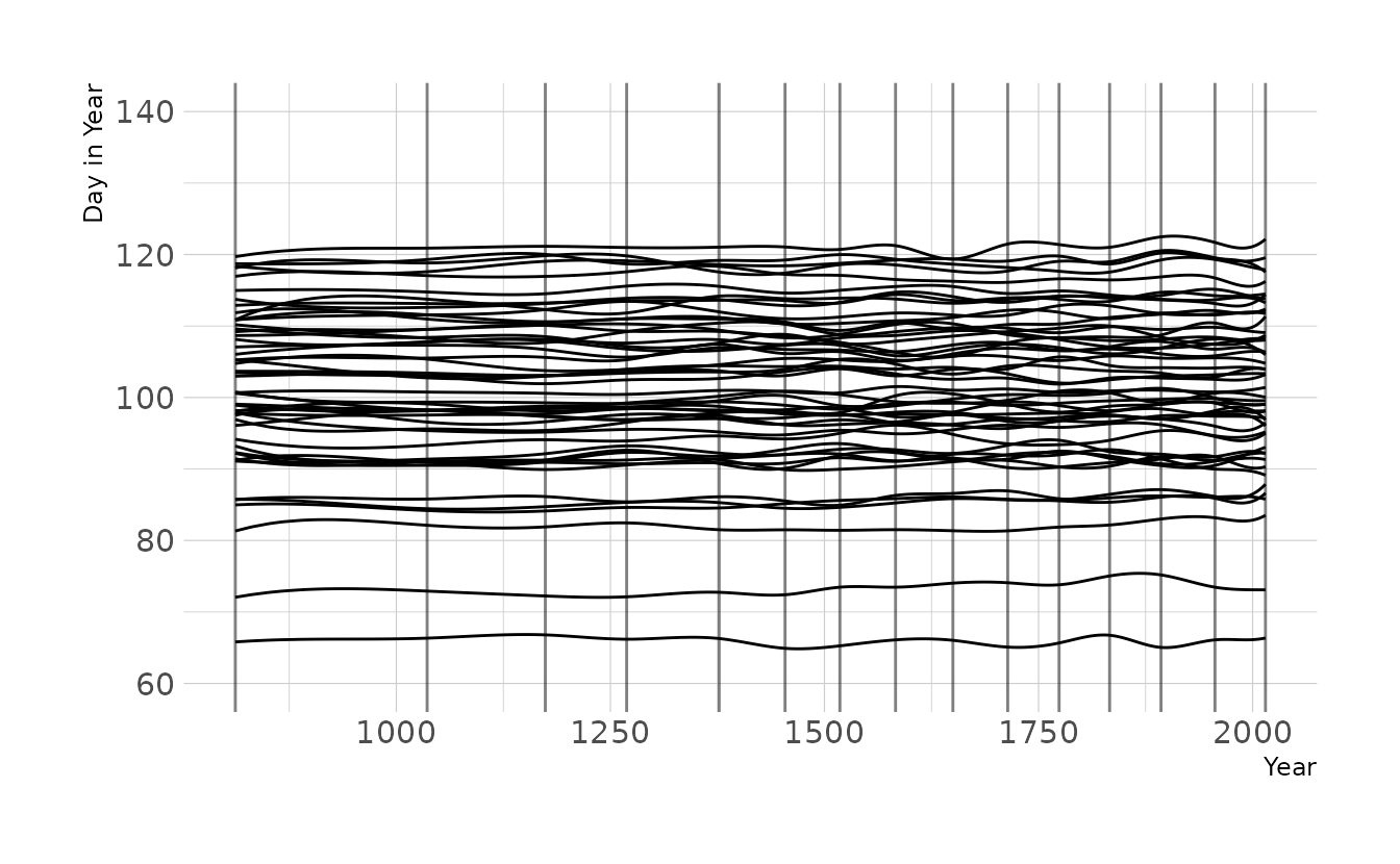
4H8. (sic; there is no 4H7 in the text, so I’ve kept this labeled 4H8 to be consistent with the book) The cherry blossom spline in the chapter used an intercept \(\alpha\), but technically it doesn’t require one. The first basis functions could substitute for the intercept. Try refitting the cherry blossom spline without the intercept. What else about the model do you need to change to make this work?
We can remove the intercept by removing the a parameter from the model. In the {brms} formula, this means replace the doy ~ 1 + B from question 4M8 with doy ~ 0 + B. The 0 means “don’t estimate the intercept.”
cb_dat <- cherry_blossoms %>%
  drop_na(doy)

knots_15 <- quantile(cb_dat$year, probs = seq(0, 1, length.out = 15))
B_15 <- bs(cb_dat$year, knots = knots_15[-c(1, 15)],
           degree = 3, intercept = TRUE)

cb_dat_15 <- cb_dat %>%
  mutate(B = B_15)

b4h8 <- brm(doy ~ 0 + B, data = cb_dat_15, family = gaussian,
            prior = c(prior(normal(0, 10), class = b),
                      prior(exponential(1), class = sigma)),
            iter = 2000, warmup = 1000, chains = 4, cores = 4, seed = 1234,
            file = here("fits", "chp4", "b4h8"))

epred_draws(b4h8, cb_dat_15) %>%
  summarize(mean_qi(.epred, .width = 0.89), .groups = "drop") %>%
  ggplot(aes(x = year, y = doy)) +
  geom_point(alpha = 0.2) +
  geom_hline(yintercept = mean(cb_dat$doy), linetype = "dashed") +
  geom_lineribbon(aes(y = y, ymin = ymin, ymax = ymax),
                  alpha = 0.8, fill = "#009FB7") +
  labs(x = "Year", y = "Day in Year")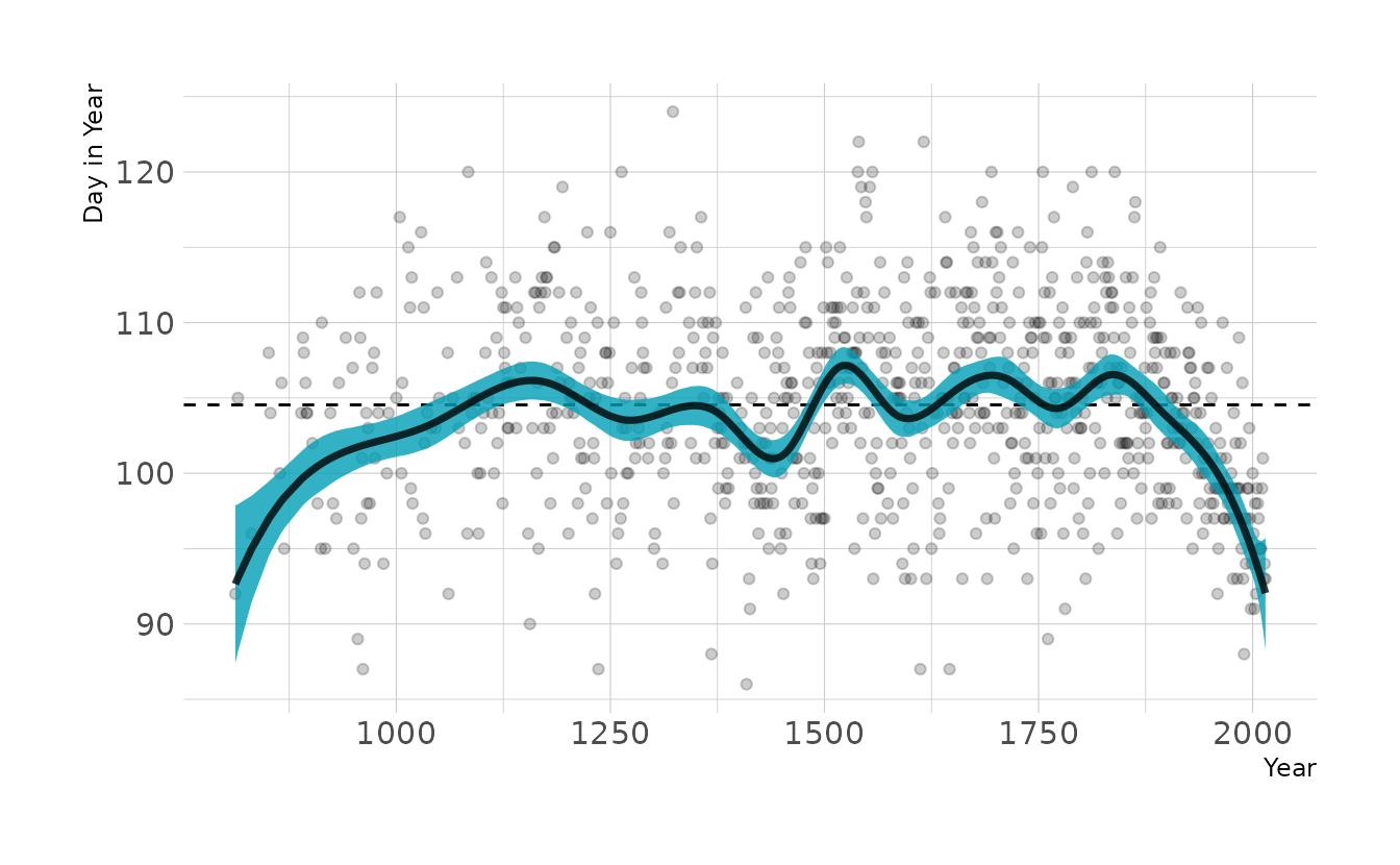
This looks a lot like our original model, except the left hand side of the spline is pulled down. This is likely due to the prior on w. The prior is centered on 0, but that assumes an intercept is present (i.e., the curves of the spline average a deviation of 0 from the mean). However, without the intercept, the prior drags the line down to actual zero when the first basis function in non-zero. By changing the prior of w to the same prior originally used for the intercept, we get almost our original model back.
b4h8_2 <- brm(doy ~ 0 + B, data = cb_dat_15, family = gaussian,
            prior = c(prior(normal(100, 10), class = b),
                      prior(exponential(1), class = sigma)),
            iter = 2000, warmup = 1000, chains = 4, cores = 4, seed = 1234,
            file = here("fits", "chp4", "b4h8-2"))

epred_draws(b4h8_2, cb_dat_15) %>%
  summarize(mean_qi(.epred, .width = 0.89), .groups = "drop") %>%
  ggplot(aes(x = year, y = doy)) +
  geom_point(alpha = 0.2) +
  geom_hline(yintercept = mean(cb_dat$doy), linetype = "dashed") +
  geom_lineribbon(aes(y = y, ymin = ymin, ymax = ymax),
                  alpha = 0.8, fill = "#009FB7") +
  labs(x = "Year", y = "Day in Year")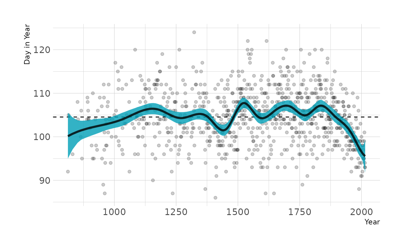
2.3 Homework
1. Construct a linear regression of weight as predicted by height, using the adults (age 18 or greater) from the Howell1 dataset. The heights listed below were recorded in the !Kung census, but weights were not recorded for these individuals. Provide predicted weights and 89% compatibility intervals for each of these individuals. That is, fill in the table below, using model-based predictions.
| Individual | height | expected weight | 89% interval |
|---|---|---|---|
| 1 | 140 | ||
| 2 | 160 | ||
| 3 | 175 |
This is very similar to question 4H1 above. But whereas in that problem we knew weight and wanted to predict height, here we know height and want to predict weight. We’ll start be estimating our linear model.
data(Howell1)
how_dat <- Howell1 %>%
  filter(age >= 18) %>%
  mutate(height_c = height - mean(height))

w2h1 <- brm(weight ~ 1 + height_c, data = how_dat, family = gaussian,
            prior = c(prior(normal(178, 20), class = Intercept),
                      prior(normal(0, 10), class = b),
                      prior(exponential(1), class = sigma)),
            iter = 2000, warmup = 1000, chains = 4, cores = 4, seed = 1234,
            file = here("fits", "hw2", "w2h1"))
Using our model, we can again use tidybayes::add_predicted_draws() to get the model based predictions to fill in the table.
tibble(individual = 1:3,
       height = c(140, 160, 175)) %>%
  mutate(height_c = height - mean(how_dat$height)) %>%
  add_predicted_draws(w2h1) %>%
  mean_qi(.prediction, .width = 0.89) %>%
  mutate(range = glue("[{sprintf('%0.1f', .lower)}--",
                      "{sprintf('%0.1f', .upper)}]"),
         .prediction = sprintf("%0.1f", .prediction)) %>%
  select(individual, height, exp = .prediction, range) %>%
  kbl(align = "c", booktabs = TRUE,
col.names = c("Individual", "height", "expected weight", "89% interval"))| Individual | height | expected weight | 89% interval |
|---|---|---|---|
| 1 | 140 | 35.8 | [29.1–42.6] |
| 2 | 160 | 48.4 | [41.6–55.3] |
| 3 | 175 | 57.9 | [51.1–64.9] |
2. From the Howell1 dataset, consider only the people younger than 13 years old. Estimate the causal association between age and weight. Assume that age influences weight through two paths. First, age influences height, and height influences weight. Second, age directly influences weight through age-related changes in muscle growth and body proportions. All of this implies this causal model (DAG):

Use a linear regression to estimate the total (not just direct) causal effect of each year of growth on weight. Be sure to carefully consider the priors. Try using prior predictive simulation to assess what they imply.
In this example, \(H\) is a pipe. Including \(H\) in the model would close the pipe, removing the indirect effect of age on weight. Therefore, we only include age as a predictor of weight in the model.
For prior distributions, we can assume that there is a positive relationship between age and weight, so we’ll use a lognormal prior for the slope. The intercept represents the weight at age 0 (i.e., birth weight). This is typically around 3-4 kg, so we’ll use a normal prior with a mean of 4 and a standard deviation of 1. This results in a wide range of plausible regression lines:
set.seed(123)
n <- 50
tibble(group = seq_len(n),
       alpha = rnorm(n, 4, 1),
       beta = rlnorm(n, 0, 1)) %>%
  expand(nesting(group, alpha, beta), age = 0:12) %>%
  mutate(weight = alpha + beta * age) %>%
  ggplot(aes(x = age, y = weight, group = group)) +
  geom_line() +
  scale_x_continuous(breaks = seq(0, 12, 2)) +
  coord_cartesian(xlim = c(0, 12), ylim = c(0, 30)) +
  labs(x = "Age", y = "Weight")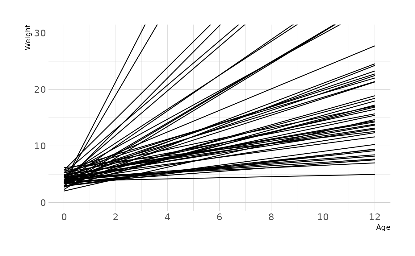
With these priors, we can now estimate our model.
data(Howell1)
kid_dat <- Howell1 %>%
  filter(age < 13)

w2h2 <- brm(weight ~ 1 + age, data = kid_dat, family = gaussian,
            prior = c(prior(normal(4, 1), class = Intercept),
                      prior(normal(0, 1), class = b),
                      prior(exponential(1), class = sigma)),
            iter = 2000, warmup = 1000, chains = 4, cores = 4, seed = 1234,
            file = here("fits", "hw2", "w2h2"))
Visualizing our posterior, we see that the 89% compatibility interval for the causal effect of age on weight (b_age) is 1.25 to 1.42 kg/year.
draws <- gather_draws(w2h2, b_Intercept, b_age, sigma)

mean_qi(draws, .width = 0.89)
#> # A tibble: 3 × 7
#>   .variable   .value .lower .upper .width .point .interval
#>   <chr>        <dbl>  <dbl>  <dbl>  <dbl> <chr>  <chr>
#> 1 b_age         1.34   1.25   1.42   0.89 mean   qi
#> 2 b_Intercept   7.00   6.42   7.59   0.89 mean   qi
#> 3 sigma         2.58   2.34   2.85   0.89 mean   qi

ggplot(draws, aes(x = .value, y = .variable)) +
  stat_halfeye(.width = 0.89) +
  labs(x = "Parameter value", y = "Parameter")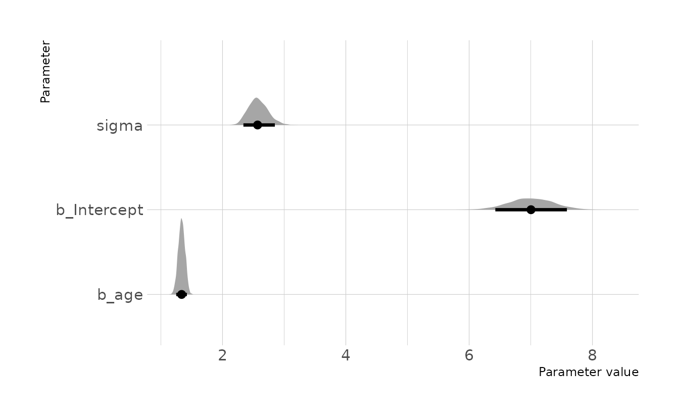
3. Now suppose the causal association between age and weight might be different for boys and girls. Use a single linear regression, with a categorical variable for sex, to estimate the total causal effect of age on weight separately for boys and girls. How do girls and boys differ? Provide one or more posterior contrasts as a summary.
We can create separate regression lines for each sex by sex (as a factor) to the model formula. Because we’re now estimating an intercept for each sex, we use the ~ 0 code to indicate that we are not estimating a global intercept, and are treating the sex variable as an index variable. We also have to use the non-linear syntax from {brms}. For details on this approach, see Solomon Kurz’s section on indicator variables.
kid_dat <- kid_dat %>%
  mutate(sex = male + 1,
         sex = factor(sex))

w2h3 <- brm(
  bf(weight ~ 0 + a + b * age,
     a ~ 0 + sex,
     b ~ 0 + sex,
     nl = TRUE),
  data = kid_dat, family = gaussian,
  prior = c(prior(normal(4, 1), class = b, coef = sex1, nlpar = a),
            prior(normal(4, 1), class = b, coef = sex2, nlpar = a),
            prior(normal(0, 1), class = b, coef = sex1, nlpar = b),
            prior(normal(0, 1), class = b, coef = sex2, nlpar = b),
            prior(exponential(1), class = sigma)),
  iter = 2000, warmup = 1000, chains = 4, cores = 4, seed = 1234,
  file = here("fits", "hw2", "w2h3")
)
When comparing the two intercepts, we see that the posterior distribution for girls (b_a_sex1) is slightly lower on average than the distribution for boys (b_a_sex2); however, there is a lot of overlap in the those distributions. Similarly, the posterior distributions for the slopes also show that boys (b_b_sex2) have a slightly higher slope on average than girls (b_b_sex1).
draws <- gather_draws(w2h3, b_a_sex1, b_a_sex2, b_b_sex1, b_b_sex2, sigma)

mean_qi(draws, .width = 0.89)
#> # A tibble: 5 × 7
#>   .variable .value .lower .upper .width .point .interval
#>   <chr>      <dbl>  <dbl>  <dbl>  <dbl> <chr>  <chr>
#> 1 b_a_sex1    6.50   5.79   7.21   0.89 mean   qi
#> 2 b_a_sex2    7.11   6.34   7.86   0.89 mean   qi
#> 3 b_b_sex1    1.36   1.25   1.47   0.89 mean   qi
#> 4 b_b_sex2    1.48   1.37   1.60   0.89 mean   qi
#> 5 sigma       2.49   2.26   2.74   0.89 mean   qi

ggplot(draws, aes(x = .value, y = .variable)) +
  stat_halfeye(.width = 0.89) +
  labs(x = "Parameter value", y = "Parameter")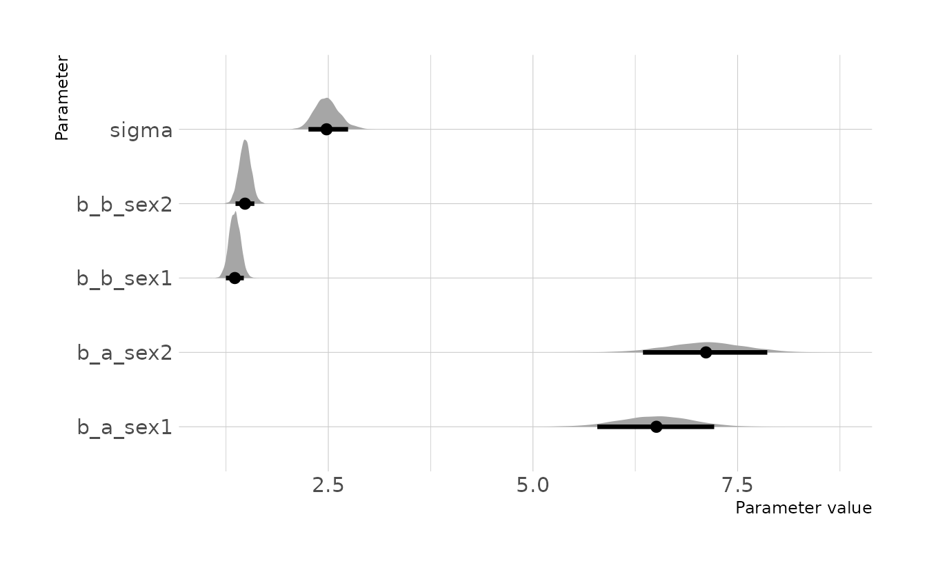
Let visualize what these regression lines look like. Overall, the boys have a slightly higher intercept and do appear to increase at a slightly higher rate. But again, these distributions are pretty similar overall.
Code to reproduce
new_age <- expand_grid(age = 0:12, sex = factor(c(1, 2)))

all_lines <- new_age %>%
  add_epred_draws(w2h3) %>%
  ungroup() %>%
  mutate(group = paste0(sex, "_", .draw))

plot_lines <- all_lines %>%
  filter(.draw %in% sample(unique(.data$.draw), size = 1000)) %>%
  select(-.draw)

animate_lines <- all_lines %>%
  filter(.draw %in% sample(unique(.data$.draw), size = 50))

ggplot(animate_lines, aes(x = age, y = .epred, color = sex, group = group)) +
  geom_line(data = plot_lines, alpha = 0.01, show.legend = FALSE) +
  geom_point(data = kid_dat, aes(x = age, y = weight, color = sex),
             inherit.aes = FALSE) +
  geom_line(alpha = 1, show.legend = FALSE, color = "black") +
  scale_color_okabeito(labels = c("Girls", "Boys")) +
  scale_x_continuous(breaks = seq(0, 12, 2)) +
  labs(x = "Age", y = "Weight (kg)", color = NULL) +
  guides(color = guide_legend(override.aes = list(size = 3))) +
  transition_states(.draw, 0, 1)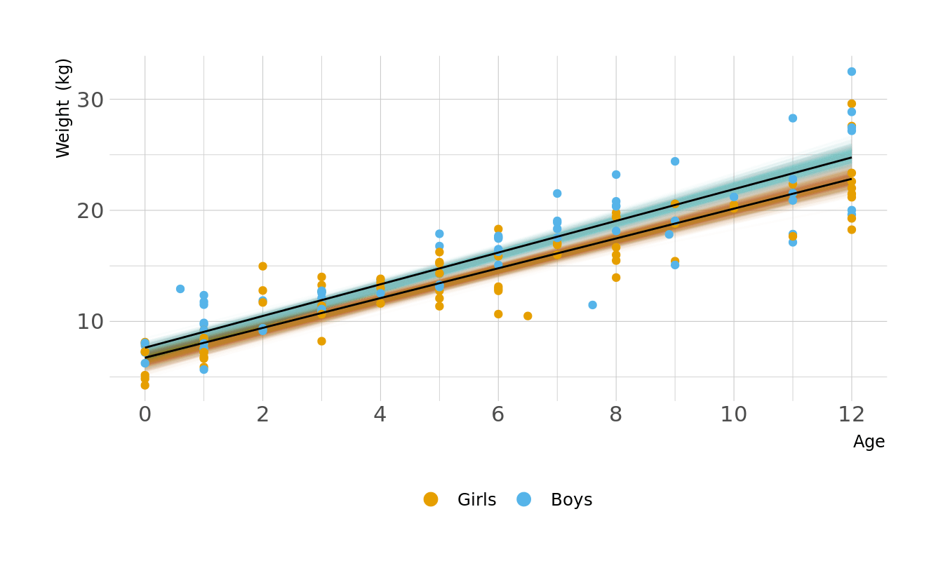
However, we are interested in the mean difference between boys and girls, not the difference in means. To estimate this contrast we need to calculate posterior simulations for each sex. This represents the distribution of expected weights for individuals of each sex. We can then take the difference of the two distributions. This is the posterior distribution of the difference, shown in the figure below. Overall, the difference is relatively small, but does appear to increase with age.
contrast <- new_age %>%
  add_predicted_draws(w2h3) %>%
  ungroup() %>%
  select(age, sex, .draw, .prediction) %>%
  mutate(sex = fct_recode(sex,
                          "Girls" = "1",
                          "Boys" = "2")) %>%
  pivot_wider(names_from = sex, values_from = .prediction) %>%
  mutate(diff = Boys - Girls)

ggplot(contrast, aes(x = age, y = diff)) +
  stat_lineribbon(aes(fill_ramp = stat(.width)), .width = ppoints(50),
                  fill = "#009FB7", show.legend = FALSE) +
  geom_hline(yintercept = 0, linetype = "dashed") +
  scale_fill_ramp_continuous(from = "transparent", range = c(1, 0)) +
  scale_x_continuous(breaks = seq(0, 12, 2)) +
  labs(x = "Age", y = "Weight difference (kg; Boys-Girls)")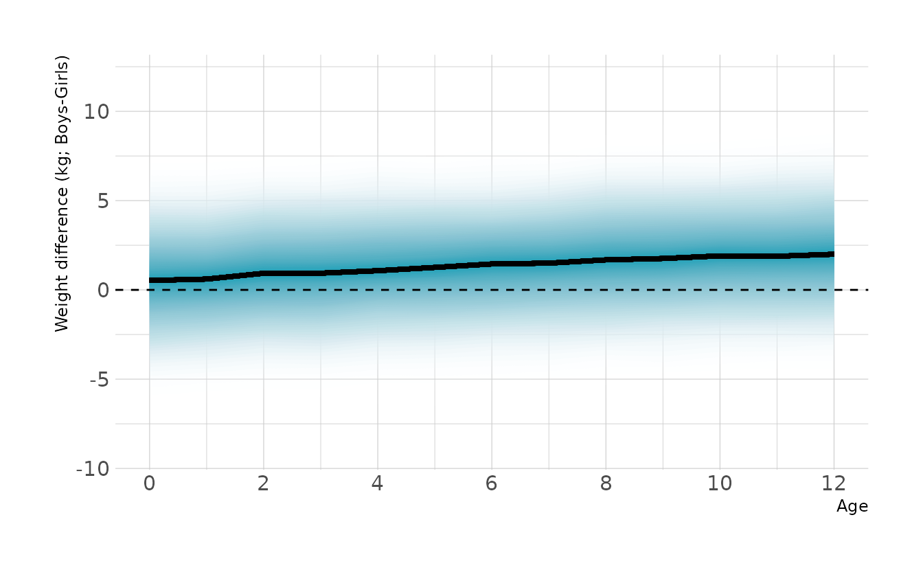
4 - OPTIONAL CHALLENGE. The data in
data(Oxboys)(rethinkingpackage) are growth records for 26 boys measured over 9 periods. I want you to model their growth. Specifically, model the increments in growth from one period (Occasionin the data table) to the next. Each increment is simply the difference between height in one occasion and height in the previous occasion. Since none of these boys shrunk during the study, all of the growth increments are greater than zero. Estimate the posterior distribution of these increments. Constrain the distribution so it is always positive—it should not be possible for the model to think that boys can shrink from year to year. Finally compute the posterior distribution of the total growth over all 9 occasions.
Let’s start by looking at the data.
data(Oxboys)
head(Oxboys)
#>   Subject     age height Occasion
#> 1       1 -1.0000    140        1
#> 2       1 -0.7479    143        2
#> 3       1 -0.4630    145        3
#> 4       1 -0.1643    147        4
#> 5       1 -0.0027    148        5
#> 6       1  0.2466    150        6
The first thing we need to do is convert the individual height measures into increments in height. This is straightforward using dplyr::lag().
increments <- Oxboys %>%
  group_by(Subject) %>%
  mutate(previous_height = lag(height),
         change = height - previous_height) %>%
  filter(!is.na(change)) %>%
  ungroup()

increments
#> # A tibble: 208 × 6
#>    Subject     age height Occasion previous_height change
#>      <int>   <dbl>  <dbl>    <int>           <dbl>  <dbl>
#>  1       1 -0.748    143.        2            140.  2.90
#>  2       1 -0.463    145.        3            143.  1.40
#>  3       1 -0.164    147.        4            145.  2.30
#>  4       1 -0.0027   148.        5            147.  0.600
#>  5       1  0.247    150.        6            148.  2.5
#>  6       1  0.556    152.        7            150.  1.5
#>  7       1  0.778    153.        8            152.  1.60
#>  8       1  0.994    156.        9            153.  2.5
#>  9       2 -0.748    139.        2            137.  2.20
#> 10       2 -0.463    140.        3            139.  1
#> # … with 198 more rows
Now we want to model the increments so they are always positive. This is not as easy as setting as prior, because the increments are the outcome, not a parameter in the model. We can do this in {brms} by using the lognormal family instead of the gaussian family we have used up to this point. This tell {brms} that our outcome is not normally distributed (i.e., gaussian), but rather lognormally distributed (i.e., constrained to be positive). Specifically, our model is defined as:
\[\begin{align} y_i &\sim \text{Lognormal}(\alpha,\sigma) \\ \alpha &\sim \text{Normal}(0,0.3) \\ \sigma &\sim \text{Exponential}(4) \end{align}\]
Why these priors? A lot of trial and error and prior predictive simulations. The lognormal distribution is not super intuitive to me, so I played with different priors until I found some that looked reasonable to me. Here is the code for prior predictive simulation. The prior expects most growth increments to be around 1cm. The 89% interval is .41cm to 1.7cm per occasion. This seems reasonable, so we’ll move forward.
set.seed(123)

n <- 1000
tibble(alpha = rnorm(n, mean = 0, sd = 0.3),
       sigma = rexp(n, rate = 4)) %>%
  mutate(sim_change = rlnorm(n, meanlog = alpha, sdlog = sigma)) %>%
  ggplot(aes(x = sim_change)) +
  geom_density() +
  labs(x = "Prior Expectation for Incremental Growth (cm)", y = "Density")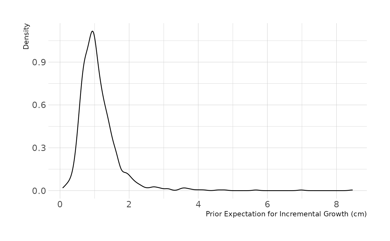
We estimate the model in {brms} by specifying family = lognormal.
w2h4 <- brm(change ~ 1, data = increments, family = lognormal,
            prior = c(prior(normal(0, 0.3), class = Intercept),
                      prior(exponential(4), class = sigma)),
            iter = 2000, warmup = 1000, chains = 4, cores = 4, seed = 1234,
            file = here("fits", "hw2", "w2h4"))
Using our model, we can examine the posterior distribution for incremental growth. On average, we would expect the boys to grow about 1.5cm per occasion.
set.seed(234)

as_draws_df(w2h4) %>%
  mutate(post_change = rlnorm(n(), meanlog = b_Intercept, sdlog = sigma)) %>%
  ggplot(aes(x = post_change)) +
  geom_density() +
  labs(x = "Posterior Distribution for Incremental Growth (cm)",
       y = "Density")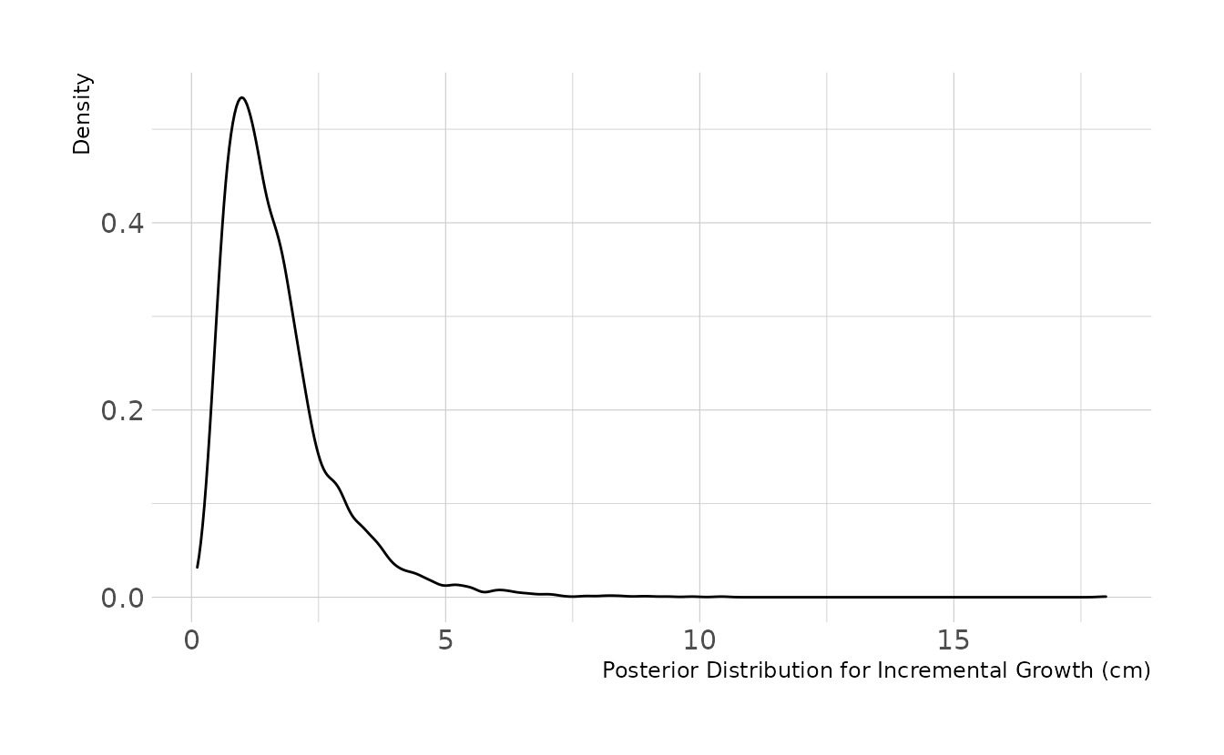
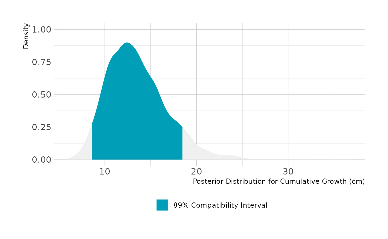
For cumulative growth across all occasions, we need to simulation 8 incremental changes and sum them. Over all 9 occasions, we expect the boys to grow about 13cm, with an 89% highest density compatibility interval of 8.6cm to 18.5cm.
set.seed(345)

as_draws_df(w2h4) %>%
  mutate(all_change = map2_dbl(b_Intercept, sigma, ~sum(rlnorm(8, .x, .y)))) %>%
  ggplot(aes(x = all_change)) +
  stat_halfeye(aes(fill = stat(between(x, 8.6, 18.5))), color = NA) +
  scale_fill_manual(values = c("#009FB7", NA),
                    labels = "89% Compatibility Interval",
                    breaks = "TRUE", na.value = "#F0F0F0") +
  labs(x = "Posterior Distribution for Cumulative Growth (cm)",
       y = "Density", fill = NULL)