Week 4: Overfitting / MCMC
The fourth week covers Chapter 7 (Ulysses’ Compass), Chapter 8 (Conditional Manatees), and Chapter 9 (Markov Chain Monte Carlo).
4.2 Exercises
4.2.1 Chapter 7
7E1. State the three motivating criteria that define information entropy. Try to express each in your own words.
Information is defined as the reduction in uncertainty when we learn and outcome. The motivating criteria for defining information entropy revolve around the measure of uncertainty that is used to derive information.
The first is that the measure of uncertainty must be continuous. This prevents large changes in the uncertainty measure resulting from relatively small changes in probabilities. Such a phenomenon often occurs when researchers use a p-value cutoff of .05 to claim “significance.” Often, the difference between “significant” and “non-significant” results is itself non-significant 🤯.
The second is that the measure of uncertainty should increase as the number of possible events increases. When there are more potential outcomes, there are more predictions that have to be made, and therefore more uncertainty about which outcome will be observed. For example, if your friend asks you to guess a number between 1 and 100, you are much less likely to guess correctly than if you were guessing a number between 1 and 2.
The third and final criteria is that the measure of uncertainty should be additive. These means that if we calculate the uncertainty for two sets of outcomes (e.g., heads or tail on a coin flip and the results of a thrown die), then the uncertainty of combinations of events (e.g., heads and “3”) should be equal to the sum of the uncertainties from the two separate events.
Information entropy is the only function that satisfies all three criteria.
7E2. Suppose a coin is weighted such that, when it is tossed and lands on a table, it comes up heads 70% of the time. What is the entropy of this coin?
Entropy is the average log-probability of an event. The formula is given as
\[\begin{equation} H(p) = -\text{E}\log(p_i) = -\sum_{i=1}^np_i\log(p_i) \end{equation}\]
Thus, for each probability \(p_i\), we multiply \(p_i\) by \(\log(p_i)\), sum all the values, and then multiply the sum by negative one. To implement this, we’ll first write a couple of functions to do the calculations. We could do this without functions, but functions will allow us to handle cases where \(p_i = 0\), as will be the case in a couple of problems. The first function, p_logp(), returns 0 if p is 0, and returns p * log(p) otherwise. The calc_entropy() function is a wrapper around p_logp(), applying p_logp() to each element of a vector of probabilities, summing the results, and multiplying the sum by -1.
p_logp <- function(p) {
  if (p == 0) return(0)
  p * log(p)
}
calc_entropy <- function(x) {
  avg_logprob <- sum(map_dbl(x, p_logp))
  -1 * avg_logprob
}
Applying these functions to the probabilities in this problem results in an entropy of about 0.61. Note this is the same as the weather example in the text, because in both cases there were two events with probabilities of 0.3 and 0.7.
probs <- c(0.7, 0.3)
calc_entropy(probs)
#> [1] 0.611
7E3. Suppose a four-sided die is loaded such that, when tossed onto a table, it shows “1” 20%, “2” 25%, “3” 25%, and “4” 30% of the time. What is the entropy of this die?
Now we have four outcomes. We can reuse our code from above, substituting the new probabilities into the vector probs. This results in an entropy of about 1.38. As expected, because there are now more outcomes, the entropy is higher than what was observed in the previous problem.
probs <- c(0.20, 0.25, 0.25, 0.30)
calc_entropy(probs)
#> [1] 1.38
7E4. Suppose another four-sided die is loaded such that it never shows “4.” The other three sides show equally often. What is the entropy of this die?
Again, we can copy our code from above, replace the probabilities. Even though there are four outcomes specified, there are effectively three outcomes, as the outcome “4” has probability 0. Thus, we would expect entropy to decrease, as there are fewer possible outcomes than in the previous problem. This is indeed what we find, as this die’s entropy is about 1.1.
probs <- c(1, 1, 1, 0)
probs <- probs / sum(probs)
probs
#> [1] 0.333 0.333 0.333 0.000

calc_entropy(probs)
#> [1] 1.1
7M1. Write down and compare the definitions of AIC and WAIC. Which of these criteria is most general? Which assumptions are required to transform the more general criterion into a less general one?
The AIC is defined as follows, where \(\text{lppd}\) is the log-pointwise-predictive density, and \(p\) is the number of free parameters in the posterior distribution.
\[ \text{AIC} = -2\text{lppd} + 2p \]
In contrast, the WAIC is defined as:
\[ \text{WAIC}(y,\Theta) = -2\Big(\text{lppd} - \sum_i \text{var}_{\theta}\log p(y_i | \theta)\Big) \]
If we distribute the \(-2\) through, this looks remarkably similar to the AIC formula, with the exception of the final \(p\) term. Whereas the AIC uses 2 times the number of free parameters, the WAIC uses 2 times the sum of the log-probability variances from each observation.
The WAIC is more general than the AIC, as the AIC assumes that priors are flat or overwhelmed by the likelihood, the posterior distribution is approximately multivariate Gaussian, and the sample size is much greater than the number of parameters. If all of these assumptions are met, then we would expect the AIC and WAIC to be about the same.
7M2. Explain the difference between model selection and model comparison. What information is lost under model selection?
Model selection refers to just picking the model that has the lowest (i.e., best) criterion value and discarding other models. When we take this approach, we lose information about the relative model accuracy that can be seen across the criterion values for the candidate models. This information can inform how confident we are in the models. Additionally, the model selection paradigm cares only about predictive accuracy and ignores causal inference. Thus, a model may be selected that has confounds or that would not correctly inform an intervention.
In contrast, model comparison uses multiple models to understand how the variables included influence prediction and affect implied conditional independencies in a causal model. Thus, we preserve information and can make more holistic judgments about our data and models.
7M3. When comparing models with an information criterion, why must all models be fit to exactly the same observations? What would happen to the information criterion values, if the models were fit to different numbers of observations? Perform some experiments, if you are not sure.
All of the information criteria are defined based on the log-pointwise-predictive density, defined as follows, where \(y\) is the data, \(\Theta\) is the posterior distribution, \(S\) is the number of samples, and \(I\) is the number of samples.
\[ \text{lppd}(y,\Theta) = \sum_i\log\frac{1}{S}\sum_sp(y_i|\Theta_s) \]
In words, this means take the log of the average probability across samples of each observation \(i\) and sum them together. Thus, a larger sample size will necessarily lead to a smaller log-pointwise-predictive-density, even if the data generating process and models are exactly equivalent (i.e., when the LPPD values are negative, the sum will get more negative as the sample size increases). More observations are entered into the sum, leading to a smaller final lppd, which will in turn increase the information criteria. We can run a quick simulation to demonstrate. For three different sample sizes, we’ll simulate 100 data sets from the exact same data generation process, estimate a the exact same linear model, and then calculate the LPPD, WAIC, and PSIS for each.
Visualizing the distribution of the LPPD, WAIC, and PSIS across simulated data sets with each sample size, we see that the LPPD gets more negative as the sample size increases, even though the data generation process and estimated model are identical. Accordingly, the WAIC and PSIS increase. Note that the WAIC and PSIS values are approximately \(-2 \times \text{lppd}\). Thus, if we fit one model with 100 observations and second model with 1,000 observations, we might conclude from the WAIC and PSIS that the first model with 100 observations has much better predictive accuracy, because the WAIC and PSIS values are lower. However, this would be only an artifact of different sample sizes, and may not actually represent true differences between the models.
Simulation Code
gen_data <- function(n) {
  tibble(x1 = rnorm(n = n)) %>%
    mutate(y = rnorm(n = n, mean = 0.3 + 0.8 * x1),
           across(everything(), standardize))
}
fit_model <- function(dat) {
  suppressMessages(output <- capture.output(
    mod <- brm(y ~ 1 + x1, data = dat, family = gaussian,
               prior = c(prior(normal(0, 0.2), class = Intercept),
                         prior(normal(0, 0.5), class = "b"),
                         prior(exponential(1), class = sigma)),
               iter = 4000, warmup = 3000, chains = 4, cores = 4, seed = 1234)
  ))

  return(mod)
}
calc_info <- function(model) {
  mod_lppd <- log_lik(model) %>%
    as_tibble(.name_repair = "minimal") %>%
    set_names(paste0("obs_", 1:ncol(.))) %>%
    rowid_to_column(var = "iter") %>%
    pivot_longer(-iter, names_to = "obs", values_to = "logprob") %>%
    mutate(prob = exp(logprob)) %>%
    group_by(obs) %>%
    summarize(log_prob_score = log(mean(prob))) %>%
    pull(log_prob_score) %>%
    sum()

  mod_waic <- suppressWarnings(waic(model)$estimates["waic", "Estimate"])
  mod_psis <- suppressWarnings(loo(model)$estimates["looic", "Estimate"])

  tibble(lppd = mod_lppd, waic = mod_waic, psis = mod_psis)
}

sample_sim <- tibble(sample_size = rep(c(100, 500, 1000), each = 100)) %>%
  mutate(sample_data = map(sample_size, gen_data),
         model = map(sample_data, fit_model),
         infc = map(model, calc_info)) %>%
  select(-sample_data, -model) %>%
  unnest(infc) %>%
  write_rds(here("fits", "chp7", "b7m3-sim.rds"), compress = "gz")
library(ggridges)

sample_sim %>%
  pivot_longer(cols = c(lppd, waic, psis)) %>%
  mutate(sample_size = fct_inorder(as.character(sample_size)),
         name = str_to_upper(name),
         name = fct_inorder(name)) %>%
  ggplot(aes(x = value, y = sample_size)) +
  facet_wrap(~name, nrow = 1, scales = "free_x") +
  geom_density_ridges(bandwidth = 4) +
  scale_y_discrete(expand = c(0, .1)) +
  scale_x_continuous(breaks = seq(-2000, 3000, by = 750)) +
  coord_cartesian(clip = "off") +
  labs(x = "Value", y = "Sample Size")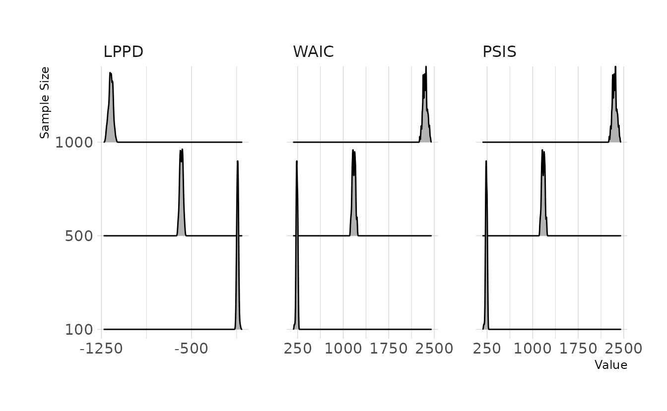
7M4. What happens to the effective number of parameters, as measured by PSIS or WAIC, as a prior becomes more concentrated? Why? Perform some experiments, if you are not sure.
The penalty term of the WAIC, \(p_{\Tiny\text{WAIC}}\) is defined as shown in the WAIC formula. Specifically, the penalty term is sum of the variances of the log probabilities for each observation.
\[ \text{WAIC}(y,\Theta) = -2\Big(\text{lppd} - \underbrace{\sum_i \text{var}_{\theta}\log p(y_i | \theta)}_{\text{penalty term}}\Big) \]
Smaller variances in log probabilities will results in a lower penalty. If we restrict the prior to become more concentrated, we restrict the plausible range of the parameters. In other words, we restrict the variability in the posterior distribution. As the parameters become more consistent, the log probability of each observation will necessarily become more consistent also. Thus, the penalty term, or effective number of parameters, becomes smaller. We can again confirm with a small simulation.
In this simulation we keep everything constant (i.e., data generation, model), with the exception of the prior for the slope coefficients. We’ll try three different priors: \(\text{Normal}(0, 0.1)\), \(\text{Normal}(0, 1)\), and \(\text{Normal}(0, 10)\). Visualizing the results, we can see that the more constricted prior does indeed result in a smaller penalty or effective number of parameters.
Simulation Code
gen_data <- function(n) {
  tibble(x1 = rnorm(n = n),
         x2 = rnorm(n = n),
         x3 = rnorm(n = n)) %>%
    mutate(y = rnorm(n = n, mean = 0.3 + 0.8 * x1 +
                       0.6 * x2 + 1.2 * x3),
           across(everything(), standardize))
}
fit_model <- function(dat, p_sd) {
  suppressMessages(output <- capture.output(
    mod <- brm(y ~ 1 + x1 + x2 + x3, data = dat,
               family = gaussian,
               prior = c(prior(normal(0, 0.2), class = Intercept),
                         prior_string(glue("normal(0, {p_sd})"), class = "b"),
                         prior(exponential(1), class = sigma)),
               iter = 4000, warmup = 3000, chains = 4, cores = 4, seed = 1234)
  ))

  return(mod)
}
calc_info <- function(model) {
  w <- suppressWarnings(brms::waic(model))
  p <- suppressWarnings(brms::loo(model))

  tibble(p_waic = w$estimates["p_waic", "Estimate"],
         p_loo = p$estimates["p_loo", "Estimate"])
}

prior_sim <- tibble(sample_size = 20,
                    prior_sd = rep(c(0.1, 1, 10), each = 100)) %>%
  mutate(sample_data = map(sample_size, gen_data),
         model = map2(sample_data, prior_sd, fit_model),
         infc = map(model, calc_info)) %>%
  select(-sample_data, -model) %>%
  unnest(infc) %>%
  write_rds(here("fits", "chp7", "b7m4-sim.rds"), compress = "gz")
prior_sim %>%
  pivot_longer(cols = c(p_waic, p_loo)) %>%
  mutate(prior_sd = glue("σ = {prior_sd}"),
         prior_sd = fct_inorder(prior_sd),
         name = factor(name, levels = c("p_waic", "p_loo"),
                       labels = c("p<sub>WAIC</sub>", "p<sub>PSIS</sub>"))) %>%
  ggplot(aes(x = value, y = prior_sd, height = stat(density))) +
  facet_wrap(~name, nrow = 1) +
  geom_density_ridges(stat = "binline", bins = 20) +
  labs(x = "Effective Parameters", y = "Prior") +
  theme(axis.text.y = element_markdown())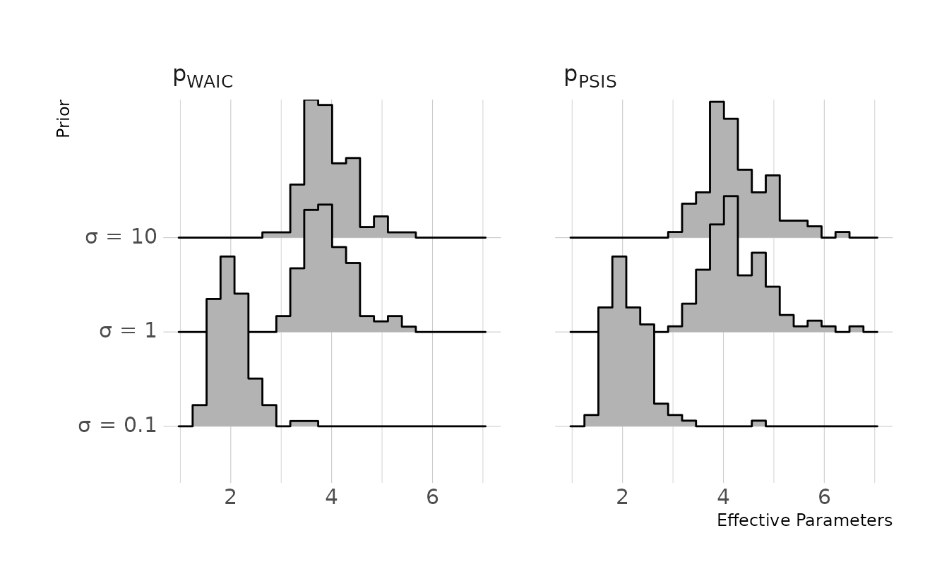
7M5. Provide an informal explanation of why informative priors reduce overfitting.
Informative priors restrict the plausible values for parameters. By using informative priors, we can limit the values of parameters to values that are reasonable, given our scientific knowledge. Thus, we can keep the model from learning too much from our specific sample.
7M6. Provide an informal explanation of why overly informative priors result in underfitting.
In contrast to the previous question, making the prior too informative can be too restrictive on the parameter space. This prevents our model from learning enough from our sample. We basically just get our prior distributions back, without learning anything from the data that could help make future predictions.
7H1. In 2007, The Wall Street Journal published an editorial (“We’re Number One, Alas”) with a graph of corportate tax rates in 29 countries plotted against tax revenue. A badly fit curve was drawn in (reconstructed at right), seemingly by hand, to make the argument that the relationship between tax rate and tax revenue increases and then declines, such that higher tax rates can actually produce less tax revenue. I want you to actually fit a curve to these data, found in
data(Laffer). Consider models that use tax rate to predict tax revenue. Compare, using WAIC or PSIS, a straight-line model to any curved models you like. What do you conclude about the relationship between tax rate and tax revenue.
First, let’s standardize the data and fit a straight line, a quadratic line, and a spline model.
data(Laffer)

laf_dat <- Laffer %>%
  mutate(across(everything(), standardize),
         tax_rate2 = tax_rate ^ 2)

laf_line <- brm(tax_revenue ~ 1 + tax_rate, data = laf_dat, family = gaussian,
                prior = c(prior(normal(0, 0.2), class = Intercept),
                          prior(normal(0, 0.5), class = b),
                          prior(exponential(1), class = sigma)),
                iter = 4000, warmup = 2000, chains = 4, cores = 4, seed = 1234,
                file = here("fits", "chp7", "b7h1-line.rds"))

laf_quad <- brm(tax_revenue ~ 1 + tax_rate + tax_rate2, data = laf_dat,
                family = gaussian,
                prior = c(prior(normal(0, 0.2), class = Intercept),
                          prior(normal(0, 0.5), class = b),
                          prior(exponential(1), class = sigma)),
                iter = 4000, warmup = 2000, chains = 4, cores = 4, seed = 1234,
                file = here("fits", "chp7", "b7h1-quad.rds"))

laf_spln <- brm(tax_revenue ~ 1 + s(tax_rate, bs = "bs"), data = laf_dat,
                family = gaussian,
                prior = c(prior(normal(0, 0.2), class = Intercept),
                          prior(normal(0, 0.5), class = b),
                          prior(normal(0, 0.5), class = sds),
                          prior(exponential(1), class = sigma)),
                iter = 4000, warmup = 2000, chains = 4, cores = 4, seed = 1234,
                control = list(adapt_delta = 0.95),
                file = here("fits", "chp7", "bh71-spln.rds"))
Let’s visualize the models:
Code to reproduce
tr_seq <- tibble(tax_rate = seq(0, 40, length.out = 100)) %>%
  mutate(tax_rate = (tax_rate - mean(Laffer$tax_rate)) / sd(Laffer$tax_rate),
         tax_rate2 = tax_rate ^ 2)

predictions <- bind_rows(
  predicted_draws(laf_line, newdata = tr_seq) %>%
    median_qi(.width = 0.89) %>%
    mutate(type = "Linear"),
  predicted_draws(laf_quad, newdata = tr_seq) %>%
    median_qi(.width = 0.89) %>%
    mutate(type = "Quadratic"),
  predicted_draws(laf_spln, newdata = tr_seq) %>%
    median_qi(.width = 0.89) %>%
    mutate(type = "Spline")
)

fits <- bind_rows(
  epred_draws(laf_line, newdata = tr_seq) %>%
    median_qi(.width = c(0.67, 0.89, 0.97)) %>%
    mutate(type = "Linear"),
  epred_draws(laf_quad, newdata = tr_seq) %>%
    median_qi(.width = c(0.67, 0.89, 0.97)) %>%
    mutate(type = "Quadratic"),
  epred_draws(laf_spln, newdata = tr_seq) %>%
    median_qi(.width = c(0.67, 0.89, 0.97)) %>%
    mutate(type = "Spline")
)

ggplot() +
  facet_wrap(~type, nrow = 1) +
  geom_ribbon(data = predictions,
              aes(x = tax_rate, ymin = .lower, ymax = .upper),
              alpha = 0.2) +
  geom_lineribbon(data = fits,
                  aes(x = tax_rate, y = .epred, ymin = .lower, ymax = .upper),
                  size = 0.6) +
  geom_point(data = laf_dat, aes(x = tax_rate, y = tax_revenue),
             alpha = 0.5) +
  scale_fill_manual(values = ramp_blue(seq(0.9, 0.1, length.out = 3)),
                    breaks = c(0.67, 0.89, 0.97)) +
  labs(x = "Standardized Tax Rate", y = "Standardized Tax Revenue",
       fill = "Interval")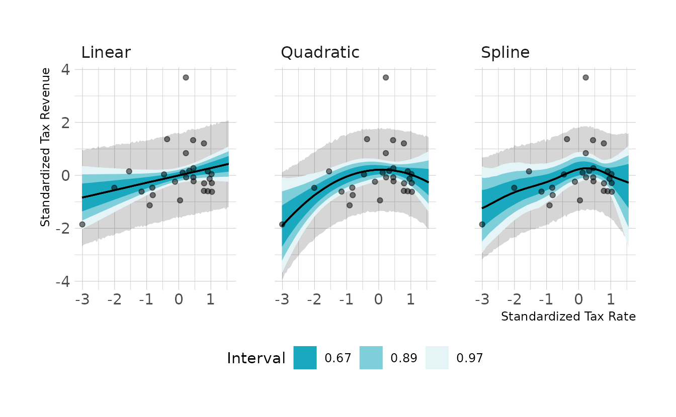
They all look pretty similar, but the quadratic and spline models do show a slight curve. Next, we can look at the PSIS (called LOO in {brms} and {rstan}) and WAIC comparisons. Neither the PSIS or WAIC is really able to differentiate the models in a meaningful way. However, it should be noted that both the PSIS and WAIC have Pareto or penalty values that are exceptionally large, which could make the criteria unreliable.
library(loo)

laf_line <- add_criterion(laf_line, criterion = c("loo", "waic"))
laf_quad <- add_criterion(laf_quad, criterion = c("loo", "waic"))
laf_spln <- add_criterion(laf_spln, criterion = c("loo", "waic"))

loo_compare(laf_line, laf_quad, laf_spln, criterion = "waic")
#>          elpd_diff se_diff
#> laf_quad  0.0       0.0
#> laf_spln -0.1       0.6
#> laf_line -0.9       0.9
loo_compare(laf_line, laf_quad, laf_spln, criterion = "loo")
#>          elpd_diff se_diff
#> laf_spln  0.0       0.0
#> laf_quad  0.0       0.7
#> laf_line -0.8       0.9
7H2. In the
Lafferdata, there is one country with a high tax revenue that is an outlier. Use PSIS and WAIC to measure the importance of this outlier in the models you fit in the previous problem. Then use robust regression with a Student’s t distribution to revist the curve fitting problem. How much does a curved relationship depend upon the outlier point.
Because I used brms::brm() to estimate the models, we can’t use the convenience functions to get the pointwise values for the PSIS and WAIC that are available in the {rethinking} package. So I’ll write my own, called criteria_influence(). When we plot the Pareto k and \(p_{\Tiny\text{WAIC}}\) values, we see that observation 12 is problematic in all three models.
library(gghighlight)

criteria_influence <- function(mod) {
  tibble(pareto_k = mod$criteria$loo$diagnostics$pareto_k,
         p_waic = mod$criteria$waic$pointwise[, "p_waic"]) %>%
    rowid_to_column(var = "obs")
}

influ <- bind_rows(
  criteria_influence(laf_line) %>%
    mutate(type = "Linear"),
  criteria_influence(laf_quad) %>%
    mutate(type = "Quadratic"),
  criteria_influence(laf_spln) %>%
    mutate(type = "Spline")
)

ggplot(influ, aes(x = pareto_k, y = p_waic)) +
  facet_wrap(~type, nrow = 1) +
  geom_vline(xintercept = 0.7, linetype = "dashed") +
  geom_hline(yintercept = 0.4, linetype = "dashed") +
  geom_point() +
  gghighlight(pareto_k > 0.7 | p_waic > 0.4, n = 1, label_key = obs,
              label_params = list(size = 3)) +
  labs(x = "Pareto *k*", y = "p<sub>WAIC</sub>")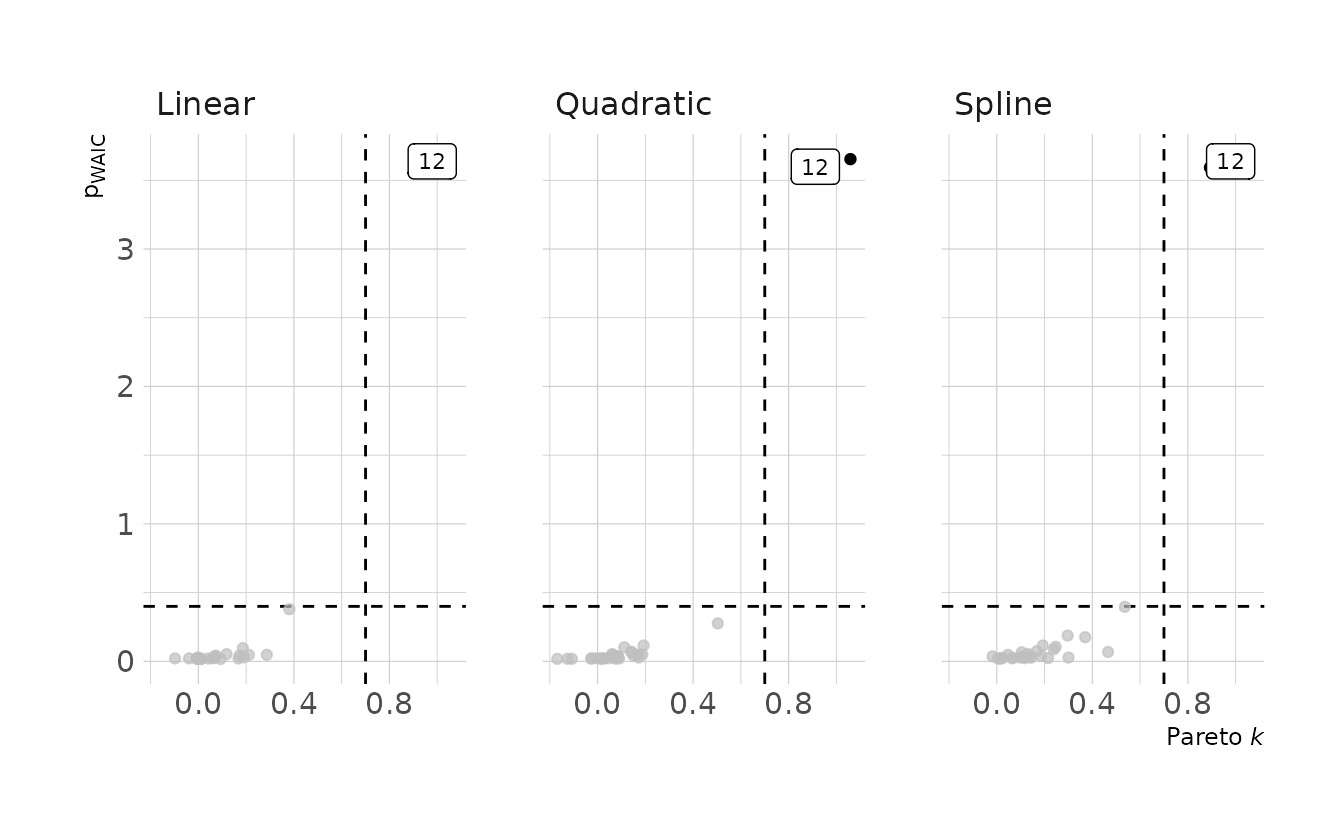
Let’s refit the model using a Student’s t distribution to put larger tails on our outcome distribution, and then visualize our new models.
laf_line2 <- brm(bf(tax_revenue ~ 1 + tax_rate, nu = 1),
                 data = laf_dat, family = student,
                 prior = c(prior(normal(0, 0.2), class = Intercept),
                           prior(normal(0, 0.5), class = b),
                           prior(exponential(1), class = sigma)),
                 iter = 4000, warmup = 2000, chains = 4, cores = 4, seed = 1234,
                 file = here("fits", "chp7", "b7h2-line.rds"))

laf_quad2 <- brm(bf(tax_revenue ~ 1 + tax_rate + tax_rate2, nu = 1),
                 data = laf_dat, family = student,
                 prior = c(prior(normal(0, 0.2), class = Intercept),
                           prior(normal(0, 0.5), class = b),
                           prior(exponential(1), class = sigma)),
                 iter = 4000, warmup = 2000, chains = 4, cores = 4, seed = 1234,
                 file = here("fits", "chp7", "b7h2-quad.rds"))

laf_spln2 <- brm(bf(tax_revenue ~ 1 + s(tax_rate, bs = "bs"), nu = 1),
                 data = laf_dat, family = student,
                 prior = c(prior(normal(0, 0.2), class = Intercept),
                           prior(normal(0, 0.5), class = b),
                           prior(normal(0, 0.5), class = sds),
                           prior(exponential(1), class = sigma)),
                 iter = 4000, warmup = 2000, chains = 4, cores = 4, seed = 1234,
                 control = list(adapt_delta = 0.99),
                 file = here("fits", "chp7", "bh72-spln.rds"))
Code to reproduce
predictions <- bind_rows(
  predicted_draws(laf_line2, newdata = tr_seq) %>%
    median_qi(.width = 0.89) %>%
    mutate(type = "Linear"),
  predicted_draws(laf_quad2, newdata = tr_seq) %>%
    median_qi(.width = 0.89) %>%
    mutate(type = "Quadratic"),
  predicted_draws(laf_spln2, newdata = tr_seq) %>%
    median_qi(.width = 0.89) %>%
    mutate(type = "Spline")
)

fits <- bind_rows(
  epred_draws(laf_line2, newdata = tr_seq) %>%
    median_qi(.width = c(0.67, 0.89, 0.97)) %>%
    mutate(type = "Linear"),
  epred_draws(laf_quad2, newdata = tr_seq) %>%
    median_qi(.width = c(0.67, 0.89, 0.97)) %>%
    mutate(type = "Quadratic"),
  epred_draws(laf_spln2, newdata = tr_seq) %>%
    median_qi(.width = c(0.67, 0.89, 0.97)) %>%
    mutate(type = "Spline")
)

ggplot() +
  facet_wrap(~type, nrow = 1) +
  geom_ribbon(data = predictions,
              aes(x = tax_rate, ymin = .lower, ymax = .upper),
              alpha = 0.2) +
  geom_lineribbon(data = fits,
                  aes(x = tax_rate, y = .epred, ymin = .lower, ymax = .upper),
                  size = 0.6) +
  geom_point(data = laf_dat, aes(x = tax_rate, y = tax_revenue),
             alpha = 0.5) +
  scale_fill_manual(values = ramp_blue(seq(0.9, 0.1, length.out = 3)),
                    breaks = c(0.67, 0.89, 0.97)) +
  labs(x = "Standardized Tax Rate", y = "Standardized Tax Revenue",
       fill = "Interval")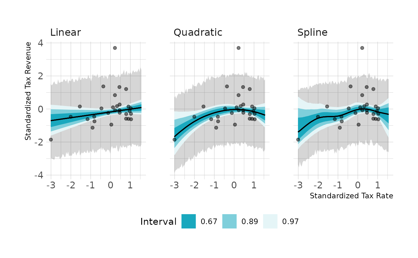
The prediction intervals are a little bit narrower, which makes sense as the predictions are no longer being as influenced by the outlier. When we look at the new PSIS and WAIC estimates, we are no longer getting warning messages about large Pareto k values; however, we do still see warnings about large \(p_{\Tiny\text{WAIC}}\) values. The comparisons also tell the same story as before, with no distinguishable differences between the models.
laf_line2 <- add_criterion(laf_line2, criterion = c("loo", "waic"))
laf_quad2 <- add_criterion(laf_quad2, criterion = c("loo", "waic"))
laf_spln2 <- add_criterion(laf_spln2, criterion = c("loo", "waic"))

loo_compare(laf_line2, laf_quad2, laf_spln2, criterion = "waic")
#>           elpd_diff se_diff
#> laf_quad2  0.0       0.0
#> laf_spln2 -0.3       1.3
#> laf_line2 -1.1       1.7
loo_compare(laf_line2, laf_quad2, laf_spln2, criterion = "loo")
#>           elpd_diff se_diff
#> laf_quad2  0.0       0.0
#> laf_spln2 -0.2       1.2
#> laf_line2 -1.1       1.7
7H3. Consider three fictional Polynesian islands. On each there is a Royal Ornithologist charged by the king with surveying the bird population. They have each found the following proportions of 5 important bird species:
| Species A | Species B | Species C | Species D | Species E | |
|---|---|---|---|---|---|
| Island 1 | 0.200 | 0.200 | 0.200 | 0.200 | 0.200 |
| Island 2 | 0.800 | 0.100 | 0.050 | 0.025 | 0.025 |
| Island 3 | 0.050 | 0.150 | 0.700 | 0.050 | 0.050 |
Notice that each row sums to 1, all the birds. This problem has two parts. It is not computationally complicated. But it is conceptually tricky. First, compute the entropy of each island’s bird distribution. Interpret these entropy values. Second, use each island’s bird distribution to predict the other two. This means to compute the KL divergence of each island from the others, treating each island as if it were a statistical model of the other islands. You should end up with 6 different KL divergence values. Which island predicts the others best? Why?
First, lets compute the entropy for each each island.
islands <- tibble(island = paste("Island", 1:3),
       a = c(0.2, 0.8, 0.05),
       b = c(0.2, 0.1, 0.15),
       c = c(0.2, 0.05, 0.7),
       d = c(0.2, 0.025, 0.05),
       e = c(0.2, 0.025, 0.05)) %>%
  pivot_longer(-island, names_to = "species", values_to = "prop")

islands %>%
  group_by(island) %>%
  summarize(prop = list(prop), .groups = "drop") %>%
  mutate(entropy = map_dbl(prop, calc_entropy))
#> # A tibble: 3 × 3
#>   island   prop      entropy
#>   <chr>    <list>      <dbl>
#> 1 Island 1 <dbl [5]>   1.61
#> 2 Island 2 <dbl [5]>   0.743
#> 3 Island 3 <dbl [5]>   0.984
The first island has the highest entropy. This is expected, because it has the most even distribution of bird species. All species are equally likely, so the observation of any one species is not surprising. In contrast, Island 2 has the lowest entropy. This is because the vast majority of birds on this island are Species A. Therefore, observing a bird that is not from Species A would be surprising.
For the second part of the question, we need to compute the KL divergence for each pair of islands. The KL divergence is defined as:
\[ D_{KL} = \sum_i p_i(\log(p_i) - \log(q_i)) \]
We’ll write a function to do this calculation.
Now, let’s calculate \(D_{KL}\) for each set of islands.
crossing(model = paste("Island", 1:3),
         predicts = paste("Island", 1:3)) %>%
  filter(model != predicts) %>%
  left_join(islands, by = c("model" = "island")) %>%
  rename(model_prop = prop) %>%
  left_join(islands, by = c("predicts" = "island", "species")) %>%
  rename(predict_prop = prop) %>%
  group_by(model, predicts) %>%
  summarize(q = list(model_prop),
            p = list(predict_prop),
            .groups = "drop") %>%
  mutate(kl_distance = map2_dbl(p, q, d_kl))
#> # A tibble: 6 × 5
#>   model    predicts q         p         kl_distance
#>   <chr>    <chr>    <list>    <list>          <dbl>
#> 1 Island 1 Island 2 <dbl [5]> <dbl [5]>       0.866
#> 2 Island 1 Island 3 <dbl [5]> <dbl [5]>       0.626
#> 3 Island 2 Island 1 <dbl [5]> <dbl [5]>       0.970
#> 4 Island 2 Island 3 <dbl [5]> <dbl [5]>       1.84
#> 5 Island 3 Island 1 <dbl [5]> <dbl [5]>       0.639
#> 6 Island 3 Island 2 <dbl [5]> <dbl [5]>       2.01
These results show us that when using Island 1 to predict Island 2, the KL divergence is about 0.87. When we use Island 1 to predict Island 3, the KL divergence is about 0.63, and so on. Overall, the distances are shorter when we used Island 1 as the model. This is because Island 1 has the highest entropy. Thus, we are less surprised by the other islands, so there’s a shorter distance. In contrast, Island 2 and Island 3 have very concentrated distributions, so predicting the other islands leads to more surprises, and therefore greater distances.
7H4. Recall the marriage, age, and happiness collider bias example from Chapter 6. Run models
m6.9andm6.10again (page 178). Compare these two models using WAIC (or PSIS, they will produce identical results). Which model is expected to make better predictions? Which model provides the correct causal inference about the influence of age on happiness? Can you explain why the answers to these two questions disagree?
As a reminder, here is the DAG for this example, where \(H\) is happiness, \(M\) is marriage, and \(A\) is age.
library(dagitty)
library(ggdag)

hma_dag <- dagitty("dag{H -> M <- A}")
coordinates(hma_dag) <- list(x = c(H = 1, M = 2, A = 3),
                             y = c(H = 1, M = 1, A = 1))

ggplot(hma_dag, aes(x = x, y = y, xend = xend, yend = yend)) +
  geom_dag_text(color = "black", size = 10) +
  geom_dag_edges(edge_color = "black", edge_width = 2,
                 arrow_directed = grid::arrow(length = grid::unit(15, "pt"),
                                              type = "closed")) +
  theme_void()
First, let’s regenerate the data and estimate the models.
d <- sim_happiness(seed = 1977, N_years = 1000)
dat <- d %>%
  filter(age > 17) %>%
  mutate(a = (age - 18) / (65 - 18),
         mid = factor(married + 1, labels = c("single", "married")))

b6.9 <- brm(happiness ~ 0 + mid + a, data = dat, family = gaussian,
            prior = c(prior(normal(0, 1), class = b, coef = midmarried),
                      prior(normal(0, 1), class = b, coef = midsingle),
                      prior(normal(0, 2), class = b, coef = a),
                      prior(exponential(1), class = sigma)),
            iter = 4000, warmup = 2000, chains = 4, cores = 4, seed = 1234,
            file = here("fits", "chp7", "b7h4-6.9"))

b6.10 <- brm(happiness ~ 1 + a, data = dat, family = gaussian,
             prior = c(prior(normal(0, 1), class = Intercept),
                       prior(normal(0, 2), class = b, coef = a),
                       prior(exponential(1), class = sigma)),
             iter = 4000, warmup = 2000, chains = 4, cores = 4, seed = 1234,
             file = here("fits", "chp7", "b7h4-6.10"))
For the model comparison we’ll use PSIS.
b6.9 <- add_criterion(b6.9, criterion = "loo")
b6.10 <- add_criterion(b6.10, criterion = "loo")

loo_compare(b6.9, b6.10)
#>       elpd_diff se_diff
#> b6.9     0.0       0.0
#> b6.10 -194.0      17.6
PSIS shows a strong preference for b6.9, which is the model that includes both age and marriage status. However, b6.10 provides the correct causal inference, as no additional conditioning is needed.
adjustmentSets(hma_dag, exposure = "A", outcome = "H")
#>  {}
The reason is that in this model, marital status is a collider. Adding this variable to the model add a real statistical association between happiness and age, which improves the predictions that are made. However, the association is not causal, so intervening on age (if that were possible), would not actually change happiness. Therefore it’s important to consider the causal implications of your model before selecting one based on PSIS or WAIC alone.
7H5. Revisit the urban fox data,
data(foxes), from the previous chapter’s practice problems. Use WAIC or PSIS based model comparison on five different models, each usingweightas the outcome, and containing these sets of predictor variables:
avgfood + groupsize + area
avgfood + groupsize
groupsize + area
avgfood
area
Can you explain the relative differences in WAIC scores, using the fox DAG from the previous chapter? Be sure to pay attention to the standard error of the score differences (
dSE).
First, let’s estimate the five models.
data(foxes)

fox_dat <- foxes %>%
  as_tibble() %>%
  select(area, avgfood, weight, groupsize) %>%
  mutate(across(everything(), standardize))

b7h5_1 <- brm(weight ~ 1 + avgfood + groupsize + area, data = fox_dat,
              family = gaussian,
              prior = c(prior(normal(0, 0.2), class = Intercept),
                        prior(normal(0, 0.5), class = b),
                        prior(exponential(1), class = sigma)),
              iter = 4000, warmup = 2000, chains = 4, cores = 4, seed = 1234,
              file = here("fits", "chp7", "b7h5_1"))

b7h5_2 <- brm(weight ~ 1 + avgfood + groupsize, data = fox_dat,
              family = gaussian,
              prior = c(prior(normal(0, 0.2), class = Intercept),
                        prior(normal(0, 0.5), class = b),
                        prior(exponential(1), class = sigma)),
              iter = 4000, warmup = 2000, chains = 4, cores = 4, seed = 1234,
              file = here("fits", "chp7", "b7h5_2"))

b7h5_3 <- brm(weight ~ 1 + groupsize + area, data = fox_dat,
              family = gaussian,
              prior = c(prior(normal(0, 0.2), class = Intercept),
                        prior(normal(0, 0.5), class = b),
                        prior(exponential(1), class = sigma)),
              iter = 4000, warmup = 2000, chains = 4, cores = 4, seed = 1234,
              file = here("fits", "chp7", "b7h5_3"))

b7h5_4 <- brm(weight ~ 1 + avgfood, data = fox_dat,
              family = gaussian,
              prior = c(prior(normal(0, 0.2), class = Intercept),
                        prior(normal(0, 0.5), class = b),
                        prior(exponential(1), class = sigma)),
              iter = 4000, warmup = 2000, chains = 4, cores = 4, seed = 1234,
              file = here("fits", "chp7", "b7h5_4"))

b7h5_5 <- brm(weight ~ 1 + area, data = fox_dat,
              family = gaussian,
              prior = c(prior(normal(0, 0.2), class = Intercept),
                        prior(normal(0, 0.5), class = b),
                        prior(exponential(1), class = sigma)),
              iter = 4000, warmup = 2000, chains = 4, cores = 4, seed = 1234,
              file = here("fits", "chp7", "b7h5_5"))
Then we can calculate the WAIC for each model and the model comparisons.
b7h5_1 <- add_criterion(b7h5_1, criterion = "waic")
b7h5_2 <- add_criterion(b7h5_2, criterion = "waic")
b7h5_3 <- add_criterion(b7h5_3, criterion = "waic")
b7h5_4 <- add_criterion(b7h5_4, criterion = "waic")
b7h5_5 <- add_criterion(b7h5_5, criterion = "waic")

comp <- loo_compare(b7h5_1, b7h5_2, b7h5_3, b7h5_4, b7h5_5, criterion = "waic")
comp
#>        elpd_diff se_diff
#> b7h5_1  0.0       0.0
#> b7h5_3 -0.4       1.4
#> b7h5_2 -0.4       1.7
#> b7h5_4 -5.2       3.4
#> b7h5_5 -5.3       3.4
In general, the models don’t appear all that different from each other. However, there does seem to be two groups of models: b7h5_1, b7h5_2, and b7h5_3 are all nearly identical; and b7h5_4 and b7h5_5 are nearly identical.
Code to reproduce
plot_comp <- comp %>%
  as_tibble(rownames = "model") %>%
  mutate(across(-model, as.numeric),
         model = fct_inorder(model))

waic_val <- plot_comp %>%
  select(model, waic, se = se_waic) %>%
  mutate(lb = waic - se,
         ub = waic + se)

diff_val <- plot_comp %>%
  select(model, waic, se = se_diff) %>%
  mutate(se = se * 2) %>%
  mutate(lb = waic - se,
         ub = waic + se) %>%
  filter(se != 0)

ggplot() +
  geom_pointrange(data = waic_val, mapping = aes(x = waic, xmin = lb, xmax = ub,
                                                 y = fct_rev(model))) +
  geom_pointrange(data = diff_val, mapping = aes(x = waic, xmin = lb, xmax = ub,
                                                 y = fct_rev(model)),
                  position = position_nudge(y = 0.2), shape = 2,
                  color = "#009FB7") +
  labs(x = "Deviance", y = NULL)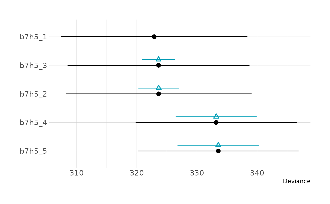
To understand why this is, we can return to the DAG for this example.
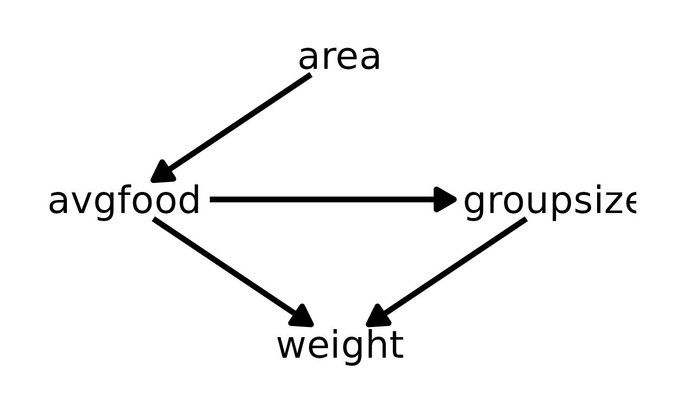
The first three models (b7h5_1, b7h5_2, and b7h5_3) all contain groupsize and one or both of area and avgfood. The reason these models is the same is that there are no back-door path from area or avgfood to weight. In other words, the effect of area adjusting for groupsize is the same as the effect of avgfood adjusting for groupsize, because the effect of area is routed entirely through avgfood.
Similarly, the last two models (b7h5_4 and b7h5_5) are also nearly identical because of the relationship of area to avgfood. Because the effect of area is routed entirely through avgfood, including only avgfood or area should result in the same inferences.
4.2.2 Chapter 8
8E1. For each of the causal relationships below, name a hypothetical third variable that would lead to an interaction effect.
- Bread dough rises because of yeast.
- Education leads to higher income.
- Gasoline makes a car go.
For the first, the amount of heat can moderate the relationship between yeast and the amount the dough rises. In the second example, ethnicity may give rise to an interaction, as individuals of some races face more systemic challenges (i.e., it’s easier for white people with low education to get a job than people of color). Thus, education may have more of an effect for minorities. Finally, a car also requires wheels. Wheels with no gas and gas with no wheels both prevent the car from moving; only with both will the car go.
8E2. Which of the following explanations invokes an interaction?
- Caramelizing onions requires cooking over low heat and making sure the onions do not dry out.
- A car will go faster when it has more cylinders or when it has better fuel injector.
- Most people acquire their political beliefs from their parents, unless they get them instead from their friends.
- Intelligent animal species tend to be either highly social or have manipulative appendages (hands, tentacles, etc.).
The first example is the only one that is, strictly speaking, an interaction. That is, low heat leads to camelization, conditional on the onions not drying out. In the second statement, it is phrased such that either more cylinders or a better fuel injector will result in faster speed. For number three, this is again phrased as an “or.” People acquire beliefs from their parents or their friends. As written, there is nothing to indicate that the influence of the parents’ beliefs depends on the influence of the friends’ beliefs (or vice versa). Finally, the last statement is also phrased as an “or.” There is no indicate that the influence of one factor impacts the influence of the other.
8E3. For each of the explanations in 8E2, write a linear model that expresses the stated relationship.
For onion caramelization, the mathematical model is:
\[ \begin{align} C_i &\sim \text{Normal}(\mu_i, \sigma) \\ \mu_i &= \alpha + \beta_HH_i + \beta_MM_i + \beta_{HM}H_iM_i \end{align} \]
The mathematical model for car speed is very similar:
\[ \begin{align} S_i &\sim \text{Normal}(\mu_i, \sigma) \\ \mu_i &= \alpha + \beta_CC_i + \beta_FF_i \end{align} \]
There is a similar model for political beliefs:
\[ \begin{align} B_i &\sim \text{Normal}(\mu_i, \sigma) \\ \mu_i &= \alpha + \beta_PP_i + \beta_FF_i \end{align} \]
And finally the model for intelligence:
\[ \begin{align} I_i &\sim \text{Normal}(\mu_i, \sigma) \\ \mu_i &= \alpha + \beta_SS_i + \beta_MM_i \end{align} \]
8M1. Recall the tulips example from the chapter. Suppose another set of treatments adjusted the temperature in the greenhouse over two levels: cold and hot. The data in the chapter were collected at the cold temperature. You find none of the plants grown under the hot temperature developed any blooms at all, regardless of the water and shade levels. Can you explain this result in terms of interactions between water, shade, and temperature?
In the chapter example, we saw that at cool temperatures, the blooms were best predicted by water, shade, and their interaction. Here, we learn that neither water nor light matter at a high temperature. This implies a three-way interaction. Just as in the chapter where water had no effect when there was no light, we see that neither water nor light have an effect when temperature is high.
8M2. Can you invent a regression equation that would make the bloom size zero, whenever the temperature is hot?
For this model, we can use the interaction model from the chapter with an additional predictor (\(C\)) that is 0 when the temperature is hot and 1 when the temperature is cold.
\[ \begin{align} B_i &\sim \text{Normal}(\mu_i, \sigma) \\ \mu_i &= C_i \times (\alpha + \beta_WW_i + \beta_SS_i + \beta_{WS}W_iS_i) \end{align} \]
8M3. In parts of North America, ravens depend upon wolves for their food. This is because ravens are carnivorous but cannot usually kill or open carcasses of prey. Wolves however can and do kill and tear open animals, and they tolerate ravens co-feeding at their kills. This species relationship is generally described as a “species interaction.” Can you invent a hypothetical set of data on raven population size in which this relationship would manifest as a statistical interaction? Do you think the biological interaction could be linear? Why or why not?
In order to predict raven population size based on wolf population size, we should include data on the territory area for the wolves, the number of wolves, and amount of food available, and finally the number of ravens. This is similar to the types of data included in data(foxes). I would expect the relationship to be non-linear. When there are no wolves, I would expect there to be no ravens. As the number of wolves increases, the number of ravens would also increase. However, eventually the number of wolves would increase to the point that the wolves exhaust the food supply, leaving no food left for the ravens, at which point the raven population would begin to shrink. Thus, if we created a counter factual plot with wolves on the x-axis and ravens on the y-axis, I would expect to see at linear trend at first, but then the raven population level off or drop when there is a large numbers of wolves.
8M4. Repeat the tulips analysis, but this time use priors that constrain the effect of water to be positive and the effect of shade to be negative. Use prior predictive simulation. What do these prior asumptions mean for the interaction prior, if anything?
There are a few issues constraining different coefficients with bounded parameters (especially negative parameters) in {brms}. For some details, see this thread on the Stan discourse. To get around this, rather than constrain the shade parameter to be negative, we’ll create a new variable which is the opposite of shade, light and the corresponding light_cent. We can then constrain this parameter to be positive, just as the water_cent parameter is constrained to be positive. Finally, because of the new light variable the positivity constraints on the main effects, we also want to constrain the interaction term to be positive. That is, if both water and light increase, we expect an additional additive effect.
library(rethinking)
data("tulips")

tulip_dat <- tulips %>%
  as_tibble() %>%
  mutate(light = -1 * shade,
         blooms_std = blooms / max(blooms),
         water_cent = water - mean(water),
         shade_cent = shade - mean(shade),
         light_cent = light - mean(light))

b8m4 <- brm(blooms_std ~ 1 + water_cent + light_cent + water_cent:light_cent,
            data = tulip_dat, family = gaussian,
            prior = c(prior(normal(0.5, 0.25), class = Intercept),
                      prior(normal(0, 0.25), class = b, lb = 0),
                      prior(exponential(1), class = sigma)),
            iter = 4000, warmup = 2000, chains = 4, cores = 4, seed = 1234,
            file = here("fits", "chp8", "b8m4"))

summary(b8m4)
#>  Family: gaussian
#>   Links: mu = identity; sigma = identity
#> Formula: blooms_std ~ 1 + water_cent + light_cent + water_cent:light_cent
#>    Data: tulip_dat (Number of observations: 27)
#>   Draws: 4 chains, each with iter = 2000; warmup = 0; thin = 1;
#>          total post-warmup draws = 8000
#>
#> Population-Level Effects:
#>                       Estimate Est.Error l-95% CI u-95% CI Rhat Bulk_ESS
#> Intercept                 0.36      0.03     0.30     0.41 1.00     7951
#> water_cent                0.21      0.03     0.14     0.27 1.00     7826
#> light_cent                0.11      0.03     0.04     0.18 1.00     5064
#> water_cent:light_cent     0.14      0.04     0.06     0.22 1.00     7552
#>                       Tail_ESS
#> Intercept                 5632
#> water_cent                4256
#> light_cent                2627
#> water_cent:light_cent     3884
#>
#> Family Specific Parameters:
#>       Estimate Est.Error l-95% CI u-95% CI Rhat Bulk_ESS Tail_ESS
#> sigma     0.14      0.02     0.11     0.20 1.00     5469     5185
#>
#> Draws were sampled using sample(hmc). For each parameter, Bulk_ESS
#> and Tail_ESS are effective sample size measures, and Rhat is the potential
#> scale reduction factor on split chains (at convergence, Rhat = 1).
Looking at the the posterior predicted blooms, the results are very similar to what we saw in Figure 8.7 from the text. This indicates that the prior constraints did not have a large effect on the predicted values.
new_tulip <- crossing(water_cent = -1:1,
                      light_cent = -1:1)

points <- tulip_dat %>%
  expand(nesting(water_cent, light_cent, blooms_std)) %>%
  mutate(light_grid = glue("light_cent = {light_cent}"))

to_string <- as_labeller(c(`-1` = "Light = -1", `0` = "Light = 0",
                           `1` = "Light = 1"))

new_tulip %>%
  add_epred_draws(b8m4, ndraws = 50) %>%
  ungroup() %>%
  ggplot(aes(x = water_cent, y = .epred)) +
  facet_wrap(~light_cent, nrow = 1,
             labeller = to_string) +
  geom_line(aes(group = .draw), alpha = 0.4) +
  geom_point(data = points, aes(y = blooms_std), color = "#009FB7") +
  scale_x_continuous(breaks = -1:1) +
  labs(x = "Water (centered)", y = "Blooms (standardized)")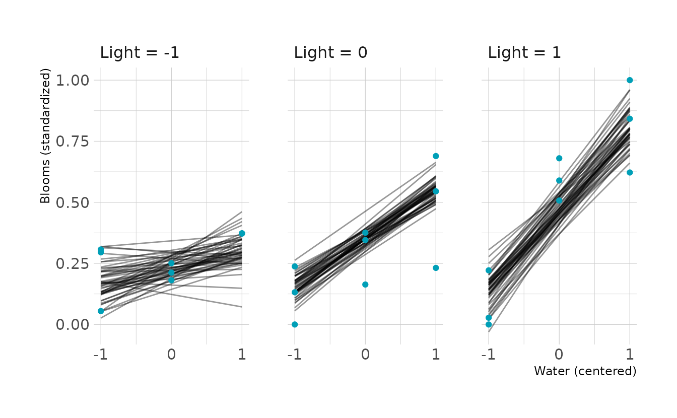
Finally, let’s look at the prior predictive simulation for this model. Overall the priors might be a little too uninformative, especially for the interaction. The interaction has the most impact in the far right panel of the below figure, and there are many lines that exceed the expected boundaries in this panel.
b8m4p <- update(b8m4, sample_prior = "only",
                iter = 4000, warmup = 2000, chains = 4, cores = 4, seed = 1234,
                file = here("fits", "chp8", "b8m4p.rds"))
#> The desired updates require recompiling the model

new_tulip %>%
  add_epred_draws(b8m4p, ndraws = 50) %>%
  ungroup() %>%
  ggplot(aes(x = water_cent, y = .epred)) +
  facet_wrap(~light_cent, nrow = 1,
             labeller = to_string) +
  geom_line(aes(group = .draw), alpha = 0.3) +
  geom_hline(yintercept = c(0, 1), linetype = "dashed") +
  scale_x_continuous(breaks = -1:1) +
  labs(x = "Water (centered)", y = "Blooms (standardized)")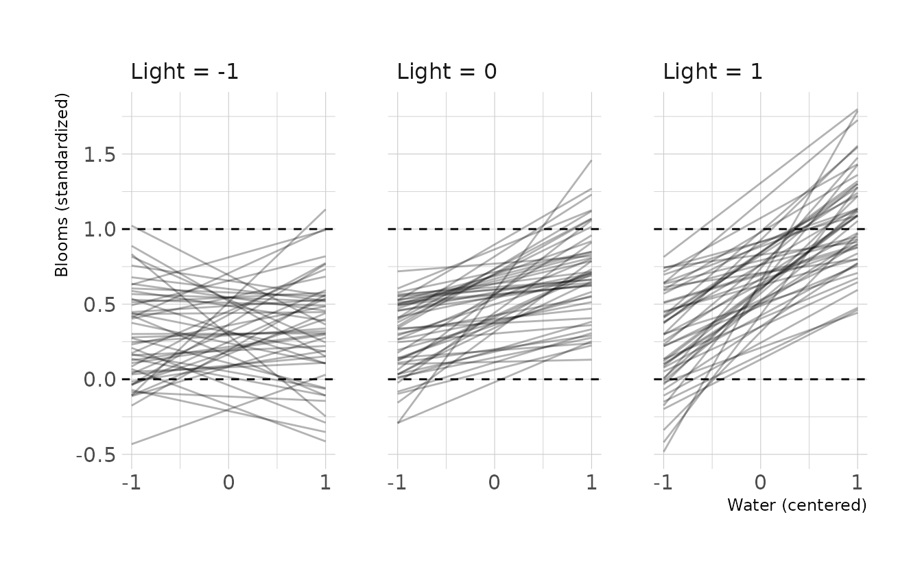
8H1. Return to the
data(tulips)example in the chapter. Now include thebedvariable as a predictor in the interaction model. Don’t interactbedwith the other predictors; just include it as a main effect. Note thatbedis categorical. So to use it properly, you will need to either construct dummy variables, or rather an index variable, as explained in Chapter 5.
The bed variable is already a factor variable in the tulips data, so we can just add it to the formula in brm(). To use indicator variables instead of a dummy variable, we remove the separate intercept (i.e., ~ 0 in the formula below). Because of what’s coming in the next question, we’ll use light instead of shade for this model also.
b8h1 <- brm(blooms_std ~ 0 + water_cent + light_cent + bed +
              water_cent:light_cent,
            data = tulip_dat, family = gaussian,
            prior = c(prior(normal(0, 0.25), class = b),
                      prior(exponential(1), class = sigma)),
            iter = 4000, warmup = 2000, chains = 4, cores = 4, seed = 1234,
            file = here("fits", "chp8", "b8h1.rds"))

summary(b8h1)
#>  Family: gaussian
#>   Links: mu = identity; sigma = identity
#> Formula: blooms_std ~ 0 + water_cent + light_cent + bed + water_cent:light_cent
#>    Data: tulip_dat (Number of observations: 27)
#>   Draws: 4 chains, each with iter = 2000; warmup = 0; thin = 1;
#>          total post-warmup draws = 8000
#>
#> Population-Level Effects:
#>                       Estimate Est.Error l-95% CI u-95% CI Rhat Bulk_ESS
#> water_cent                0.21      0.03     0.14     0.27 1.00    11367
#> light_cent                0.11      0.03     0.05     0.17 1.00    12221
#> beda                      0.26      0.04     0.17     0.35 1.00    12912
#> bedb                      0.38      0.04     0.29     0.47 1.00    12297
#> bedc                      0.40      0.04     0.31     0.48 1.00    12459
#> water_cent:light_cent     0.14      0.04     0.07     0.22 1.00    12903
#>                       Tail_ESS
#> water_cent                6156
#> light_cent                6045
#> beda                      5953
#> bedb                      5615
#> bedc                      5556
#> water_cent:light_cent     6107
#>
#> Family Specific Parameters:
#>       Estimate Est.Error l-95% CI u-95% CI Rhat Bulk_ESS Tail_ESS
#> sigma     0.13      0.02     0.10     0.18 1.00     6707     5592
#>
#> Draws were sampled using sample(hmc). For each parameter, Bulk_ESS
#> and Tail_ESS are effective sample size measures, and Rhat is the potential
#> scale reduction factor on split chains (at convergence, Rhat = 1).
8H2. Use WAIC to compare the model from 8H1 to a model that omits
bed. What do you infer from this comparison? Can you reconcile the WAIC results with the posterior distribution of thebedcoefficients?
For the comparison, we’ll compare b8h1 to the model b8m4, which is the model from the chapter, with new prior distributions that constrain the main effect of water to be positive and the main effect of shade to be negative (i.e., the main effect of light is positive).
Model b8h1 is the preferred model; however, the standard error of the difference is larger than the magnitude of the difference, indicating that the WAIC is not able to meaningfully differentiate between the two models. For predictive purposes, this means that the inclusion of the bed variable does not significantly improve the model. It should also be noted that both of the models have some exceptionally large penalty values, so these analyses may be unreliable, and we should consider re-fitting the models with a distribution with fatter tails.
b8m4 <- add_criterion(b8m4, criterion = "waic")
b8h1 <- add_criterion(b8h1, criterion = "waic")

loo_compare(b8m4, b8h1, criterion = "waic") %>%
  print(simplify = FALSE)
#>      elpd_diff se_diff elpd_waic se_elpd_waic p_waic se_p_waic waic  se_waic
#> b8h1   0.0       0.0    13.7       3.3          6.2    1.4     -27.3   6.6
#> b8m4  -1.2       3.0    12.5       3.8          4.3    1.1     -24.9   7.6
8H3. Consider again the
data(rugged)data on economic development and terrain ruggedness, examined in this chapter. One of the African countries in that example Seychelles, is far outside the cloud of other nations, being a rare country with both relatively high GDP and high ruggedness. Seychelles is also unusual, in that it is a group of islands far from the coast of mainland Africa, and its main economic activity is tourism.
- Focus on model
m8.5from the chapter. Use WAIC pointwise penalties and PSIS Pareto k values to measure relative influence of each country. By these criteria, is Seychelles influencing the results? Are there other nations that are relatively influential? If so, can you explain why?- Now use robust regression, as described in the previous chapter. Modify
m8.5to se a Student-t distribution with \(\nu = 2\). Does this change the results in a substantial way?
In the text, model m8.5 uses the tulips data, so I’m assuming this is a typo and we should be looking at model m8.3, which is the interaction model from the terrain ruggedness example in the chapter. So, let’s first create a {brms} version of model m8.3.
data("rugged")
rugged_dat <- rugged %>%
  as_tibble() %>%
  select(country, rgdppc_2000, rugged, cont_africa) %>%
  drop_na(rgdppc_2000) %>%
  mutate(log_gdp = log(rgdppc_2000),
         log_gdp_std = log_gdp / mean(log_gdp),
         rugged_std = rugged / max(rugged),
         rugged_std_cent = rugged_std - mean(rugged_std),
         cid = factor(cont_africa, levels = c(1, 0),
                      labels = c("African", "Not African")))

b8h3 <- brm(
  bf(log_gdp_std ~ 0 + a + b * rugged_std_cent,
     a ~ 0 + cid,
     b ~ 0 + cid,
     nl = TRUE),
  data = rugged_dat, family = gaussian,
  prior = c(prior(normal(1, 0.1), class = b, coef = cidAfrican, nlpar = a),
            prior(normal(1, 0.1), class = b, coef = cidNotAfrican, nlpar = a),
            prior(normal(0, 0.3), class = b, coef = cidAfrican, nlpar = b),
            prior(normal(0, 0.3), class = b, coef = cidNotAfrican, nlpar = b),
            prior(exponential(1), class = sigma)),
  iter = 4000, warmup = 2000, chains = 4, cores = 4, seed = 1234,
  file = here("fits", "chp8", "b8h3.rds")
)

b8h3 <- add_criterion(b8h3, criterion = c("loo", "waic"))

summary(b8h3)
#>  Family: gaussian
#>   Links: mu = identity; sigma = identity
#> Formula: log_gdp_std ~ 0 + a + b * rugged_std_cent
#>          a ~ 0 + cid
#>          b ~ 0 + cid
#>    Data: rugged_dat (Number of observations: 170)
#>   Draws: 4 chains, each with iter = 2000; warmup = 0; thin = 1;
#>          total post-warmup draws = 8000
#>
#> Population-Level Effects:
#>                 Estimate Est.Error l-95% CI u-95% CI Rhat Bulk_ESS Tail_ESS
#> a_cidAfrican        0.89      0.02     0.85     0.92 1.00     9876     6334
#> a_cidNotAfrican     1.05      0.01     1.03     1.07 1.00    10083     6572
#> b_cidAfrican        0.13      0.08    -0.02     0.28 1.00     9543     6356
#> b_cidNotAfrican    -0.14      0.05    -0.25    -0.04 1.00     9485     6149
#>
#> Family Specific Parameters:
#>       Estimate Est.Error l-95% CI u-95% CI Rhat Bulk_ESS Tail_ESS
#> sigma     0.11      0.01     0.10     0.12 1.00     8960     6057
#>
#> Draws were sampled using sample(hmc). For each parameter, Bulk_ESS
#> and Tail_ESS are effective sample size measures, and Rhat is the potential
#> scale reduction factor on split chains (at convergence, Rhat = 1).
Now let’s take a look at the Pareto k and \(p_{\Tiny\text{WAIC}}\) values from the model. Seychelles does appear to be influential. The Pareto \(k\) value is not above the above the 0.7 threshold; however, the \(p_{\Tiny\text{WAIC}}\) value is above the 0.4 threshold. No other countries have Pareto k or \(p_{\Tiny\text{WAIC}}\) values over the thresholds.
library(gghighlight)

tibble(pareto_k = b8h3$criteria$loo$diagnostics$pareto_k,
       p_waic = b8h3$criteria$waic$pointwise[, "p_waic"]) %>%
  rowid_to_column(var = "obs") %>%
  left_join(rugged_dat %>%
              select(country) %>%
              rowid_to_column(var = "obs"),
            by = "obs") %>%
  ggplot(aes(x = pareto_k, y = p_waic)) +
  geom_vline(xintercept = 0.7, linetype = "dashed") +
  geom_hline(yintercept = 0.4, linetype = "dashed") +
  geom_point() +
  gghighlight(pareto_k > 0.7 | p_waic > 0.4, n = 1, label_key = country,
              label_params = list(size = 3)) +
  labs(x = "Pareto *k*", y = "p<sub>WAIC</sub>")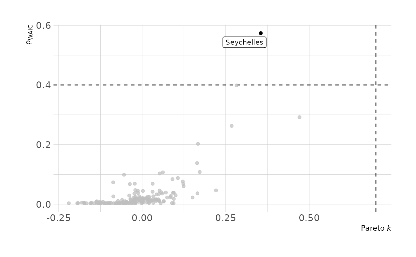
Now for part (b), we’ll use a Student-t distribution with \(\nu = 2\).
b8h3_t <- brm(
  bf(log_gdp_std ~ 0 + a + b * rugged_std_cent,
     a ~ 0 + cid,
     b ~ 0 + cid,
     nu = 2,
     nl = TRUE),
  data = rugged_dat, family = student,
  prior = c(prior(normal(1, 0.1), class = b, coef = cidAfrican, nlpar = a),
            prior(normal(1, 0.1), class = b, coef = cidNotAfrican, nlpar = a),
            prior(normal(0, 0.3), class = b, coef = cidAfrican, nlpar = b),
            prior(normal(0, 0.3), class = b, coef = cidNotAfrican, nlpar = b),
            prior(exponential(1), class = sigma)),
  iter = 4000, warmup = 2000, chains = 4, cores = 4, seed = 1234,
  file = here("fits", "chp8", "b8h3_t.rds")
)

b8h3_t <- add_criterion(b8h3_t, criterion = c("loo", "waic"))
How much does the Student’s t distribution affect our model? Let’s look at the posterior distribution of the difference between African and Non-African countries. In the Student’s t model, the difference actually increased on average. This is because switching the distribution affects all points, not just the high leverage points that were flagged originally. Therefore, it’s not unexpected that the distribution might shift.
n_diff <- spread_draws(b8h3, b_b_cidAfrican, b_b_cidNotAfrican) %>%
mutate(diff = b_b_cidAfrican - b_b_cidNotAfrican)
t_diff <- spread_draws(b8h3_t, b_b_cidAfrican, b_b_cidNotAfrican) %>%
mutate(diff = b_b_cidAfrican - b_b_cidNotAfrican)
ggplot() +
geom_density(data = n_diff, aes(x = diff, fill = "Normal"),
color = NA, alpha = 0.6) +
geom_density(data = t_diff, aes(x = diff, fill = "Student's *t*"),
color = NA, alpha = 0.6) +
scale_fill_manual(values = c("#009FB7", "#FED766")) +
labs(x = "African − Non-African", y = "Density", fill = NULL) +
theme(legend.text = element_markdown())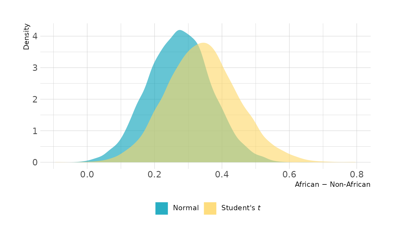
8H4. The values in
data(nettle)are data on language diversity in 74 nations.1 The meaning of each column is given below.
country: Name of the countrynum.lang: Number of recognized languages spokenarea: Area in square kilometersk.pop: Population, in thousandsnum.stations: Number of weather stations that provided data for the next two columnsmean.growing.season: Average length of growing season, in monthssd.growing.season: Standard deviation of length of growing season, in months
Use these data to evaluate the hypothesis that language diversity is partly a product of food security. The notion is that, in productive ecologies, people don’t need large social networks to buffer them against risk of food shortfalls. The means cultural groups can be smaller and more self-sufficient, leading to more languages per capita. Use the number of languages per capita as the outcome:
d$lang.per.cap <- d$num.lang / d$k.popUse the logarithm of this new variable as your regression outcome. (A count model would be better here, but you’ll learn those later, in Chapter 11.) This problem is open ended, allowing you to decide how you address the hypotheses and the uncertain advice the modeling provides. If you think you need to use WAIC anyplace, please do. If you think you need certain priors, argue for them. If you think you need to plot predictions in a certain way, please do. Just try to honestly evaluate the main effects of both
mean.growing.seasonandsd.growing.season, as well as their two-way interaction. Here are three parts to help.
- Evaluate the hypothesis that language diversity, as measured by
log(lang.per.cap), is positively associated with average length of the growing season,mean.growing.season. Considerlog(area)in your regression(s) as a covariate (not an interaction). Interpret your results.
First, let’s calculate some new variables we’ll need for these models. We’ll also go ahead and standardize everything to make setting the priors a little bit easier.
data(nettle)

nettle <- nettle %>%
  as_tibble() %>%
  mutate(lang_per_cap = num.lang / k.pop,
         log_lang_per_cap = log(lang_per_cap),
         log_area = log(area),
         lang_per_cap_std = standardize(log_lang_per_cap),
         area_std = standardize(log_area),
         mean_growing_std = standardize(mean.growing.season),
         sd_growing_std = standardize(sd.growing.season))

nettle
#> # A tibble: 74 × 14
#>    country num.lang   area  k.pop num.stations mean.growing.se… sd.growing.seas…
#>    <fct>      <int>  <int>  <int>        <int>            <dbl>            <dbl>
#>  1 Algeria       18 2.38e6  25660          102             6.6              2.29
#>  2 Angola        42 1.25e6  10303           50             6.22             1.87
#>  3 Austra…      234 7.71e6  17336          134             6                4.17
#>  4 Bangla…       37 1.44e5 118745           20             7.4              0.73
#>  5 Benin         52 1.13e5   4889            7             7.14             0.99
#>  6 Bolivia       38 1.10e6   7612           48             6.92             2.5
#>  7 Botswa…       27 5.82e5   1348           10             4.6              1.69
#>  8 Brazil       209 8.51e6 153322          245             9.71             5.87
#>  9 Burkin…       75 2.74e5   9242            6             5.17             1.07
#> 10 CAR           94 6.23e5   3127           13             8.08             1.21
#> # … with 64 more rows, and 7 more variables: lang_per_cap <dbl>,
#> #   log_lang_per_cap <dbl>, log_area <dbl>, lang_per_cap_std <dbl>,
#> #   area_std <dbl>, mean_growing_std <dbl>, sd_growing_std <dbl>
We’ll start by fitting two models, one with only mean_growing_std as a predictor, and one that also includes area_std. We can then compare the models using PSIS-LOO.
b8h4a_1 <- brm(lang_per_cap_std ~ mean_growing_std,
               data = nettle, family = gaussian,
               prior = c(prior(normal(0, 0.2), class = Intercept),
                         prior(normal(0, 0.5), class = b),
                         prior(exponential(1), class = sigma)),
               iter = 4000, warmup = 2000, chains = 4, cores = 4, seed = 1234,
               file = here("fits", "chp8", "b8h4a_1.rds"))

b8h4a_2 <- brm(lang_per_cap_std ~ mean_growing_std + area_std,
               data = nettle, family = gaussian,
               prior = c(prior(normal(0, 0.2), class = Intercept),
                         prior(normal(0, 0.5), class = b),
                         prior(exponential(1), class = sigma)),
               iter = 4000, warmup = 2000, chains = 4, cores = 4, seed = 1234,
               file = here("fits", "chp8", "b8h4a_2.rds"))

b8h4a_1 <- add_criterion(b8h4a_1, criterion = "loo")
b8h4a_2 <- add_criterion(b8h4a_2, criterion = "loo")

loo_compare(b8h4a_1, b8h4a_2)
#>         elpd_diff se_diff
#> b8h4a_1  0.0       0.0
#> b8h4a_2 -0.1       1.6
We see that the model without area is slightly preferred, but PSIS-LOO isn’t really able to distinguish between the models very well. For the purpose of this exercise, we’ll continue with model b8h4a_2, which includes both predictors. Visualizing the model, we see that, as expected given the model comparisons, area doesn’t appear to have much impact. However, there does appear to be a positive relationship between the the mean growing season and the number of languages.
new_nettle <- crossing(area_std = seq(-4, 4, by = 2),
                       mean_growing_std = seq(-4, 4, by = 1),
                       sd_growing_std = seq(-4, 4, by = 1))

to_string <- as_labeller(c(`-4` = "Area = -4", `-2` = "Area = -2",
                           `0` = "Area = 0",
                           `2` = "Area = 2", `4` = "Area = 4"))

new_nettle %>%
  add_epred_draws(b8h4a_2, ndraws = 1000) %>%
  mean_qi(.width = c(0.67, 0.89, 0.97)) %>%
  ggplot(aes(x = mean_growing_std, y = .epred, ymin = .lower, ymax = .upper)) +
  facet_wrap(~area_std, nrow = 1, labeller = to_string) +
  geom_lineribbon(color = NA) +
  scale_fill_manual(values = ramp_blue(seq(0.9, 0.2, length.out = 3)),
                    breaks = c("0.67", "0.89", "0.97")) +
  labs(x = "Mean Growing Season (standardized)",
       y = "Log Languages per Capita (standardized)",
       fill = "Interval")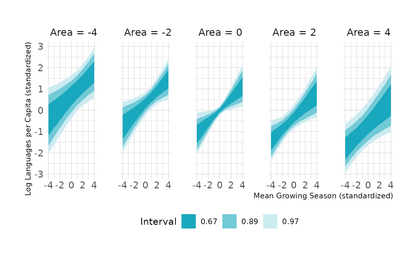
- Now evaluate the hypothesis that language diversity is negatively associated with the standard deviation of length of growing season,
sd.growing.season. This hypothesis follows from uncertainty in harvest favoring social insurance through larger social networks and therefore fewer languages. Again, considerlog(area)as a covariate (not an interaction). Interpret your results.
For the second part, we replace mean_growing_std with sd_growing_std. Again, we’ll fit two models and compare with PSIS-LOO.
b8h4b_1 <- brm(lang_per_cap_std ~ sd_growing_std,
               data = nettle, family = gaussian,
               prior = c(prior(normal(0, 0.2), class = Intercept),
                         prior(normal(0, 0.5), class = b),
                         prior(exponential(1), class = sigma)),
               iter = 4000, warmup = 2000, chains = 4, cores = 4, seed = 1234,
               file = here("fits", "chp8", "b8h4b_1.rds"))

b8h4b_2 <- brm(lang_per_cap_std ~ sd_growing_std + area_std,
               data = nettle, family = gaussian,
               prior = c(prior(normal(0, 0.2), class = Intercept),
                         prior(normal(0, 0.5), class = b),
                         prior(exponential(1), class = sigma)),
               iter = 4000, warmup = 2000, chains = 4, cores = 4, seed = 1234,
               file = here("fits", "chp8", "b8h4b_2.rds"))

b8h4b_1 <- add_criterion(b8h4b_1, criterion = "loo")
b8h4b_2 <- add_criterion(b8h4b_2, criterion = "loo")

loo_compare(b8h4b_1, b8h4b_2)
#>         elpd_diff se_diff
#> b8h4b_1 0.0       0.0
#> b8h4b_2 0.0       1.7
The story here is much the same. PSIS-LOO can’t really differentiate between the two models, indicating that area doesn’t add too much information. This is again reflected in the visualization. We see that the expected distribution of regression lines is fairly similar for all levels of area. Additionally, we do see a negative relationship between the standard deviation of the growing season and the number of languages, as the question suggested.
new_nettle %>%
  add_epred_draws(b8h4b_2, ndraws = 1000) %>%
  mean_qi(.width = c(0.67, 0.89, 0.97)) %>%
  ggplot(aes(x = sd_growing_std, y = .epred, ymin = .lower, ymax = .upper)) +
  facet_wrap(~area_std, nrow = 1, labeller = to_string) +
  geom_lineribbon(color = NA) +
  scale_fill_manual(values = ramp_blue(seq(0.9, 0.2, length.out = 3)),
                    breaks = c("0.67", "0.89", "0.97")) +
  labs(x = "Standard Deviation of Growing Season (standardized)",
       y = "Log Languages per Capita (standardized)",
       fill = "Interval")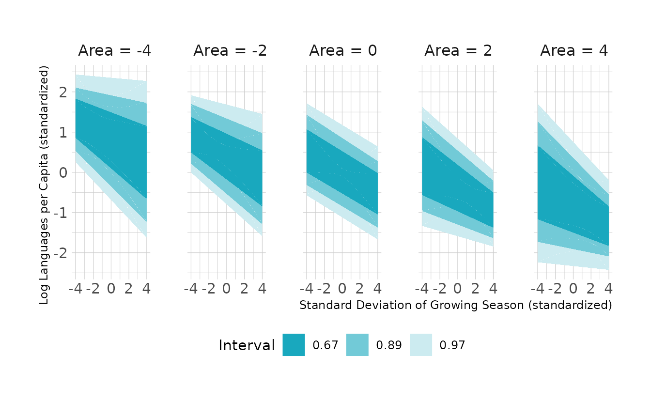
- Finally, evaluate the hypothesis that
mean.growing.seasonandsd.growing.seasoninteract to synergistically reduce language diversity. The idea is that, in nations with longer average growing seasons, high variance makes storage and redistribution even more important than it would be otherwise. That way, people can cooperate to preserve and protect windfalls to be used during the droughts.
In the third part of the question, we are asked to add the interaction term. We’ll drop area since it does not appear to have an effect in either of the previous parts of this question.
b8h4_c <- brm(lang_per_cap_std ~ mean_growing_std * sd_growing_std,
              data = nettle, family = gaussian,
              prior = c(prior(normal(0, 0.2), class = Intercept),
                        prior(normal(0, 0.5), class = b),
                        prior(exponential(1), class = sigma)),
              iter = 4000, warmup = 2000, chains = 4, cores = 4, seed = 1234,
              file = here("fits", "chp8", "b8h4_c.rds"))

summary(b8h4_c)
#>  Family: gaussian
#>   Links: mu = identity; sigma = identity
#> Formula: lang_per_cap_std ~ mean_growing_std * sd_growing_std
#>    Data: nettle (Number of observations: 74)
#>   Draws: 4 chains, each with iter = 2000; warmup = 0; thin = 1;
#>          total post-warmup draws = 8000
#>
#> Population-Level Effects:
#>                                 Estimate Est.Error l-95% CI u-95% CI Rhat
#> Intercept                           0.00      0.09    -0.18     0.19 1.00
#> mean_growing_std                    0.23      0.11     0.01     0.46 1.00
#> sd_growing_std                     -0.23      0.10    -0.43    -0.03 1.00
#> mean_growing_std:sd_growing_std    -0.24      0.11    -0.44    -0.03 1.00
#>                                 Bulk_ESS Tail_ESS
#> Intercept                           8427     5784
#> mean_growing_std                    7513     6080
#> sd_growing_std                      9774     5790
#> mean_growing_std:sd_growing_std     8652     6050
#>
#> Family Specific Parameters:
#>       Estimate Est.Error l-95% CI u-95% CI Rhat Bulk_ESS Tail_ESS
#> sigma     0.89      0.08     0.75     1.06 1.00     7972     5945
#>
#> Draws were sampled using sample(hmc). For each parameter, Bulk_ESS
#> and Tail_ESS are effective sample size measures, and Rhat is the potential
#> scale reduction factor on split chains (at convergence, Rhat = 1).
We see that the interaction is negative. What this means can be seen by visualizing the interaction from both directions. This is shown in the following image. In the top row, we plot the expected effect of mean growing season on languages. We see that there is a positive relationship between mean growing season and languages, except when there is high variance in the growing. Similarly, the bottom row shows the expected effect of standard deviation of the growing season on languages. When the mean growing season is short, there is no effect of the variance on languages. When the mean growing season is long, there is a negative relationship between variance and languages.
Code to reproduce
library(patchwork)

new_nettle <- crossing(mean_growing_std = seq(-2, 2, by = 0.5),
                       sd_growing_std = seq(-2, 4, by = 0.5))

int_preds <- new_nettle %>%
  add_epred_draws(b8h4_c, ndraws = 1000) %>%
  mean_qi(.width = 0.97)

facet_levels <- seq(-2, 2, by = 2)
sd_facets <- list_along(facet_levels)
for (i in seq_along(sd_facets)) {
  points <- nettle %>%
    mutate(diff = sd_growing_std - facet_levels[i])

  p <- int_preds %>%
    filter(sd_growing_std == facet_levels[i]) %>%
    ggplot(aes(x = mean_growing_std, y = .epred, ymin = .lower,
               ymax = .upper)) +
    geom_lineribbon(fill = "#99D8E2", color = "black") +
    geom_point(data = points,
               aes(x = mean_growing_std, y = lang_per_cap_std,
                   alpha = -1 * abs(diff)), size = 0.5,
               inherit.aes = FALSE, show.legend = FALSE) +
    expand_limits(x = c(-2, 2), y = c(-2.5, 3.5)) +
    labs(x = "Mean growing season", y = "Languages",
         subtitle = glue("SD growing season = {facet_levels[i]}")) +
    theme(plot.subtitle = element_text(size = 10))

  if (i == 2) {
    p <- p +
      theme(plot.margin = margin(0, 20, 0, 20))
  } else {
    p <- p +
      theme(plot.margin = margin(0, 0, 0, 0))
  }

  sd_facets[[i]] <- p
}

mean_facets <- list_along(facet_levels)
for (i in seq_along(mean_facets)) {
  points <- nettle %>%
    mutate(diff = mean_growing_std - facet_levels[i])

  p <- int_preds %>%
    filter(mean_growing_std == facet_levels[i]) %>%
    ggplot(aes(x = sd_growing_std, y = .epred, ymin = .lower,
               ymax = .upper)) +
    geom_lineribbon(fill = "#99D8E2", color = "black") +
    geom_point(data = points,
               aes(x = sd_growing_std, y = lang_per_cap_std,
                   alpha = -1 * abs(diff)), size = 0.5,
               inherit.aes = FALSE, show.legend = FALSE) +
    expand_limits(x = c(-2, 2), y = c(-2.5, 3.5)) +
    labs(x = "SD growing season", y = "Languages",
         subtitle = glue("Mean growing season = {facet_levels[i]}")) +
    theme(plot.subtitle = element_text(size = 10))

  if (i == 2) {
    p <- p +
      theme(plot.margin = margin(30, 20, 0, 20))
  } else {
    p <- p +
      theme(plot.margin = margin(30, 0, 0, 0))
  }

  mean_facets[[i]] <- p
}

sd_patch <- (sd_facets[[1]] | sd_facets[[2]] | sd_facets[[3]])
mean_patch <- (mean_facets[[1]] | mean_facets[[2]] | mean_facets[[3]])

sd_patch / mean_patch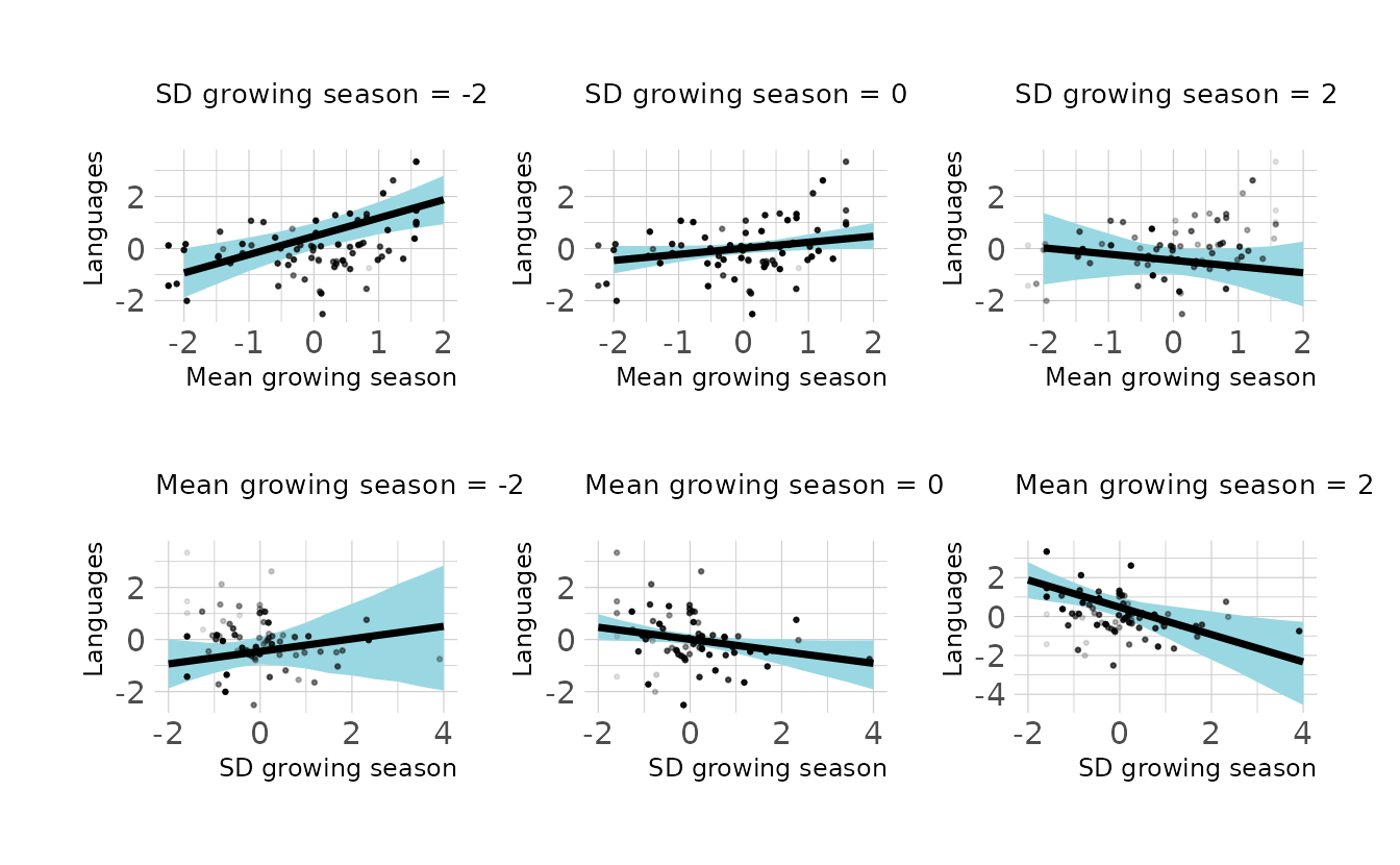
8H5. Consider the
data(Wines2012)data table. These data are expert ratings of 20 different French and American wines by 9 different French and American judges. Your goal is to modelscore, the subjective rating assigned by each judge to each wine. I recommend standardizing it. In this problem, consider only variation among judges and wines. Construct index variables ofjudgeandwineand then use these index variables to construct a linear regression model. Justify your priors. You should end up with 9 judge parameters and 20 wine parameters. How do you interpret the variation among individual judges and individual wines? Do you notice any patterns, just by plotting the differences? Which judges gave the highest/lowest ratings? Which wines were rated worst/best on average?
First, let’s prepare the data. We’ll standardize the score and create index variables for both judge and wine.
data(Wines2012)

wine <- Wines2012 %>%
  as_tibble() %>%
  mutate(score_std = standardize(score),
         judge_ind = factor(as.integer(judge)),
         wine_ind = factor(as.integer(wine)),
         red = factor(flight, levels = c("white", "red")),
         wine_amer = factor(wine.amer),
         judge_amer = factor(judge.amer))
Next, we’ll fit the model, remembering to remove the overall intercept (i.e., ~ 0) so that the index variables are estimated correctly. Because the scores have been standardized, we can use the normal(0, 0.5) prior we’ve used previously and which is used throughout much of the text. We’ll also extract the posterior draws so that we can explore the posterior for each judge and wine individually.
b8h5 <- brm(bf(score_std ~ 0 + j + w,
               j ~ 0 + judge_ind,
               w ~ 0 + wine_ind,
               nl = TRUE),
            data = wine, family = gaussian,
            prior = c(prior(normal(0, 0.5), nlpar = j),
                      prior(normal(0, 0.5), nlpar = w),
                      prior(exponential(1), class = sigma)),
            iter = 4000, warmup = 2000, chains = 4, cores = 4, seed = 1234,
            file = here("fits", "chp8", "b8h5.rds"))

draws <- as_draws_df(b8h5) %>%
  as_tibble() %>%
  select(-sigma, -lp__) %>%
  pivot_longer(-c(.chain, .iteration, .draw), names_to = c(NA, NA, "type", "num"), names_sep = "_",
               values_to = "value", ) %>%
  mutate(num = str_replace_all(num, "ind", ""),
         num = as.integer(num))
Looking at the distributions by judge, we can see that John Foy tends to give the highest scores, whereas Robert Hodgson and Jean-M Cardebat give the lowest scores on average.
draws %>%
  filter(type == "judge") %>%
  mutate(num = factor(num)) %>%
  left_join(wine %>%
              distinct(judge, judge_ind),
            by = c("num" = "judge_ind")) %>%
  select(judge, value) %>%
  group_by(judge) %>%
  median_hdci(.width = c(0.67, 0.89, 0.97)) %>%
  ggplot(aes(y = fct_rev(judge), x = value, xmin = .lower, xmax = .upper)) +
  geom_interval() +
  scale_color_manual(values = ramp_blue(seq(0.9, 0.1, length.out = 3)),
                     limits = as.character(c(0.67, 0.89, 0.97))) +
  labs(y = NULL, x = "Parameter Value", color = "Interval")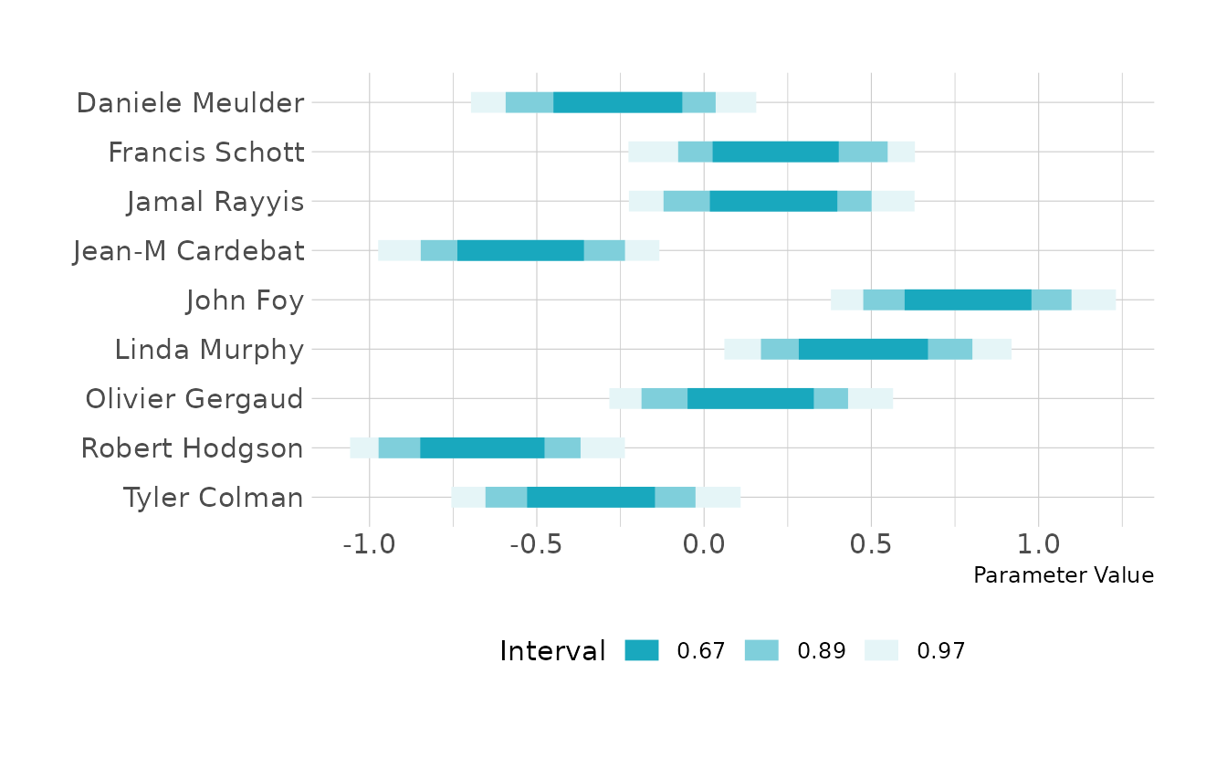
For wines, B2, J2, D2, D1, and B1 received the highest scores on average, and wine I2 was clearly the lowest rated of the wines. However, overall, there is more variability among the judges than among the wines.
draws %>%
  filter(type == "wine") %>%
  mutate(num = factor(num)) %>%
  left_join(wine %>%
              distinct(wine, wine_ind),
            by = c("num" = "wine_ind")) %>%
  select(wine, value) %>%
  group_by(wine) %>%
  median_hdci(.width = c(0.67, 0.89, 0.97)) %>%
  ggplot(aes(y = fct_rev(wine), x = value, xmin = .lower, xmax = .upper)) +
  geom_interval() +
  scale_color_manual(values = ramp_blue(seq(0.9, 0.1, length.out = 3)),
                     limits = as.character(c(0.67, 0.89, 0.97))) +
  labs(y = NULL, x = "Parameter Value", color = "Interval")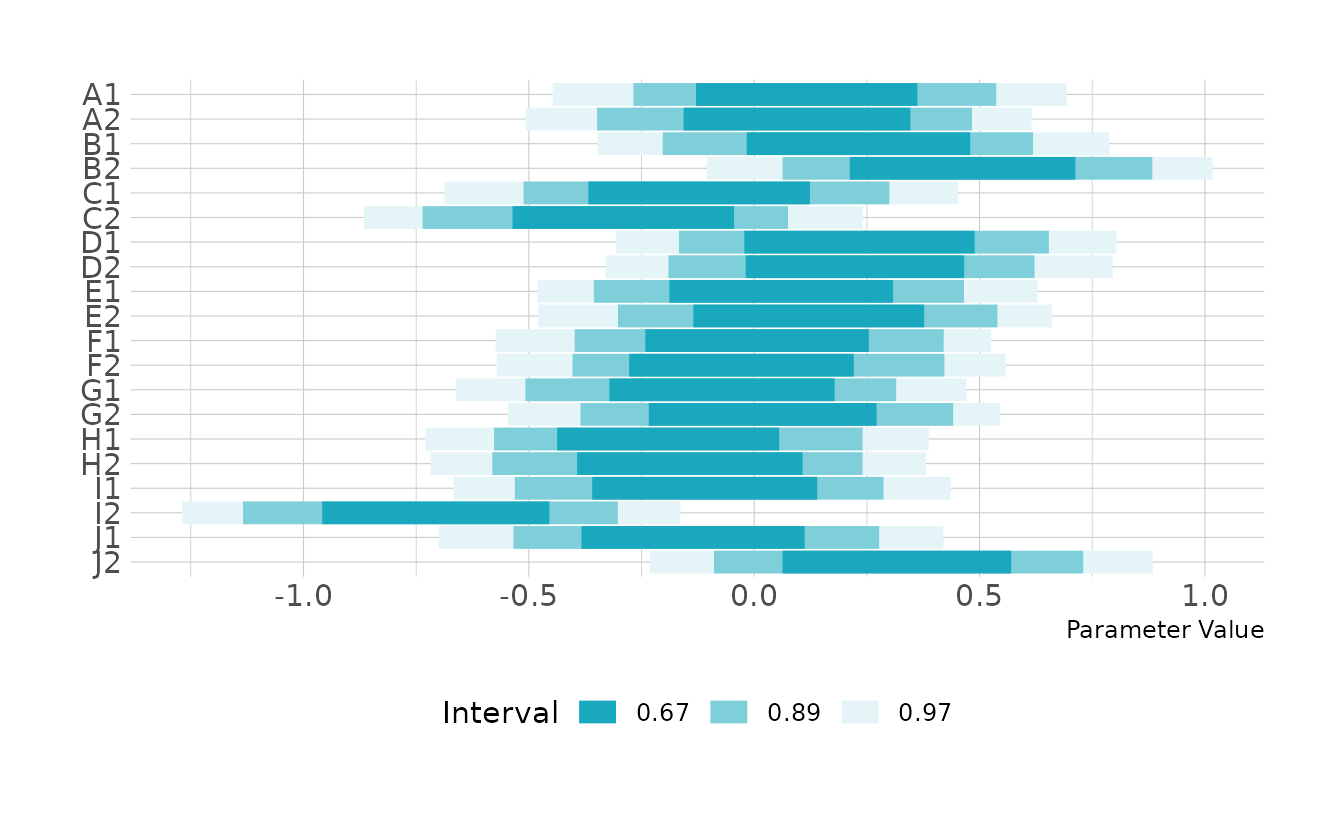
8H6. Now consider three features of the wines and judges:
flight: Whether the wine is red or white.wine.amer: Indicator variable for American wines.judge.amer: Indicator variable for American judges.
Use indicator or index variables to model the influence of these features on the scores. Omit the individual judge and wine index variables from Problem 1. Do not include interaction effects yet. Again justify your priors What do you conclude about the differences among the wines and judges? Try to relate the results to the inferences in the previous problem.
We can estimate the {brms} model as defined below. In this definition, we’re using indicator variables rather than index variables, as that will make the next question a little bit easier. We’ll use our standard normal(0, 0.2) prior for the intercept, since that will have to be near zero given that the score has been standardized. For the coefficients, we have to ask what a reasonable difference in scores would be between New Jersey and French wines, New Jersey and French judges, and red and white wine. One standard deviation seems to be the edge of what might be reasonable, so we’ll use normal(0, 0.5), as that will leave sufficient probability in the tails. These priors constrain the space to plausible values, but we could probably use tighter priors on the slope parameters if we wanted to get more regularization.
b8h6 <- brm(score_std ~ wine_amer + judge_amer + red,
            data = wine, family = gaussian,
            prior = c(prior(normal(0, 0.2), class = Intercept),
                      prior(normal(0, 0.5), class = b),
                      prior(exponential(1), class = sigma)),
            iter = 4000, warmup = 2000, chains = 4, cores = 4, seed = 1234,
            file = here("fits", "chp8", "b8h6.rds"))

fixef(b8h6)
#>             Estimate Est.Error    Q2.5 Q97.5
#> Intercept   -0.01641     0.157 -0.3237 0.287
#> wine_amer1  -0.17688     0.145 -0.4640 0.109
#> judge_amer1  0.22773     0.143 -0.0534 0.503
#> redred      -0.00686     0.145 -0.2873 0.277
As indicated by the last problem, there is basically no effect of red vs. white wine. There does appear to be a slight preference for French wines; however, there’s a good deal of posterior density on both sides of 0. This confirms what we found in the last problem: that there is little variation coming from the wines. We do see a slightly stronger effect among judges, with American judges giving higher scores on average.
8H7. Now consider two-way interactions among the three features. You should end up with three different interaction terms in your model. These will be easier to build, if you use indicator variables. Again justify your priors. Explain what each interaction means. Be sure to interpret the model’s predictions on the outcome scale (
mu, the expected score), not on the scale of individual parameters. You can uselinkto help with this, or just use your knowledge of the linear model instead. What do you conclude about the features and the scores? Can you relate the results of your model(s) to the individual judge and wine inferences from 8H5?
We’ll start by fitting the model. Here I’ve used the same priors as the previous problem for the intercept and main effect parameters. For the interactions, I have specified a normal(0, 0.25) prior. The interaction priors are a little tighter because as we keep subsetting the sample, values can’t keep getting larger and larger.
b8h7 <- brm(score_std ~ wine_amer + judge_amer + red +
              wine_amer:judge_amer + wine_amer:red + judge_amer:red,
            data = wine, family = gaussian,
            prior = c(prior(normal(0, 0.2), class = Intercept),
                      prior(normal(0, 0.5), class = b),
                      prior(normal(0, 0.25), class = b,
                            coef = judge_amer1:redred),
                      prior(normal(0, 0.25), class = b,
                            coef = wine_amer1:judge_amer1),
                      prior(normal(0, 0.25), class = b,
                            coef = wine_amer1:redred),
                      prior(exponential(1), class = sigma)),
            iter = 4000, warmup = 2000, chains = 4, cores = 4, seed = 1234,
            file = here("fits", "chp8", "b8h7.rds"))

fixef(b8h7)
#>                        Estimate Est.Error   Q2.5 Q97.5
#> Intercept               -0.0749     0.176 -0.420 0.274
#> wine_amer1              -0.0553     0.193 -0.419 0.324
#> judge_amer1              0.2258     0.194 -0.158 0.603
#> redred                   0.1028     0.198 -0.280 0.494
#> wine_amer1:judge_amer1  -0.0314     0.186 -0.396 0.325
#> wine_amer1:redred       -0.2335     0.188 -0.596 0.136
#> judge_amer1:redred       0.0410     0.188 -0.323 0.410
To interpret what all these parameters mean, we can visualize the predicted score for each combination of judge, wine location, and wine type. In this figure we see that all combinations of of judge and wine for white wines. However, there do appear to be some slight differences in the red wines. In general, French judges really don’t like the American reds, and American judges really do like the French reds.
wine %>%
  distinct(wine_amer, judge_amer, red) %>%
  mutate(combo = glue("{ifelse(judge_amer == 0, 'French', 'American')} judge, ",
                      "{ifelse(wine_amer == 0, 'French', 'American')} wine")) %>%
  add_epred_draws(b8h7) %>%
  median_hdi(.width = c(0.67, 0.89, 0.97)) %>%
  ggplot(aes(x = .epred, xmin = .lower, xmax = .upper, y = combo)) +
  facet_wrap(~red, nrow = 1, labeller = as_labeller(str_to_title)) +
  geom_interval() +
  scale_color_manual(values = ramp_blue(seq(0.9, 0.1, length.out = 3)),
                     breaks = c("0.67", "0.89", "0.97")) +
  labs(x = "Value", y = NULL, color = "Interval")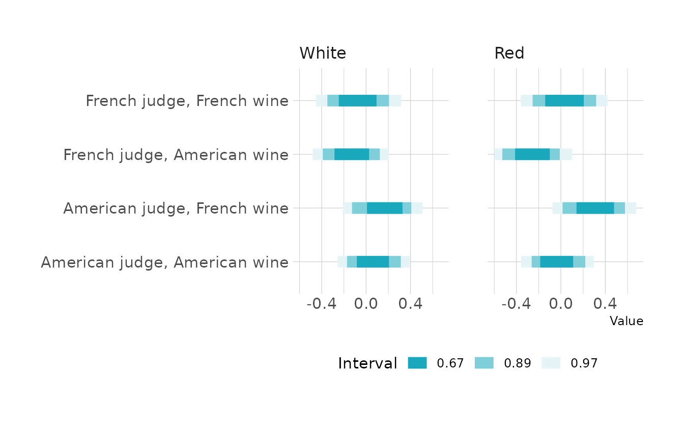
4.2.3 Chapter 9
9E1. Which of the following is a requirement of the simple Metropolis algorithm?
- The parameters must be discrete.
- The likelihood must be Gaussian.
- The proposal distribution must be symmetric.
Only (3) is required.
9E2. Gibbs sampling is more efficient than the Metropolis algorithm. How does it achieve tis extra efficiency? Are there any limitations to the Gibbs sampling strategy?
Gibbs sampling is more efficient because it makes smarter proposals. This is accomplished through conjugate priors, which make it possible to get analytical solutions to the posterior for each parameter in the model. However, this is also limiting, because we are constrained in which prior distributions we are able to select. Additionally, like the Metropolis algorithm, Gibbs samplers can get stuck in one area of the posterior if parameters are highly correlated or if the parameters are in a high-dimensional space.
9E3. Which sort of parameters can Hamiltonian Monte Carlo not handle? Can you explain why?
Hamiltonian Monte Carlo cannot handle discrete parameters. This is because the method uses a physics simulation to glide an imaginary particle over the surface of the posterior. If parameters are discrete, that breaks the surface and the particle cannot glide.
9E4. Explain the difference between the effective number of samples,
n_effas calculated by Stan, and the actual number of samples.
The actual number of samples is simply the number of draws we make from the posterior distribution. These draws may be autocorrelated, so the effective number of samples is an estimate of the number of completely independent (i.e., uncorrelated) draws that would contain the same amount of information. As autocorrelation increases, the number of effective samples decreases. Usually, n_eff will be smaller than the actual number of samples. However, there are times when Stan can make better than independent draws, which would result in an n_eff great than the actual number of samples.
9E5. Which value should
Rhatapproach, when a chain is sampling the posterior distribution correctly?
The Rhat should approach 1 from above. That is, bad chains will result in an Rhat greater than 1.
9E6. Sketch a good trace plot for a Markov chain, one that is effectively sampling from the posterior distribution. What is good about its shape? Then sketch a trace plot for a malfunctioning Markov chain. What about its shape indicates malfunction?
Below is an example of a good Markov chain. Here I’ve simulated 3 chains. They are all stationary and mixing well. Additionally, they are all jumbled together, so you can’t see any patterns of the different chains sampling different spaces.
iters <- 1000

good_chain <- tibble(.iter = seq_len(iters),
                     chain1 = rnorm(n = iters, mean = 0, sd = 1),
                     chain2 = rnorm(n = iters, mean = 0, sd = 1),
                     chain3 = rnorm(n = iters, mean = 0, sd = 1)) %>%
  pivot_longer(-.iter, names_to = "chain", values_to = "value")

ggplot(good_chain, aes(x = .iter, y = value, color = chain)) +
  geom_line(show.legend = FALSE) +
  scale_color_okabeito() +
  labs(x = "Iteration", y = "Value")
In contrast this plot shows a bad chain. Here, one of the chains has gotten stuck in a different area of the posterior. All three chains are fairly stationary, but one chain is clearly not mixing with the others. We should rexamine our model to figure out what might be causing this behavior.
bad_chain <- tibble(.iter = seq_len(iters),
                    chain1 = rnorm(n = iters, mean = 0, sd = 1),
                    chain2 = rnorm(n = iters, mean = 0, sd = 1),
                    chain3 = rnorm(n = iters, mean = 3, sd = .5)) %>%
  pivot_longer(-.iter, names_to = "chain", values_to = "value")

ggplot(bad_chain, aes(x = .iter, y = value, color = chain)) +
  geom_line(show.legend = FALSE) +
  scale_color_okabeito() +
  labs(x = "Iteration", y = "Value")
9E7. Repeat the problem above, but now for a trace rank plot.
This one is harder, because I like the look of McElreath’s trace rank plots. Specifically, he uses outline of the histogram only, without lines to separate the individual bars. So I wrote a function called make_trank() that will automate this work. It takes a data frame with one column per parameter and an additional column named Chain. It returns a data frame suitable for making trace rank plots in {ggplot2} with geom_line().
Let’s look at a good trace rank plot. Here we see a good mixing, with a fairly consistent number of samples from each bin in each chain.
View make_trank()
make_trank <- function(dat, bins = 20) {
  dat <- dat %>%
    group_by(Chain) %>%
    mutate(iteration = 1:n()) %>%
    pivot_longer(-c(Chain, iteration),
                 names_to = "parameter", values_to = "value") %>%
    group_by(parameter) %>%
    mutate(value_rank = row_number(value))

  bucket_counts <- dat %>%
    mutate(value_bucket = cut_interval(value_rank, n = bins,
                                       labels = FALSE)) %>%
    ungroup() %>%
    count(Chain, parameter, value_bucket)

  dat %>%
    ungroup() %>%
    select(Chain, iteration) %>%
    mutate(iter_bucket = cut_interval(iteration, n = bins,
                                      labels = FALSE)) %>%
    left_join(bucket_counts, by = c("Chain", "iter_bucket" = "value_bucket")) %>%
    mutate(Chain = factor(Chain))
}
good_chain %>%
  mutate(Chain = str_replace_all(chain, "chain", ""),
         Chain = as.integer(Chain)) %>%
  select(Chain, value) %>%
  make_trank(bins = 25) %>%
  ggplot(aes(x = iteration, y = n, color = Chain)) +
  geom_line(show.legend = FALSE, size = 1) +
  scale_color_okabeito() +
  scale_x_continuous(breaks = waiver(), n.breaks = 6,
                     labels = ~.x * 3) +
  labs(x = "Rank", y = "Samples")
Now for the bad chain. We know from the trace plot that one chain was sampling values that were higher than the other two chains. This is reflected in the trace rank plot. We can see that the values with the highest ranks nearly all come from one chain, and that chain has none of the low ranks. This is the chains are clearly not mixed, and do not show a consistent number of samples across the bins.
bad_chain %>%
  mutate(Chain = str_replace_all(chain, "chain", ""),
         Chain = as.integer(Chain)) %>%
  select(Chain, value) %>%
  make_trank(bins = 25) %>%
  ggplot(aes(x = iteration, y = n, color = Chain)) +
  geom_line(na.rm = TRUE, show.legend = FALSE, size = 1) +
  scale_color_okabeito() +
  scale_x_continuous(breaks = waiver(), n.breaks = 6,
                     labels = ~.x * 3) +
  labs(x = "Rank", y = "Samples")
9M1. Re-estimate the terrain reggedness model from the chapter, but now using a uniform prior for the standard deviation,
sigma. The uniform prior should bedunif(0,1). Useulamto estimate the posterior. Does the different prior have any detectible influence on the posterior distribution ofsigma? Why or why not?
We’ll fit two models, first the model from the chapter that uses and exponential prior for sigma. Then the second model which will use the uniform prior.
data(rugged)

rugged_dat <- rugged %>%
  as_tibble() %>%
  select(country, rgdppc_2000, rugged, cont_africa) %>%
  drop_na(rgdppc_2000) %>%
  mutate(log_gdp = log(rgdppc_2000),
         log_gdp_std = log_gdp / mean(log_gdp),
         rugged_std = rugged / max(rugged),
         rugged_std_cent = rugged_std - mean(rugged_std),
         cid = factor(cont_africa, levels = c(1, 0),
                      labels = c("African", "Not African")))

b9m1_chp <- brm(
  bf(log_gdp_std ~ 0 + a + b * rugged_std_cent,
     a ~ 0 + cid,
     b ~ 0 + cid,
     nl = TRUE),
  data = rugged_dat, family = gaussian,
  prior = c(prior(normal(1, 0.1), class = b, coef = cidAfrican, nlpar = a),
            prior(normal(1, 0.1), class = b, coef = cidNotAfrican, nlpar = a),
            prior(normal(0, 0.3), class = b, coef = cidAfrican, nlpar = b),
            prior(normal(0, 0.3), class = b, coef = cidNotAfrican, nlpar = b),
            prior(exponential(1), class = sigma)),
  iter = 4000, warmup = 2000, chains = 4, cores = 4, seed = 1234,
  file = here("fits", "chp9", "b9m1-chp.rds")
)

b9m1_uni <- brm(
  bf(log_gdp_std ~ 0 + a + b * rugged_std_cent,
     a ~ 0 + cid,
     b ~ 0 + cid,
     nl = TRUE),
  data = rugged_dat, family = gaussian,
  prior = c(prior(normal(1, 0.1), class = b, coef = cidAfrican, nlpar = a),
            prior(normal(1, 0.1), class = b, coef = cidNotAfrican, nlpar = a),
            prior(normal(0, 0.3), class = b, coef = cidAfrican, nlpar = b),
            prior(normal(0, 0.3), class = b, coef = cidNotAfrican, nlpar = b),
            prior(uniform(0, 1), class = sigma)),
  iter = 4000, warmup = 2000, chains = 4, cores = 4, seed = 1234,
  file = here("fits", "chp9", "b9m1-uni.rds")
)
Now let’s compare the posterior distributions. They are nearly identical. This is because we have enough data to get a good estimate of sigma, regardless of the prior. However, if sigma were greater than 1, the uniform prior would not give the same estimate, as that prior gives 0 probability to values outside of the [0, 1] interval.
bind_rows(
  as_draws_df(b9m1_chp, variable = "sigma") %>%
    as_tibble() %>%
    mutate(prior = "Exponential(1)"),
  as_draws_df(b9m1_uni, variable = "sigma") %>%
    as_tibble() %>%
    mutate(prior = "Uniform(0, 1)")
) %>%
  ggplot(aes(x = sigma, color = prior)) +
  geom_density(size = 1, key_glyph = "timeseries") +
  scale_color_okabeito() +
  labs(x = "σ", y = "Posterior Density", color = "Prior")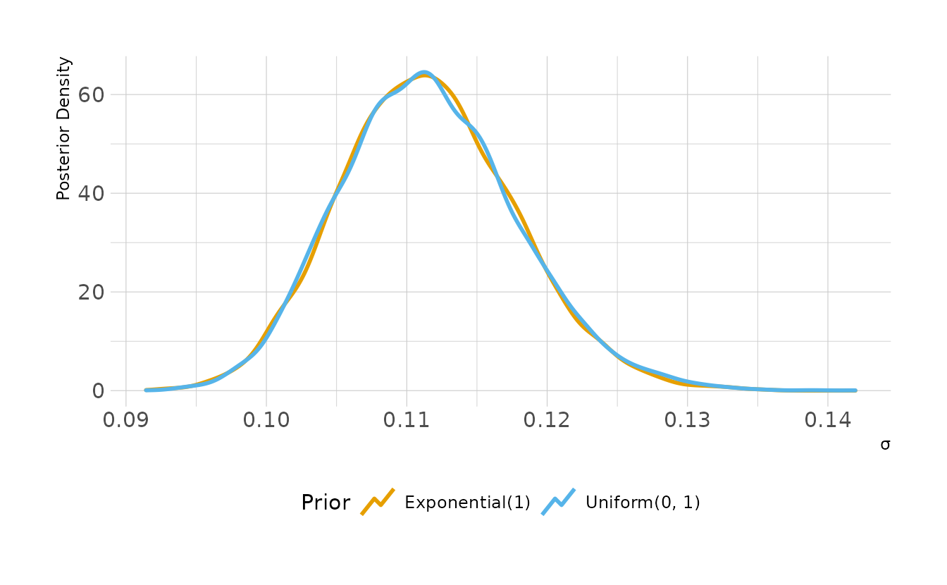
9M2. Modify the terrain ruggedness model again. This time, change the prior for
b[cid]todexp(0.3). What does this do to the posterior distribution? Can you explain it?
First we’ll fit the model with the new priors.
b9m2_exp <- brm(
  bf(log_gdp_std ~ 0 + a + b * rugged_std_cent,
     a ~ 0 + cid,
     b ~ 0 + cid,
     nl = TRUE),
  data = rugged_dat, family = gaussian,
  prior = c(prior(normal(1, 0.1), class = b, coef = cidAfrican, nlpar = a),
            prior(normal(1, 0.1), class = b, coef = cidNotAfrican, nlpar = a),
            prior(exponential(0.3), class = b, coef = cidAfrican, nlpar = b),
            prior(exponential(0.3), class = b, coef = cidNotAfrican, nlpar = b),
            prior(exponential(1), class = sigma)),
  iter = 4000, warmup = 2000, chains = 4, cores = 4, seed = 1234,
  control = list(adapt_delta = 0.95, max_treedepth = 15),
  file = here("fits", "chp9", "b9m2-exp.rds")
)
Now let’s compare the posterior distributions of the beta parameters. For the first, \(\beta_{African}\), the posteriors are nearly identical. However, the posterior for \(\beta_{Not African}\) is quite different. This is because the parameter wants to be negative, as it was in the original model. The new prior constrains the parameter to be positive, so we see all of the posterior density piled up right next to 0.
bind_rows(
as_draws_df(b9m1_chp, variable = "b_b_.*", regex = TRUE) %>%
as_tibble() %>%
pivot_longer(starts_with("b_b_"), names_to = "parameter",
values_to = "value") %>%
mutate(prior = "Normal(0, 0.3)"),
as_draws_df(b9m2_exp, variable = "b_b_.*", regex = TRUE) %>%
as_tibble() %>%
pivot_longer(starts_with("b_b_"), names_to = "parameter",
values_to = "value") %>%
mutate(prior = "Exponential(0.3)")
) %>%
mutate(parameter = factor(parameter,
levels = c("b_b_cidAfrican", "b_b_cidNotAfrican"),
labels = c("β<sub>African</sub>",
"β<sub>Not African</sub>"))) %>%
ggplot(aes(x = value, color = prior)) +
facet_wrap(~parameter, nrow = 1, scales = "free_y") +
geom_density(size = 1, key_glyph = "timeseries") +
scale_color_okabeito(breaks = c("Normal(0, 0.3)", "Exponential(0.3)")) +
labs(x = "β", y = "Posterior Density", color = "Prior")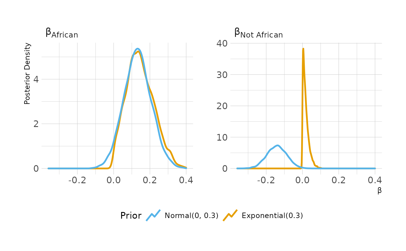
9M3. Re-estimate one of the Stan models from the chapter, but at different numbers of
warmupiterations. Be sure to use the same number of sampling interations in each case. Compare then_effvalues. How much warmup is enough?
For simplicity, we’ll use the same terrain-ruggedness example as the previous two problems. We’ll investigate 7 different warm-up lengths, with the number of post-warmup samples fixed to 1,000.
warmup_length <- c(10, 25, 50, 100, 250, 500, 1000)

b9m3_sim <- map_dfr(warmup_length,
                    function(w) {
                      mod <- brm(b9m1_chp$formula, data = b9m1_chp$data,
                                 family = gaussian, prior = b9m1_chp$prior,
                                 chains = 1, seed = 1234,
                                 iter = w + 1000, warmup = w)

                      mod_sum <- summary(mod)
                      mod_sum$fixed %>%
                        bind_rows(mod_sum$spec_pars) %>%
                        rownames_to_column(var = "parameter") %>%
                        mutate(warmup = w, .before = 1) %>%
                        as_tibble() %>%
                        select(warmup, parameter, Bulk_ESS, Tail_ESS)
                    }) %>%
  write_rds(here("fits", "chp9", "b9m3-sim.rds"))
b9m3_sim <- read_rds(here("fits", "chp9", "b9m3-sim.rds"))With {brms}, rather than one measure of effective sample size (ESS), we get two measures, as described in Vehtari et al. (2021). Bulk ESS describes the mean of the distribution (i.e., the bulk), and Tail ESS describes the variance (i.e., the tails of the distribution). We can see that for this particular model, both the Bulk ESS and Tail ESS level off fairly quickly, meaning that not much warmup is needed in this particular case.
b9m3_sim %>%
pivot_longer(ends_with("_ESS"), names_to = "type", values_to = "value") %>%
mutate(param_label = parameter,
param_label = str_replace_all(param_label, "a_cid(.*)$", "α<sub>\\1</sub>"),
param_label = str_replace_all(param_label, "b_cid(.*)$", "β<sub>\\1</sub>"),
param_label = str_replace_all(param_label, "sigma", "<sub>σ</sub>"),
type = str_replace_all(type, "_", " ")) %>%
ggplot(aes(x = warmup, y = value, color = type)) +
facet_wrap(~param_label, ncol = 3) +
geom_line(size = 1) +
scale_color_okabeito() +
scale_x_comma() +
labs(x = "Warmup Iterations", y = "Effective Sample Size",
color = NULL)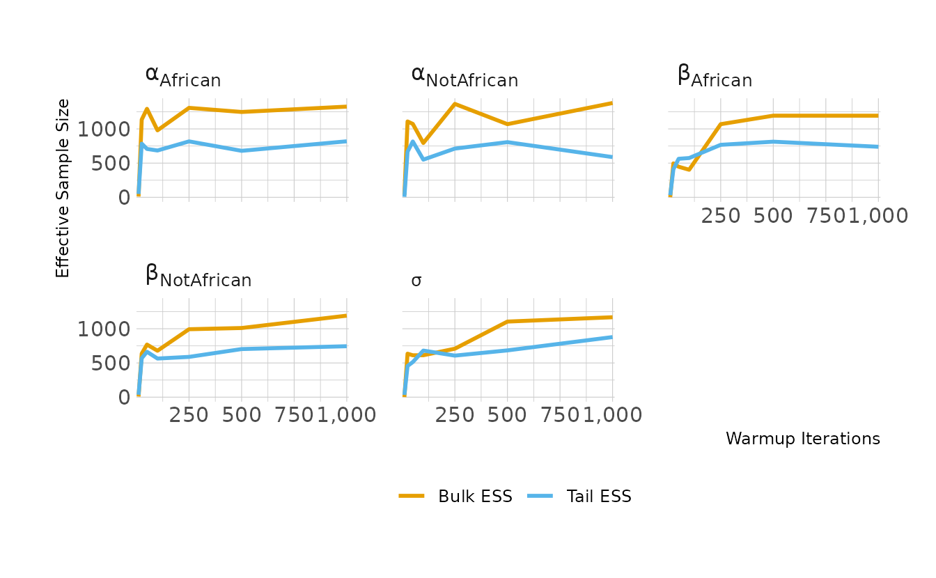
9H1. Run the model below and then inspect the posterior distribution and explain what it is accomplishing.
Compare the samples for the parameters
aandb. Can you explain the different trace plots? If you are unfamiliar with the Cauchy distribution, you should look it up. The key feature to attend to is that it has no expected value. Can you connect this fact to the trace plot?
This model is just sampling prior distributions. Let reproduce this using {brms}. To get prior samples, we set sample_prior = "only". That, in combination with the non-linear syntax we’ve seen before, lets us duplicate the model from the question.
mp <- brm(bf(1 ~ a + b, a ~ 1, b ~ 1, nl = TRUE), data = 1,
          prior = c(prior(normal(0, 1), class = b, nlpar = a),
                    prior(cauchy(0, 1), class = b, nlpar = b)),
          iter = 2000, chains = 1, sample_prior = "only",
          file = here("fits", "chp9", "b9h1-prior"))
Looking at the trace plots, we see that a is sampling as we would expect, given the prior, bouncing around between -3 and 3. The b parameter looks a little odd. However, this is normal for the Cauchy distribution. This distribution has an undefined mean and variance, with very heavy tails. Because of this, it will occasionally jump to extreme values.
as_draws_df(mp, variable = "^b_", regex = TRUE) %>%
  as_tibble() %>%
  pivot_longer(starts_with("b_"), names_to = "param") %>%
  mutate(param = str_replace_all(param, "b_([ab])_Intercept", "\\1")) %>%
  ggplot(aes(x = .draw, y = value)) +
  facet_wrap(~param, nrow = 1, scales = "free_y") +
  geom_line(color = "#009FB7")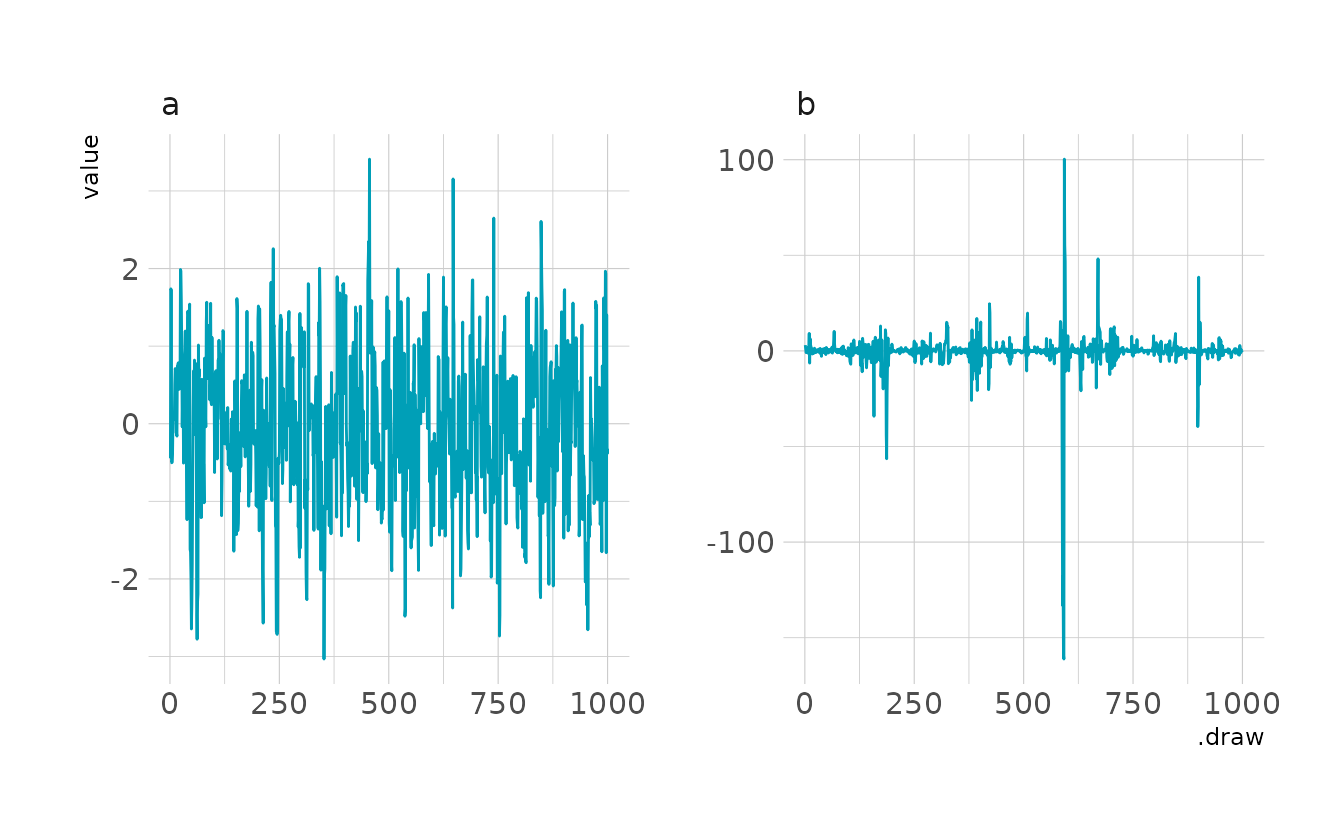
9H2. Recall the divorce rate example from Chapter 5. Repeat that analysis, using
ulamthis time, fitting modelsm5.1,m5.2, andm5.3. Usecompareto compare the models on the basis of WAIC or PSIS. To use WAIC or PSIS withulam, you need add the argumentlog_lik=TRUE. Explain the model comparison results.
First, the code to reproduce the three models. Model bm51 uses only median age at marriage to predict the divorce rate, bm52 uses only marriage rate, and bm53 uses both predictors.
data("WaffleDivorce")

waffle_dat <- WaffleDivorce %>%
  select(d = Divorce, m = Marriage, a = MedianAgeMarriage) %>%
  mutate(across(everything(), standardize))

bm51 <- brm(d ~ 1 + a, data = waffle_dat, family = gaussian,
            prior = c(prior(normal(0, 0.2), class = Intercept),
                      prior(normal(0, 0.5), class = b),
                      prior(exponential(1), class = sigma)),
            iter = 4000, warmup = 2000, chains = 4, cores = 4, seed = 1234,
            file = here("fits", "chp9", "b9h2-m51"))

bm52 <- brm(d ~ 1 + m, data = waffle_dat, family = gaussian,
            prior = c(prior(normal(0, 0.2), class = Intercept),
                      prior(normal(0, 0.5), class = b),
                      prior(exponential(1), class = sigma)),
            iter = 4000, warmup = 2000, chains = 4, cores = 4, seed = 1234,
            file = here("fits", "chp9", "b9h2-m52"))

bm53 <- brm(d ~ 1 + m + a, data = waffle_dat, family = gaussian,
            prior = c(prior(normal(0, 0.2), class = Intercept),
                      prior(normal(0, 0.5), class = b),
                      prior(exponential(1), class = sigma)),
            iter = 4000, warmup = 2000, chains = 4, cores = 4, seed = 1234,
            file = here("fits", "chp9", "b9h2-m53"))

bm51 <- add_criterion(bm51, criterion = c("waic", "loo"))
bm52 <- add_criterion(bm52, criterion = c("waic", "loo"))
bm53 <- add_criterion(bm53, criterion = c("waic", "loo"))
Now let’s compare. With both the WAIC and PSIS-LOO, the first model with only age at marriage is preferred. However, the score for bm53 is nearly the same. This indicates that the two models are not really being differentiated very well.
loo_compare(bm51, bm52, bm53, criterion = "waic")
#>      elpd_diff se_diff
#> bm51  0.0       0.0
#> bm53 -0.9       0.3
#> bm52 -6.7       4.6

loo_compare(bm51, bm52, bm53, criterion = "loo")
#>      elpd_diff se_diff
#> bm51  0.0       0.0
#> bm53 -0.9       0.3
#> bm52 -6.6       4.7
9H3. Sometimes changing a prior for one parameter has unanticipated effects on other parameters. This is because when a parameter is highly correlated with another parameter in the posterior, the prior influences both parameters. Here’s an example to work and think through.
Go back to the leg length example in Chapter 6 and use the code there to simulate height and leg lengths for 100 imagined individuals. Below is the model you fit before, resulting in a highly correlated posterior for the two beta parameters. This time, fit the model using
ulam:
m5.8s <- ulam(
  alist(
    height ~ dnorm(mu, sigma),
    mu <- a + bl * leg_left + br * leg_right ,
    a ~ dnorm(10, 100),
    bl ~ dnorm(2, 10),
    br ~ dnorm(2, 10),
    sigma ~ dexp(1)
  ), data = d, chains = 4,
  start = list(a =10 , bl = 0, br = 0.1, sigma = 1)
)
Compare the posterior distribution produced by the code above to the posterior distribution produced when you change the prior for
brso that it is strictly positive:
m5.8s2 <- ulam(
  alist(
    height ~ dnorm(mu, sigma),
    mu <- a + bl * leg_left + br * leg_right ,
    a ~ dnorm(10, 100),
    bl ~ dnorm(2, 10),
    br ~ dnorm(2, 10),
    sigma ~ dexp(1)
  ), data = d, chains = 4,
  constraints = list(br = "lower=0"),
  start = list(a =10 , bl = 0, br = 0.1, sigma = 1)
)
Note the
constraintslist. What this does is constrain the prior distribution ofbrso that is has positive probability only above zero. In other words, that prior ensures that the posterior distribution forbrwill have no probability mass below zero. Compare the two posterior distributions form5.8sandm5.8s2. What has changed in the posterior distribution of both beta parameters? Can you explain the change induced by the change in prior?
Let’s start by simulating the data we used for those models. As a reminder, there is a strong correlation between the lengths of the two legs.
set.seed(909)

n <- 100

height <- rnorm(n, 10, 2)
leg_prop <- runif(n, 0.4, 0.5)
leg_left <- leg_prop * height + rnorm(n, 0, 0.02)
leg_right <- leg_prop * height + rnorm(n, 0, 0.02)

leg_dat <- tibble(height, leg_left, leg_right)

cor(leg_dat$leg_left, leg_dat$leg_right)
#> [1] 1
Now let’s fit the two models.
bm58s <- brm(height ~ 1 + leg_left + leg_right, data = leg_dat,
             family = gaussian,
             prior = c(prior(normal(10, 100), class = Intercept),
                       prior(normal(2, 10), class = b, coef = leg_left),
                       prior(normal(2, 10), class = b, coef = leg_right),
                       prior(exponential(1), class = sigma)),
             iter = 4000, warmup = 2000, chains = 4, cores = 4, seed = 1234,
             file = here("fits", "chp9", "b9h3-m58s"))

bm58s2 <- brm(bf(height ~ int + ll + lr,
                 int ~ 1,
                 ll ~ 0 + leg_left,
                 lr ~ 0 + leg_right,
                 nl = TRUE),
              data = leg_dat, family = gaussian,
              prior = c(prior(normal(10, 100), class = b, nlpar = int),
                        prior(normal(2, 10), class = b, nlpar = ll),
                        prior(normal(2, 10), class = b, lb = 0, nlpar = lr),
                        prior(exponential(1), class = sigma)),
              iter = 4000, warmup = 2000, chains = 4, cores = 4, seed = 1234,
              file = here("fits", "chp9", "b9h3-m58s2"))
To examine the posteriors, we’ll first look at the correlations between parameters. In both models, there is a very strong negative correlation between \(\beta_L\) and \(\beta_R\). This makes sense given our data. Because the data are so strongly correlated, that they provide basically the same information. So if we take more information from the left leg (i.e., higher values of \(\beta_L\)), we necessarily must let less from the right leg. This results in in the negative correlation.
draws <- bind_rows(
as_draws_df(bm58s, variable = "b_leg.*", regex = TRUE) %>%
as_tibble() %>%
mutate(prior = "Unconstrained"),
as_draws_df(bm58s2, variable = "b_l[lr]_leg.*", regex = TRUE) %>%
as_tibble() %>%
rename(b_leg_left = b_ll_leg_left, b_leg_right = b_lr_leg_right) %>%
mutate(prior = "Constrained")
) %>%
mutate(prior = fct_inorder(prior))
ggplot(draws, aes(x = b_leg_right, y = b_leg_left)) +
facet_wrap(~prior, nrow = 1, scales = "free") +
geom_point(alpha = 0.2) +
labs(x = "β<sub>R</sub>", y = "β<sub>L</sub>")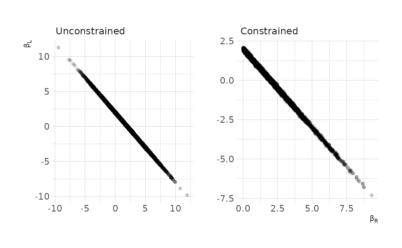
However, looking at the actual distributions reveals in the impact of constraining one parameter to be positive. In the unconstrained model, the distributions are very similar. In the constrained model, \(\beta_R\) takes only positive values, and the distributions are mirror images of each other. In order to preserve the negative correlation of the posterior, the change in prior for one parameter has cascaded into the other parameter.
draws %>%
pivot_longer(starts_with("b_"), names_to = "param") %>%
ggplot(aes(x = value)) +
facet_wrap(~prior, nrow = 1) +
geom_density(aes(color = param), size = 1, key_glyph = "timeseries") +
scale_color_okabeito(labels = c("β<sub>L</sub>", "β<sub>R</sub>")) +
labs(x = "β", y = "Density", color = "Parameter") +
theme(legend.text = element_markdown())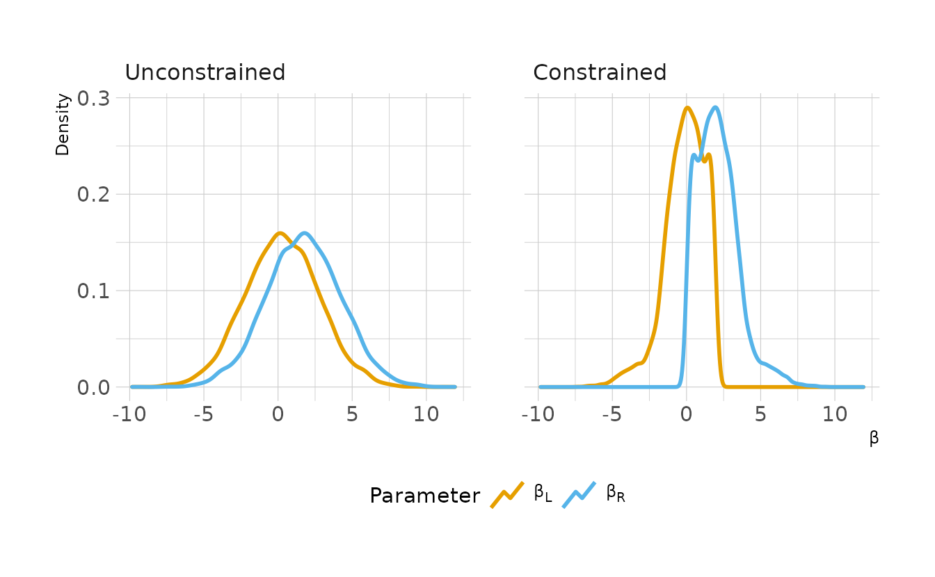
9H4. For the two models fit in the previous problem, use WAIC or PSIS to compare the effective numbers of parameters for each model. You will need to use
log_lik=TRUEto instructulamto compute the terms that both WAIC and PSIS need. Which model has more effective parameters? Why?
The number of effective parameters is give by the p_waic and p_loo columns, respectively. The unconstrained model (bm58s) has a large number of effective parameters, 3.2 compared to 2.6. This makes sense given our priors. The second model has a more informative prior, so the parameters are not able to move around as freely and the posterior as a smaller variance.
bm58s <- add_criterion(bm58s, criterion = c("waic", "loo"))
bm58s2 <- add_criterion(bm58s2, criterion = c("waic", "loo"))

print(loo_compare(bm58s, bm58s2, criterion = "waic"), simplify = FALSE)
#>        elpd_diff se_diff elpd_waic se_elpd_waic p_waic se_p_waic waic  se_waic
#> bm58s2   0.0       0.0   -96.9       5.6          2.6    0.4     193.9  11.2
#> bm58s   -0.6       0.2   -97.5       5.6          3.2    0.5     195.1  11.3

print(loo_compare(bm58s, bm58s2, criterion = "loo"), simplify = FALSE)
#>        elpd_diff se_diff elpd_loo se_elpd_loo p_loo se_p_loo looic se_looic
#> bm58s2   0.0       0.0   -96.9      5.6         2.6   0.4    193.9  11.2
#> bm58s   -0.6       0.2   -97.6      5.6         3.2   0.5    195.1  11.3
9H5. Modify the Metropolis algorithm code from the chapter to handle the case that the island populations have a different distribution than the island labels. This means the island’s number will not be the same as its population.
In the original example, the population of each island was 1 to 10 in order. For this problem, we’ll pick a random population order.
set.seed(209)

pop_size <- sample(1:10, size = 10, replace = FALSE)
names(pop_size) <- paste("Island", 1:10)
pop_size
#>  Island 1  Island 2  Island 3  Island 4  Island 5  Island 6  Island 7  Island 8
#>         2         3        10         6         8         5         7         9
#>  Island 9 Island 10
#>         1         4
Now we can repeat the simulation from the chapter. The function takes a current island position, island, and the popualtion of the island, and returns the next island. The guts of the function are the same as the for loop from the chapter.
island_sim <- function(island, ..., island_pop) {
  # flip coin to generate proposal
  proposal <- island + (sample(c(-1L, 1L), size = 1))

  # loop when we reach the boundary
  if (proposal < 1) proposal <- 10L
  if (proposal > 10) proposal <- 1L

  # decide if we move
  prob <- island_pop[proposal] / island_pop[island]
  island <- ifelse(runif(1) < prob, proposal, island)

  return(island)
}
We can then use accumulate() to run the function 100,000 times, passing the previous position to island each time. In the summary we can see the proportion of total visits that each island received (visit_prop) and the proportion of the total population that lives on each island (pop_prop). We can see that these two columns are nearly identical, so we are in fact visiting each island in proportion to the populations of the islands.
visits <- accumulate(seq_len(1e6), island_sim, .init = 10L,
                     island_pop = pop_size)

tibble(island = visits) %>%
  count(island) %>%
  mutate(population = pop_size,
         visit_prop = n / sum(n),
         pop_prop = population / sum(population))
#> # A tibble: 10 × 5
#>    island      n population visit_prop pop_prop
#>     <int>  <int>      <int>      <dbl>    <dbl>
#>  1      1  35867          2     0.0359   0.0364
#>  2      2  53920          3     0.0539   0.0545
#>  3      3 181239         10     0.181    0.182
#>  4      4 109238          6     0.109    0.109
#>  5      5 146186          8     0.146    0.145
#>  6      6  91538          5     0.0915   0.0909
#>  7      7 127965          7     0.128    0.127
#>  8      8 163814          9     0.164    0.164
#>  9      9  18102          1     0.0181   0.0182
#> 10     10  72132          4     0.0721   0.0727
9H6. Modify the Metropolis algorithm code from the chapter to write your own simple MCMC estimator for globe tossing data and model from Chapter 2.
Like in the previous problem, we’ll start by writing a function for the simulation. This follows the same structure as the previous problem, but rather than moving based on the ratio island populations, we move based on the ratio of the likelihoods for our parameter estimate.
globe_sim <- function(prop, ..., n, trials) {
  # proposal value: random number +/-0.1 from current value of `prop`
  proposal <- prop + runif(1, -0.1, 0.1)

  # reflect back when proposal is outside the [0,1] bounds of `prop`
  if (proposal < 0) proposal <- abs(proposal)
  if (proposal > 1) proposal <- 1 - (proposal - 1)

  # probability of current and proposed values
  # uses uniform prior, but could change `dunif` to some other prior
  prob_current <- dbinom(x = n, size = trials, prob = prop) * dunif(prop, 0, 1)
  prob_proposal <- dbinom(x = n, size = trials, prob = proposal) * dunif(proposal, 0, 1)

  # accept proposal?
  prob_accept <- prob_proposal / prob_current
  prop <- ifelse(runif(1) < prob_accept, proposal, prop)

  return(prop)
}
For fun, we’ll generate three chains so that we can have some more interesting plots to look at. In the Chapter 2 example, we had 6 waters out of 9 total trials, so those values are passed to the n and trials arguments of the function we just created. Finally, I start each chain at a different value, with the hope that they all converge to the same are of the posterior.
set.seed(209)

chain1 <- accumulate(seq_len(1e4), globe_sim, .init = 0.2, n = 6, trials = 9)
chain2 <- accumulate(seq_len(1e4), globe_sim, .init = 0.5, n = 6, trials = 9)
chain3 <- accumulate(seq_len(1e4), globe_sim, .init = 0.8, n = 6, trials = 9)
Let’s look at the trace rank plot for our chains. We see a fairly stable distribution within each chain, and good mixing between chains, which is exactly what we would want to see!
bind_rows(tibble(Chain = 1L, p = chain1),
          tibble(Chain = 2L, p = chain2),
          tibble(Chain = 3L, p = chain3)) %>%
  make_trank(bins = 25) %>%
  ggplot(aes(x = iteration, y = n, color = Chain)) +
  geom_line(show.legend = FALSE, size = 1) +
  scale_color_okabeito() +
  scale_x_continuous(breaks = waiver(), n.breaks = 6,
                     labels = ~prettyNum(.x * 3, big.mark = ",")) +
  labs(x = "Rank", y = "Samples")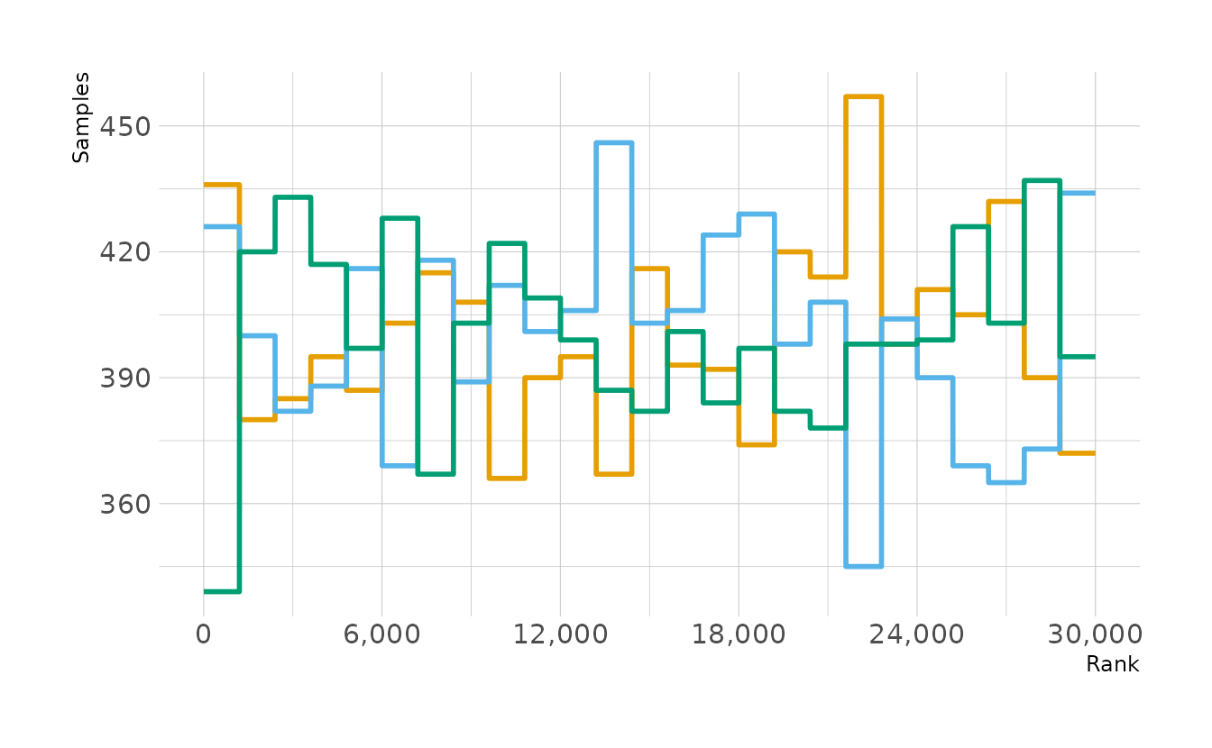
The last step is to actually look at our estimate of the proportion of water. There’s an expected value of 0.63, with a 95% interval of 0.33 to 0.88.
mean_qi(c(chain1, chain2, chain3), .width = 0.95)
#>       y  ymin ymax .width .point .interval
#> 1 0.633 0.335 0.88   0.95   mean        qi
9H7. Can you write your own Hamiltonian Monte Carlo algorithm for the globe tossing data, using the R code in the chapter? You will have to write your own functions for the likelihood and gradient, but you can use the HMC2 function.
There are two functions that we need to re-write if we’re following the example from the book. U_globe() will be the log-probability of the data, and U_globe_gradient() will be the gradient. We’ll start with U_globe(), which is very similar to what we created in the previous problem.
U_globe <- function(q) {
  U <- dbinom(y, size = n, prob = q, log = TRUE) +
    dunif(q, 0, 1, log = TRUE)
  return(-U)
}
The gradient of the U function is given as
\[ \frac{\partial U(y|n,p)}{\partial p} \] If we solve this (I cheated and used Mathematica), we get the answer for our gradient:
\[ \frac{\partial \log U(y|n,p)}{\partial p} = \frac{y - np}{p(1-p)} \]
In function form, we define U_globe_gradient() as:
U_globe_gradient <- function(q) {
  G <- (y - n * q) / (q * (1 - q))
  return(-G)
}
Finally, we plug our functions into a wrapper function that we can pass to accumulate(), and run 3 chains.
globe_hmc <- function(Q, ..., y = 6, n = 9, step = 0.03, L = 10) {
  Q <- HMC2(U_globe, U_globe_gradient, step, L, Q$q)
}

set.seed(209)

y <- 6
n <- 9

chain1 <- accumulate(seq_len(1000), globe_hmc, .init = list(q = 0.2)) %>%
  keep(~"accept" %in% names(.x)) %>%
  map_dbl(~ifelse(.x$accept == 1, .x$q, NA_real_))
chain2 <- accumulate(seq_len(1000), globe_hmc, .init = list(q = 0.5)) %>%
  keep(~"accept" %in% names(.x)) %>%
  map_dbl(~ifelse(.x$accept == 1, .x$q, NA_real_))
chain3 <- accumulate(seq_len(1000), globe_hmc, .init = list(q = 0.8)) %>%
  keep(~"accept" %in% names(.x)) %>%
  map_dbl(~ifelse(.x$accept == 1, .x$q, NA_real_))
Once again, we can look at the trace rank plot. We still get good mixing and consistency, indicating that the chains are mixing well and sampling the same area of the posterior.
bind_rows(tibble(Chain = 1L, p = chain1),
          tibble(Chain = 2L, p = chain2),
          tibble(Chain = 3L, p = chain3)) %>%
  make_trank(bins = 25) %>%
  ggplot(aes(x = iteration, y = n, color = Chain)) +
  geom_line(show.legend = FALSE, size = 1) +
  scale_color_okabeito() +
  scale_x_continuous(breaks = waiver(), n.breaks = 6,
                     labels = ~prettyNum(.x * 3, big.mark = ",")) +
  labs(x = "Rank", y = "Samples")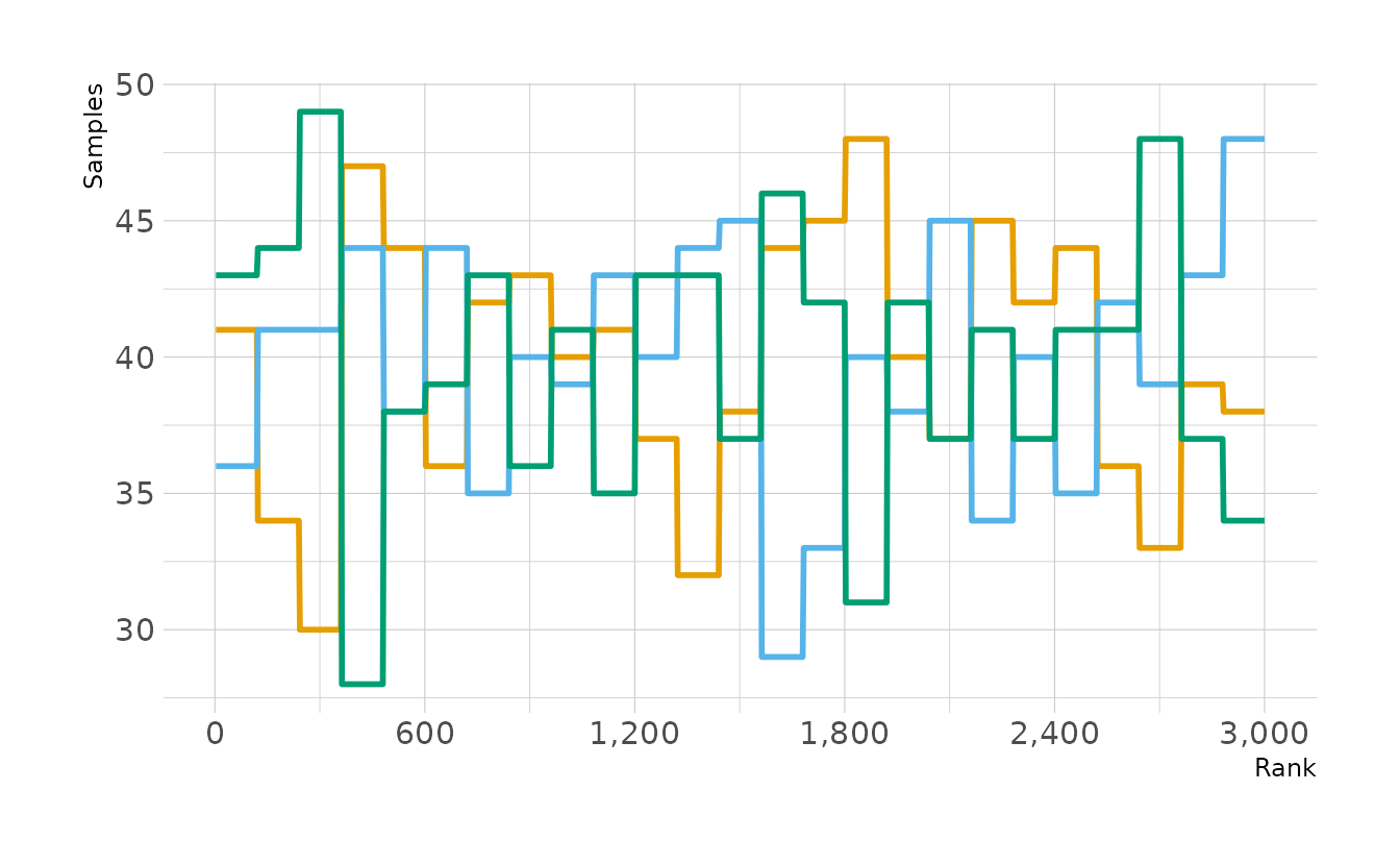
Looking at our posterior, we ahve an expected value of 0.63, with a 95% interval of 0.35 to 0.87. This is very similar to what we achieved with the Metropolis algorithm.
4.3 Homework
1. Revisit the marriage, age, and happiness collider bias example from Chapter 6. Run models
m6.9andm6.10again (pages 178–179). Compare these two models using both PSIS and WAIC. Which model is expected to make better predictions, according to these criteria? On the basis of the causal model, how should you interpret the parameter estimates from the model preferred by PSIS and WAIC?
As a reminder, here is the DAG for this example, where \(H\) is happiness, \(M\) is marriage, and \(A\) is age.
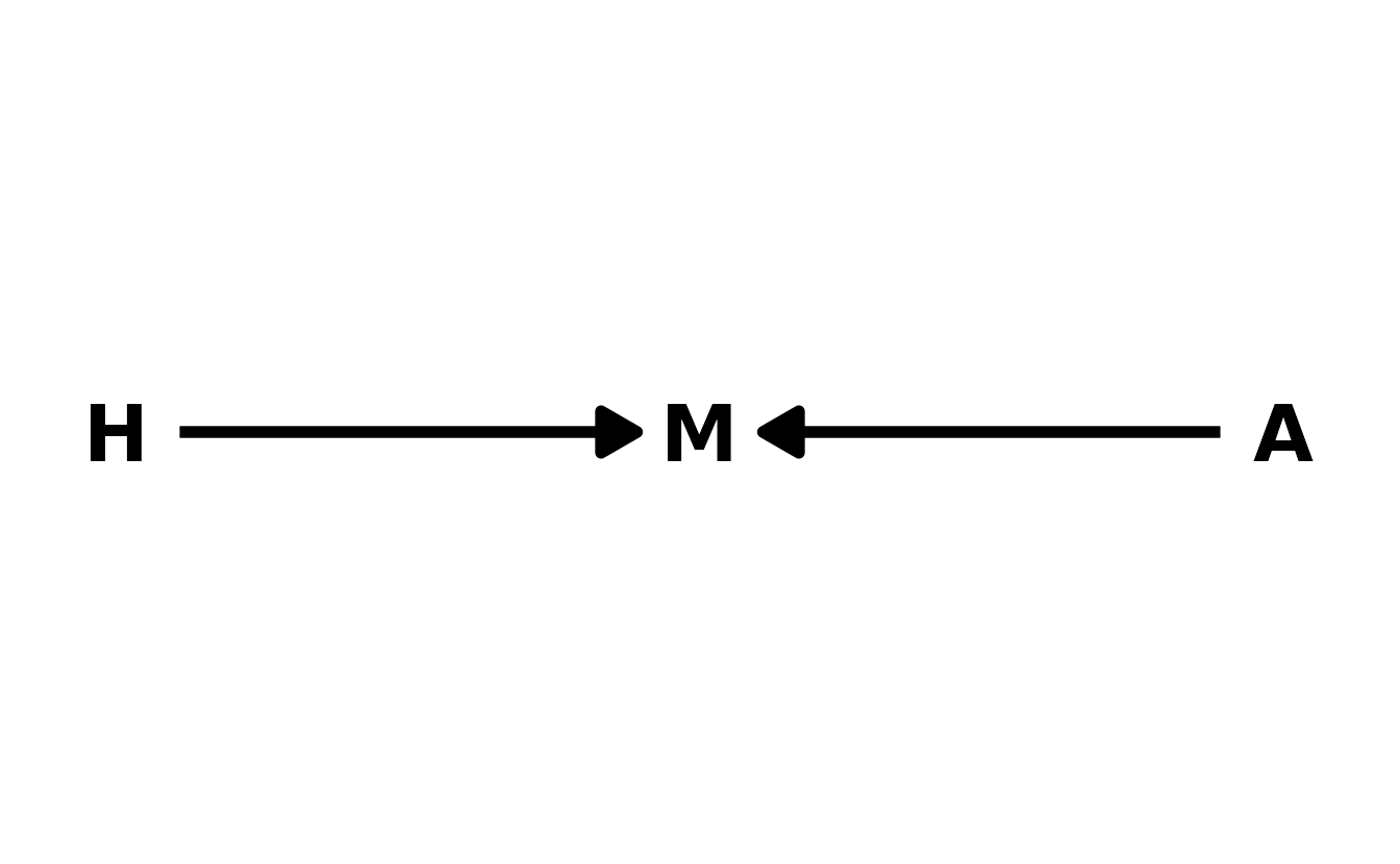
First, let’s regenerate the data and estimate the models.
d <- sim_happiness(seed = 1977, N_years = 1000)
dat <- d %>%
  filter(age > 17) %>%
  mutate(a = (age - 18) / (65 - 18),
         mid = factor(married + 1, labels = c("single", "married")))

b6.9 <- brm(happiness ~ 0 + mid + a, data = dat, family = gaussian,
            prior = c(prior(normal(0, 1), class = b, coef = midmarried),
                      prior(normal(0, 1), class = b, coef = midsingle),
                      prior(normal(0, 2), class = b, coef = a),
                      prior(exponential(1), class = sigma)),
            iter = 4000, warmup = 2000, chains = 4, cores = 4, seed = 1234,
            file = here("fits", "hw4", "w4h1-6.9"))

b6.10 <- brm(happiness ~ 1 + a, data = dat, family = gaussian,
             prior = c(prior(normal(0, 1), class = Intercept),
                       prior(normal(0, 2), class = b, coef = a),
                       prior(exponential(1), class = sigma)),
             iter = 4000, warmup = 2000, chains = 4, cores = 4, seed = 1234,
             file = here("fits", "hw4", "w4h1-6.10"))
Now we’ll compare both PSIS and WAIC. The results from PSIS and WAIC are identical, with both showing a very strong preference for b6.9 which includes marriage as a predictor. Thus, if we are interested only in predicting happiness, we should use model b6.9. However, due to the causal model, the coefficients can’t be interpreted. The coefficient for age is confounded by the collider. Similarly, the coefficient for marriage is odd, because in the DAG, marriage does not cause happiness, it is a cause of happiness. Thus, all of the parameters represents conditional associations. None are causal effects.
b6.9 <- add_criterion(b6.9, criterion = c("waic", "loo"))
b6.10 <- add_criterion(b6.10, criterion = c("waic", "loo"))

loo_compare(b6.9, b6.10, criterion = "waic")
#>       elpd_diff se_diff
#> b6.9     0.0       0.0
#> b6.10 -194.0      17.6
loo_compare(b6.9, b6.10, criterion = "loo")
#>       elpd_diff se_diff
#> b6.9     0.0       0.0
#> b6.10 -194.0      17.6
2. Reconsider the urban fox analysis from last week’s homework. On the basis of PSIS and WAIC scores, which combination of variables best predicts body weight (\(W\),
weight)? How would you interpret the estimates from the best scoring model?
As a reminder, here is the DAG for the fox data.
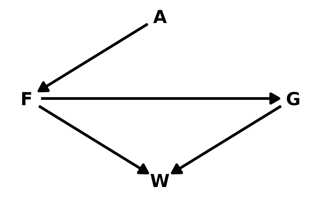
Last week we estimated many models to the fox data. Here are five models that predict weight with various combinations of predictors.
data(foxes)

fox_dat <- foxes %>%
  as_tibble() %>%
  select(area, avgfood, weight, groupsize) %>%
  mutate(across(everything(), standardize))

fox_1 <- brm(weight ~ 1 + avgfood + groupsize + area, data = fox_dat,
             family = gaussian,
             prior = c(prior(normal(0, 0.2), class = Intercept),
                       prior(normal(0, 0.5), class = b,),
                       prior(exponential(1), class = sigma)),
             iter = 4000, warmup = 2000, chains = 4, cores = 4, seed = 1234,
             file = here("fits", "hw4", "w4h2-1"))

fox_2 <- brm(weight ~ 1 + avgfood + groupsize, data = fox_dat,
             family = gaussian,
             prior = c(prior(normal(0, 0.2), class = Intercept),
                       prior(normal(0, 0.5), class = b,),
                       prior(exponential(1), class = sigma)),
             iter = 4000, warmup = 2000, chains = 4, cores = 4, seed = 1234,
             file = here("fits", "hw4", "w4h2-2"))

fox_3 <- brm(weight ~ 1 + groupsize + area, data = fox_dat,
             family = gaussian,
             prior = c(prior(normal(0, 0.2), class = Intercept),
                       prior(normal(0, 0.5), class = b,),
                       prior(exponential(1), class = sigma)),
             iter = 4000, warmup = 2000, chains = 4, cores = 4, seed = 1234,
             file = here("fits", "hw4", "w4h2-3"))

fox_4 <- brm(weight ~ 1 + avgfood + area, data = fox_dat,
             family = gaussian,
             prior = c(prior(normal(0, 0.2), class = Intercept),
                       prior(normal(0, 0.5), class = b,),
                       prior(exponential(1), class = sigma)),
             iter = 4000, warmup = 2000, chains = 4, cores = 4, seed = 1234,
             file = here("fits", "hw4", "w4h2-4"))

fox_5 <- brm(weight ~ 1 + area, data = fox_dat,
             family = gaussian,
             prior = c(prior(normal(0, 0.2), class = Intercept),
                       prior(normal(0, 0.5), class = b,),
                       prior(exponential(1), class = sigma)),
             iter = 4000, warmup = 2000, chains = 4, cores = 4, seed = 1234,
             file = here("fits", "hw4", "w4h2-5"))

fox_1 <- add_criterion(fox_1, criterion = c("waic", "loo"))
fox_2 <- add_criterion(fox_2, criterion = c("waic", "loo"))
fox_3 <- add_criterion(fox_3, criterion = c("waic", "loo"))
fox_4 <- add_criterion(fox_4, criterion = c("waic", "loo"))
fox_5 <- add_criterion(fox_5, criterion = c("waic", "loo"))
Here again, the WAIC and PSIS scores are very similar. Both methods prefer model 1, which includes all three predictors in the model. However, the differences are often smaller than the standard error of difference, so the preference is not overly strong.
loo_compare(fox_1, fox_2, fox_3, fox_4, fox_5, criterion = "waic")
#>       elpd_diff se_diff
#> fox_1  0.0       0.0
#> fox_3 -0.4       1.4
#> fox_2 -0.4       1.7
#> fox_5 -5.3       3.4
#> fox_4 -5.7       3.3

loo_compare(fox_1, fox_2, fox_3, fox_4, fox_5, criterion = "loo")
#>       elpd_diff se_diff
#> fox_1  0.0       0.0
#> fox_3 -0.4       1.4
#> fox_2 -0.4       1.7
#> fox_5 -5.3       3.4
#> fox_4 -5.7       3.3
We can interpret the coefficients for fox_1 using the DAG. First for avgfood. Since, groupsize is in the model, the indirect path from food to weight is closed. Therefore, the coefficient for avgfood represents the direct effect of food on weight. Second, for groupsize, avgfood is a backdoor fork. So by closing this path, the group size coefficient represents the total (and also direct since this is only one path remaining) causal effect of group size on weight.
Finally, area is a little weird. Because avgfood is a pipe, mediating the relationship between area and weight, including avgfood should block the association between area and weight. This is indeed what we see in model 4, which includes only area and avgfood. There is a good deal of posterior probability on both sides of 0, indicating that the effect of area is could plausibly be negative or positive.
fixef(fox_4)
#>            Estimate Est.Error   Q2.5 Q97.5
#> Intercept -0.000187    0.0845 -0.165 0.166
#> avgfood   -0.148423    0.1740 -0.486 0.191
#> area       0.144857    0.1748 -0.199 0.483
However, when groupsize is added as in the first model, we see that the association between area and weight increases, even though avgfood should still be blocking the path. Therefore, this indicates that something else may be going on in the data, or our DAG might be incorrect.
fixef(fox_1)
#>            Estimate Est.Error    Q2.5  Q97.5
#> Intercept -0.000224    0.0818 -0.1600  0.165
#> avgfood    0.294284    0.2156 -0.1308  0.718
#> groupsize -0.632656    0.1860 -0.9978 -0.268
#> area       0.275539    0.1746 -0.0716  0.622
3. Build a predictive model of the relationship shown on the cover of the book, the relationship between the timing of cherry blossoms and March temperature in the same year. The data are found in
data(cherry_blossoms). Consider at least two functions to predictdoywithtemp. Compare them with PSIS or WAIC.Suppose March temperatures reach 9 degrees by the year 2050. What does your best model predict for the predictive distribution of the day-in-year that the cherry trees will blossom?
For this exercise, I’ll fit 2 spline models and a linear model. For the spline models I’ll use 30 knots, one model with loose priors and the other with tighter priors.
library(splines)

data(cherry_blossoms)
cb_dat <- cherry_blossoms %>%
  select(doy, temp) %>%
  drop_na(everything())

linear <- brm(doy ~ 1 + temp, data = cb_dat, family = gaussian,
              prior = c(prior(normal(100, 10), class = Intercept),
                        prior(normal(0, 10), class = b),
                        prior(exponential(1), class = sigma)),
              iter = 2000, warmup = 1000, chains = 4, cores = 4, seed = 1234,
              file = here("fits", "hw4", "w4h3-1"))

spline_1 <- brm(doy ~ 1 + s(temp, bs = "bs", k = 30), data = cb_dat,
                family = gaussian,
                prior = c(prior(normal(100, 10), class = Intercept),
                          prior(normal(0, 10), class = b),
                          prior(student_t(3, 0, 5.9), class = sds),
                          prior(exponential(1), class = sigma)),
                iter = 2000, warmup = 1000, chains = 4, cores = 4, seed = 1234,
                file = here("fits", "hw4", "w4h3-2"))

spline_2 <- brm(doy ~ 1 + s(temp, bs = "bs", k = 30), data = cb_dat,
                family = gaussian,
                prior = c(prior(normal(100, 10), class = Intercept),
                          prior(normal(0, 2), class = b),
                          prior(student_t(3, 0, 5.9), class = sds),
                          prior(exponential(1), class = sigma)),
                iter = 2000, warmup = 1000, chains = 4, cores = 4, seed = 1234,
                file = here("fits", "hw4", "w4h3-3"))


linear <- add_criterion(linear, criterion = c("waic", "loo"))
spline_1 <- add_criterion(spline_1, criterion = c("waic", "loo"))
spline_2 <- add_criterion(spline_2, criterion = c("waic", "loo"))
When comparing the models, both PSIS and WAIC prefer the linear. Although the two spline models perform almost identically, the standard errors of the differences between these models and the linear model are only about one fifth of the difference.
loo_compare(linear, spline_1, spline_2, criterion = "waic")
#>          elpd_diff se_diff
#> linear    0.0       0.0
#> spline_2 -0.9       0.2
#> spline_1 -1.0       0.2

loo_compare(linear, spline_1, spline_2, criterion = "loo")
#>          elpd_diff se_diff
#> linear    0.0       0.0
#> spline_2 -1.0       0.2
#> spline_1 -1.0       0.2
Using our linear model, we can predict the the date of the first bloom with a March temperature of 9. We see expected value is around day 96, with an 89% compatibility interval of 87 to 106. Since 2050 is not a leap year, this corresponds to a first bloom between March 28 and April 16.
new_dat <- tibble(temp = 9)

preds <- new_dat %>%
  add_predicted_draws(linear)

mean_hdi(preds$.prediction, .width = c(0.89))
#>      y ymin ymax .width .point .interval
#> 1 96.2 86.2  105   0.89   mean       hdi

ggplot(preds, aes(x = .prediction)) +
  stat_halfeye(.width = c(0.67, 0.89, 0.97)) +
  labs(x = "Day of Year", y = "Posterior Predictive Density")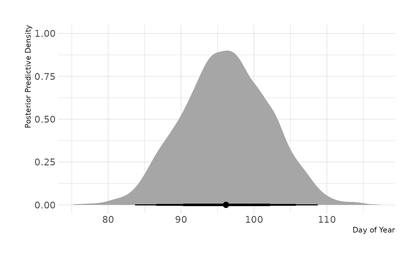
4 - OPTIONAL CHALLENGE. The data in
data(Dinosaurs)are body mass estimates at different estimated ages for six different dinosaur species. See?Dinosaursfor more details. Choose one or more of these species (at least one, but as many as you like) and model its growth. To be precise: Make a predictive model of body mass using age as a predictor. Consider two or more model types for the function relating age to body mass and score each using PSIS and WAIC.Which model do you think is best, on predictive grounds? On scientific grounds? If your answers to these questions differ, why?
This is a challenging exercise, because the data are so scarce. But it is also a realistic example, because people publish Nature papers with even less data. So do your best, and I look forward to seeing your growth curves.
Not being familiar with biological growth models, this question stumped me. So I’ll be pulling from McElreath’s solution, but translating everything to {tidyverse} and {brms}.
We start by loading the data and normalizing mass to be the proportion of maximum mass within each species. We also create sub-sample of just one dinosaur to more easily illustrate the various models we’ll explore.
data(Dinosaurs)

dino_dat <- Dinosaurs %>%
  as_tibble() %>%
  select(species_name = species, species = sp_id, age, mass) %>%
  group_by(species) %>%
  mutate(prop_mass = mass / max(mass),
         species = factor(species)) %>%
  ungroup()

one_dino <- filter(dino_dat, species == 1)
First up is a straight linear regression. This model looks just like all of the other regressions we’ve fit with {brms} so far.
one_dino_linear <- brm(prop_mass ~ 1 + age, data = one_dino, family = gaussian,
                       prior = c(prior(normal(0, 1), class = Intercept),
                                 prior(normal(0, 1), class = b),
                                 prior(exponential(1), class = sigma)),
                       iter = 2000, warmup = 1000, chains = 4, cores = 4, seed = 1234,
                file = here("fits", "hw4", "w4h4-one-linear"))
Visualizing the model, we see that it actually does a pretty good job of fitting the data points for this one dinosaur, but leads to impossible predictions. For example, ages 0 to about 4 are predicted to have negative mass. Additionally, from a scientific perspective, linear growth doesn’t make any biological sense.
new_dat <- tibble(age = seq(0, 16, length.out = 50))

new_dat %>%
  add_epred_draws(one_dino_linear) %>%
  ggplot(aes(x = age, y = .epred)) +
  stat_lineribbon(.width = 0.89, fill = "#009FB7", alpha = 0.4,
                  color = NA) +
  stat_lineribbon(fill = "transparent") +
  geom_point(data = one_dino, aes(y = prop_mass), size = 2) +
  scale_x_continuous(breaks = seq(0, 15, by = 5)) +
  coord_cartesian(ylim = c(0, 1.05), expand = FALSE) +
  labs(x = "Age", y = "Mass (normalized)")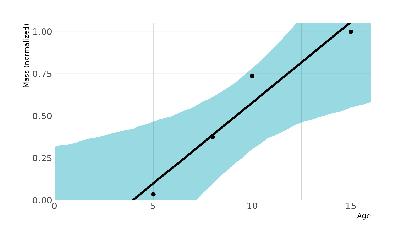
The next model is a classic biological model called the von Bertalanffy growth model (1934). Under this models, organisms grow at a certain rate given the differential equation (my notation shifts a bit from McElreath’s solution to make the model fitting in {brms} easier):
\[ \frac{dM}{dA} = k(\phi - M) \]
where \(M\) is mass, \(A\) is age, \(k\) is a rate, and \(\phi\) is the maximum adult size. Solving the equation gives us:
\[ M(A) = \phi(1 - \exp(-kA)) \]
We can define this equation in {brms} using the non-linear syntax, as described by Solomon Kurz.
one_dino_bio <- brm(bf(prop_mass ~ phi * (1 - exp(-k * age)),
                       phi + k ~ 1,
                       nl = TRUE), data = one_dino, family = gaussian,
                    prior = c(prior(normal(1, 0.5), nlpar = phi),
                              prior(exponential(1), nlpar = k, lb = 0),
                              prior(exponential(1), class = sigma)),
                    iter = 4000, warmup = 3000, chains = 4, cores = 4, seed = 1234,
                    control = list(adapt_delta = 0.95),
                    file = here("fits", "hw4", "w4h4-one-bio"))

new_dat %>%
  add_epred_draws(one_dino_bio) %>%
  ggplot(aes(x = age, y = .epred)) +
  stat_lineribbon(.width = 0.89, fill = "#009FB7", alpha = 0.4,
                  color = NA) +
  stat_lineribbon(fill = "transparent") +
  geom_point(data = one_dino, aes(y = prop_mass), size = 2) +
  scale_x_continuous(breaks = seq(0, 15, by = 5)) +
  coord_cartesian(ylim = c(0, 1.05), expand = FALSE) +
  labs(x = "Age", y = "Mass (normalized)")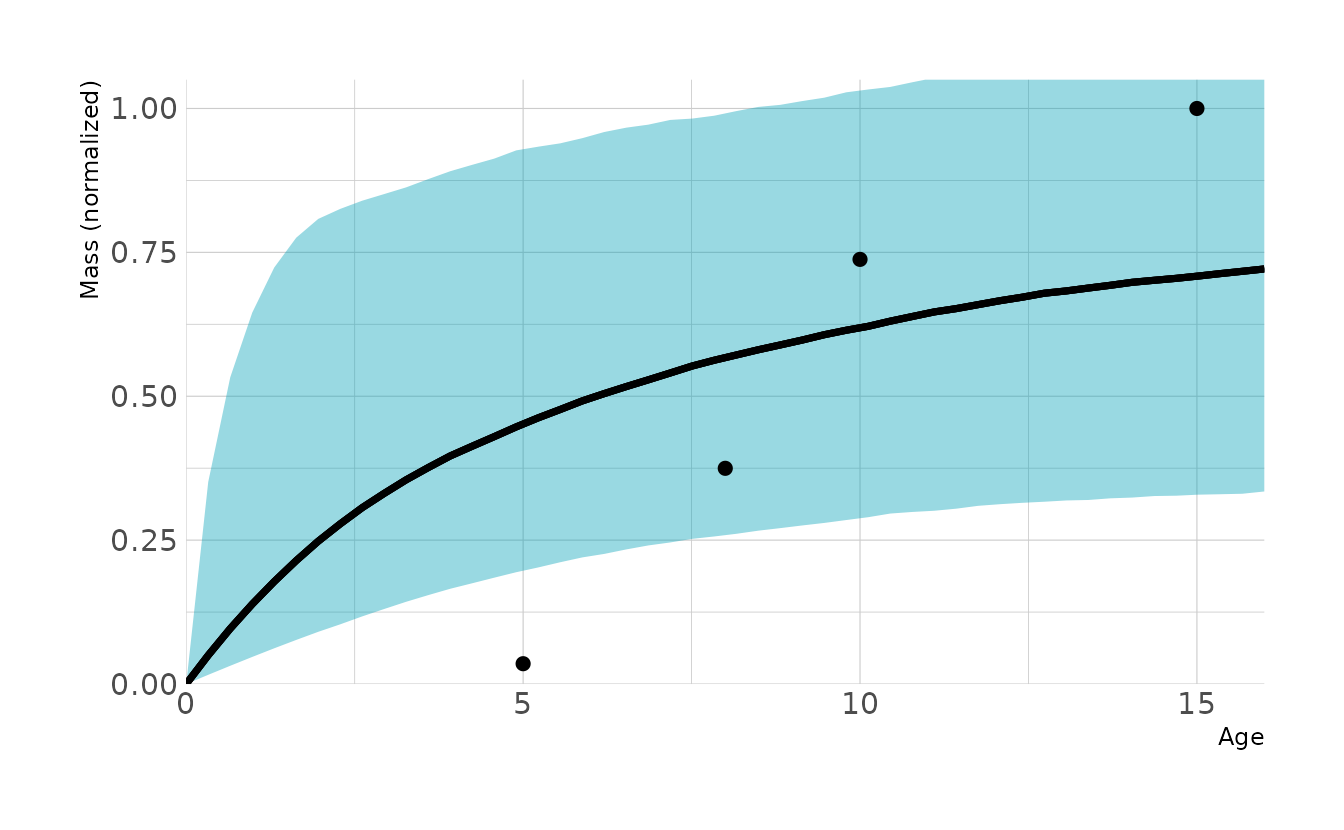
This looks worse that our original line, except for the fact that we no longer get implausible predictions. So that’s a win. The problem is that we want growth to be slow at first and then accelerate around age 5. In the von Bertalanffy growth model, this is accomplished by raising the growth function to a power, \(\theta\):
\[ M(A) = \phi(1 - \exp(-kA))^\theta \]
We can again fit this model using the non-linear {brms} syntax.
one_dino_acc <- brm(bf(prop_mass ~ phi * (1 - exp(-k * age)) ^ theta,
                       phi + k + theta ~ 1,
                       nl = TRUE), data = one_dino, family = gaussian,
                    prior = c(prior(normal(1, 0.5), nlpar = phi),
                              prior(exponential(1), nlpar = k, lb = 0),
                              prior(exponential(0.1), nlpar = theta, lb = 0),
                              prior(exponential(1), class = sigma)),
                    iter = 20000, warmup = 19000, chains = 4, cores = 4, seed = 1234,
                    control = list(adapt_delta = 0.999, max_treedepth = 15),
                    file = here("fits", "hw4", "w4h4-one-acc"))

new_dat %>%
  add_epred_draws(one_dino_acc) %>%
  ggplot(aes(x = age, y = .epred)) +
  stat_lineribbon(.width = 0.89, fill = "#009FB7", alpha = 0.4,
                  color = NA) +
  stat_lineribbon(fill = "transparent") +
  geom_point(data = one_dino, aes(y = prop_mass), size = 2) +
  scale_x_continuous(breaks = seq(0, 15, by = 5)) +
  coord_cartesian(ylim = c(0, 1.05), expand = FALSE) +
  labs(x = "Age", y = "Mass (normalized)")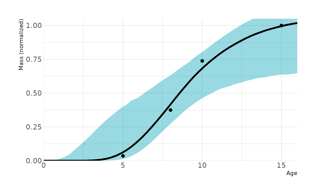
This looks pretty good! Comparing our models with PSIS, we see that the accelerated growth model is preferred, even after taking the standard errors into consideration.
one_dino_linear <- add_criterion(one_dino_linear, criterion = "loo")
one_dino_bio <- add_criterion(one_dino_bio, criterion = "loo")
one_dino_acc <- add_criterion(one_dino_acc, criterion = "loo")

loo_compare(one_dino_linear, one_dino_bio, one_dino_acc,
            criterion = "loo")
#>                 elpd_diff se_diff
#> one_dino_acc     0.0       0.0
#> one_dino_linear -2.8       0.5
#> one_dino_bio    -4.4       0.8
Now let’s fit that model to all of the dinosaurs in our data set. The only difference here is that we know index phi, k, and theta by species so that each will get their own curve.
all_dinos <- brm(bf(prop_mass ~ phi * (1 - exp(-k * age)) ^ theta,
                    phi ~ 0 + species,
                    k ~ 0 + species,
                    theta ~ 0 + species,
                    nl = TRUE), data = dino_dat, family = gaussian,
                 prior = c(prior(normal(1, 0.5), nlpar = phi),
                           prior(exponential(1), nlpar = k, lb = 0),
                           prior(exponential(0.1), nlpar = theta, lb = 0),
                           prior(exponential(1), class = sigma)),
                 iter = 10000, warmup = 9000, chains = 4, cores = 4, seed = 1234,
                 control = list(adapt_delta = 0.95),
                 file = here("fits", "hw4", "w4h4-all"))

p <- distinct(dino_dat, species_name, species) %>%
  expand_grid(age = seq(0, 16, length.out = 50)) %>%
  add_epred_draws(all_dinos) %>%
  ggplot(aes(x = age, y = .epred, fill = species_name, color = species_name)) +
  stat_lineribbon(.width = 0.89, alpha = 0.6, color = NA) +
  stat_lineribbon(fill = "transparent") +
  geom_point(data = dino_dat, aes(y = prop_mass), size = 2) +
  scale_fill_viridis_d(option = "turbo") +
  scale_color_viridis_d(option = "turbo") +
  scale_x_continuous(breaks = seq(0, 15, by = 5)) +
  coord_cartesian(ylim = c(0, 2.05), expand = FALSE) +
  labs(x = "Age", y = "Mass (normalized)", fill = "Species",
       color = "Species")

p
There’s a lot of uncertainty in each curve, which isn’t unexpected given how few data points we have. To me it’s a little easier to digest if we split each species into it’s own plot. Overall, it looks like our models are doing a pretty good job of estimating the dinosaur growth!
p +
  facet_wrap(~species_name, ncol = 3) +
  guides(fill = "none", color = "none")